A girl, her dog, and a diva off to see the Wizard
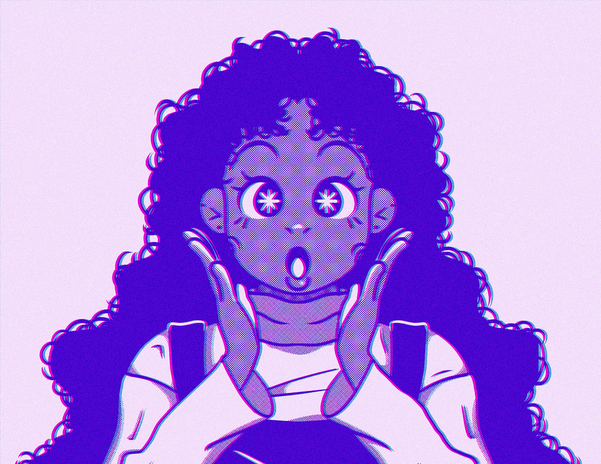
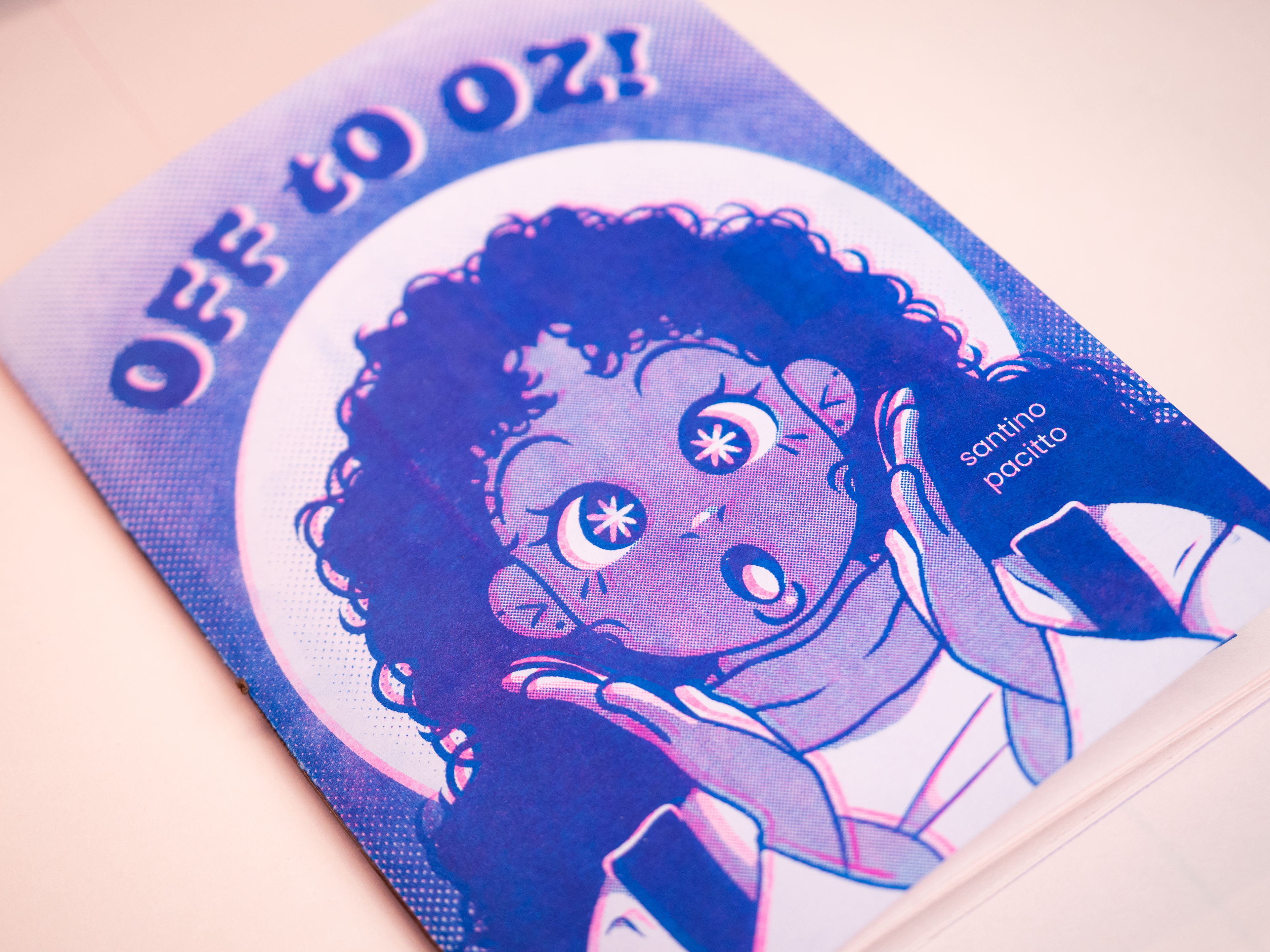
Off to Oz is a reimagining of The Wizard of Oz that focuses on themes of diversity and acceptance, told in a graphic novel format. The goal of the project was to update the characters and story for a modern audience while addressing topics that would be both helpful and entertaining for young readers. The visual style was designed to feel fun, bright, and heavily influenced by riso printing techniques.
The comic
Deliverables
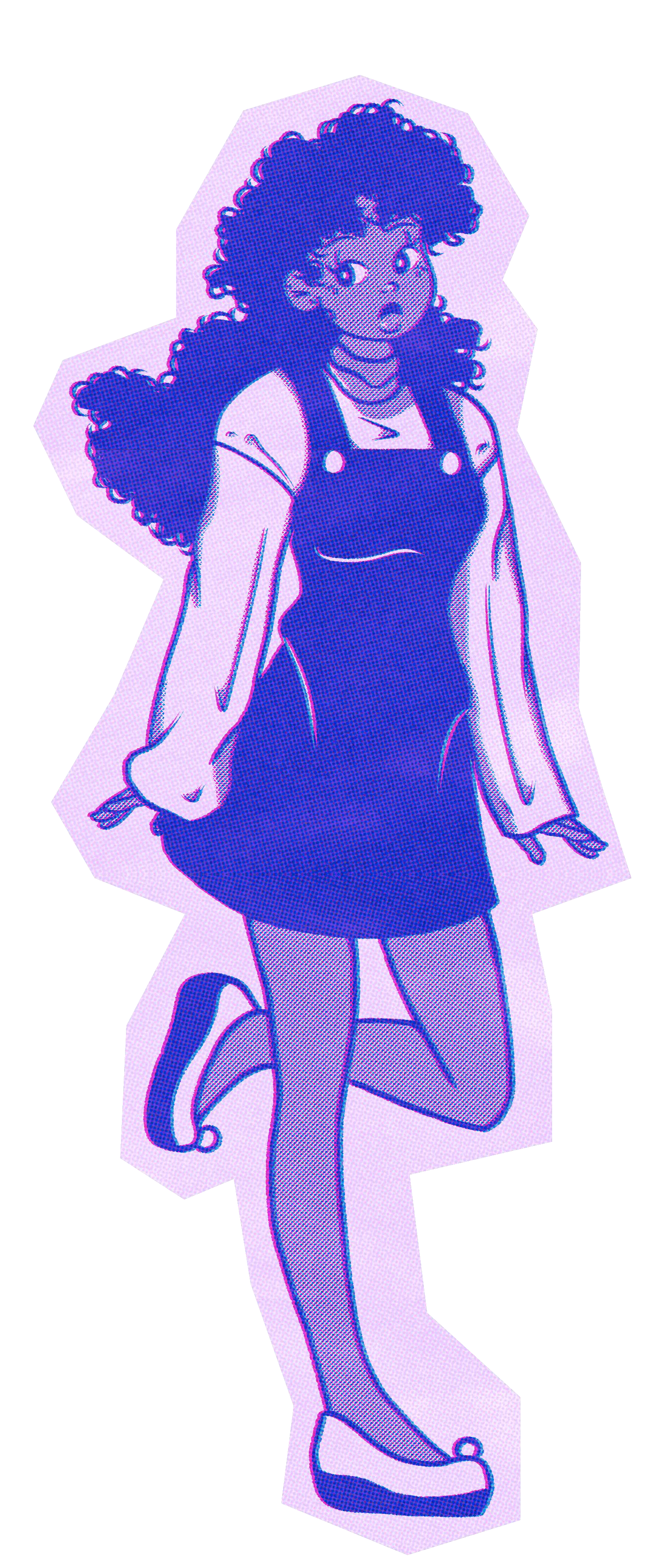
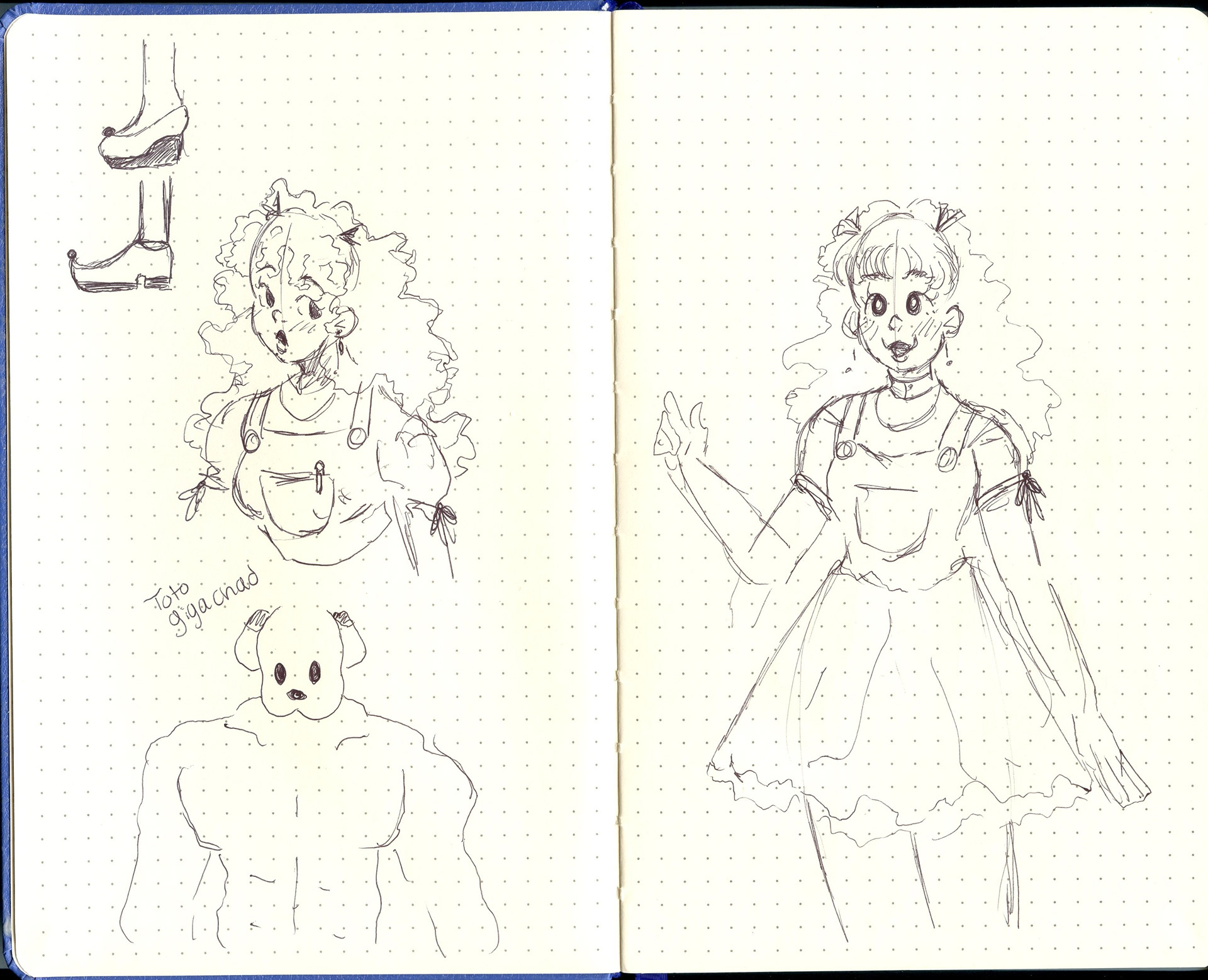
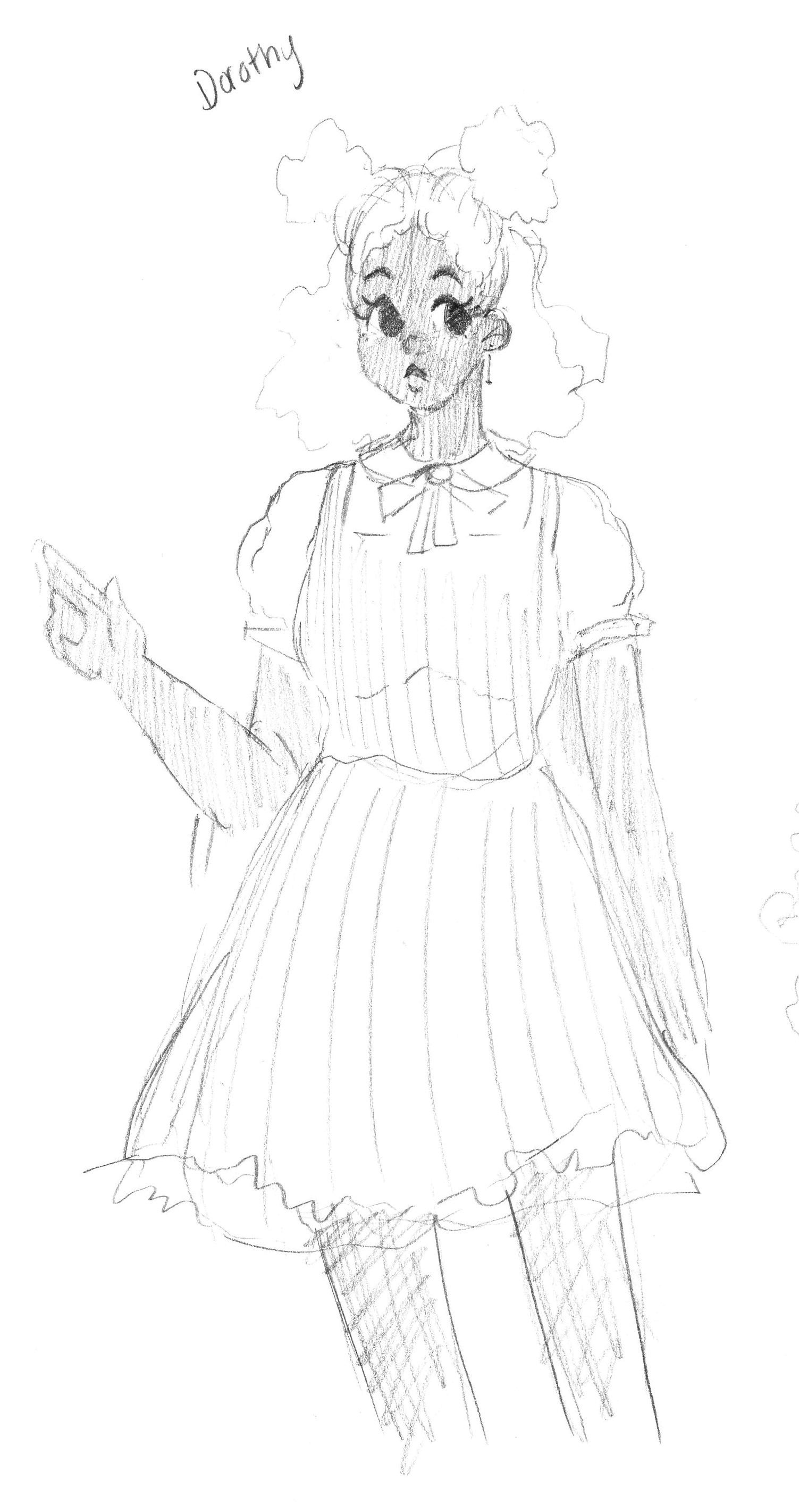
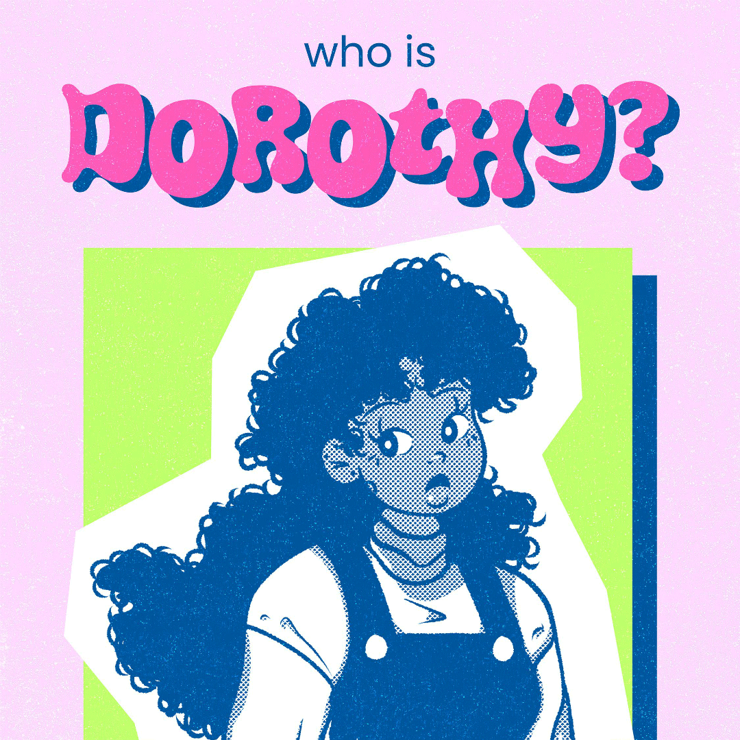
Dorothy
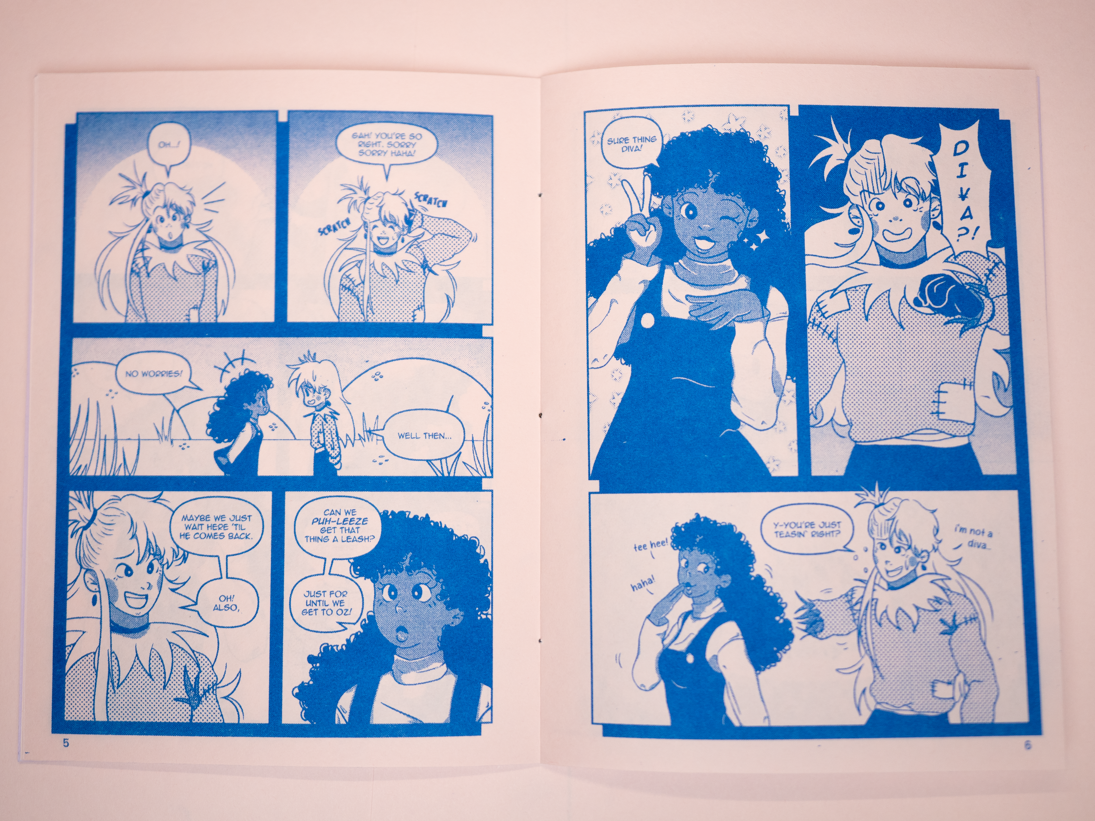
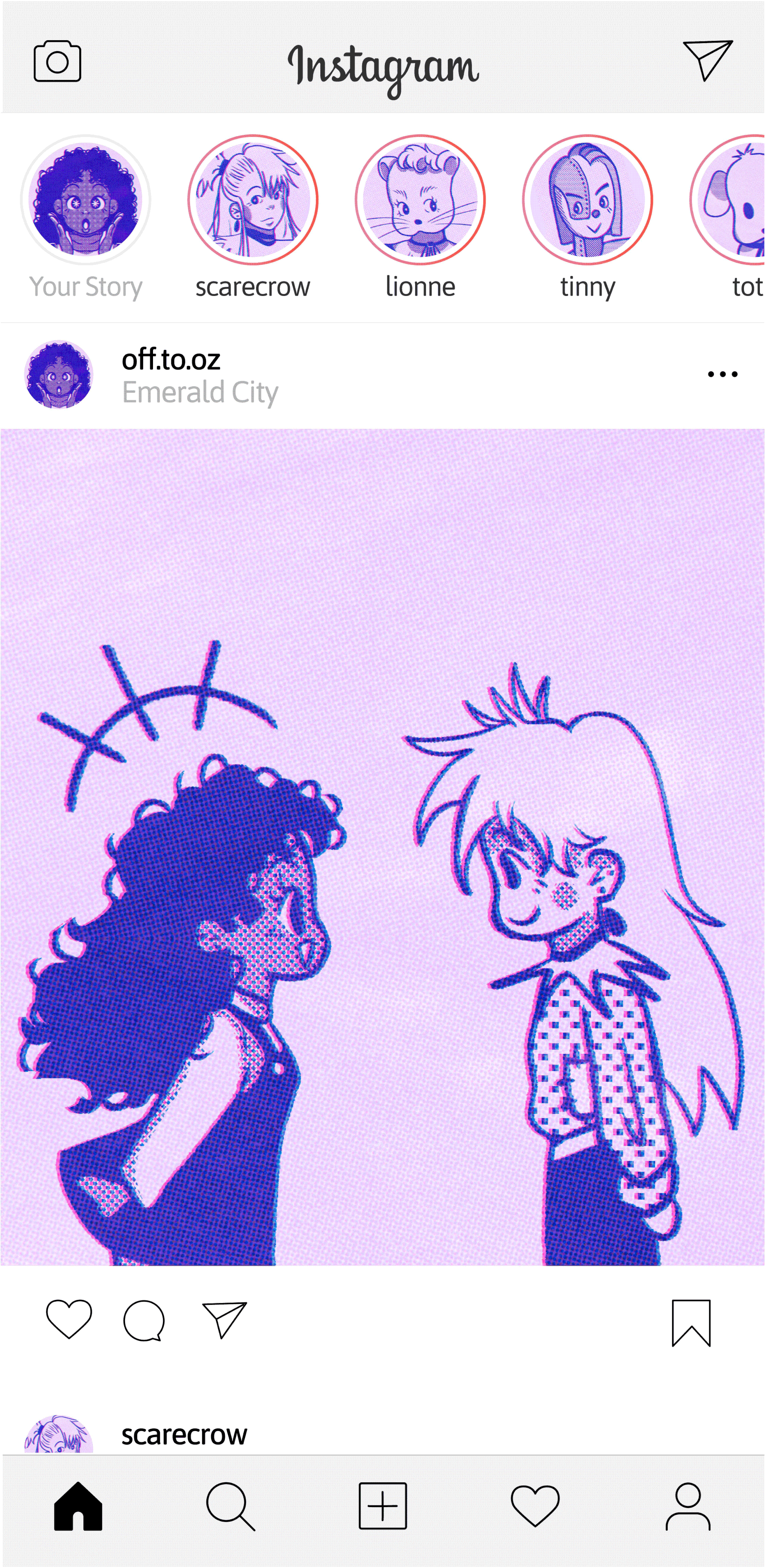
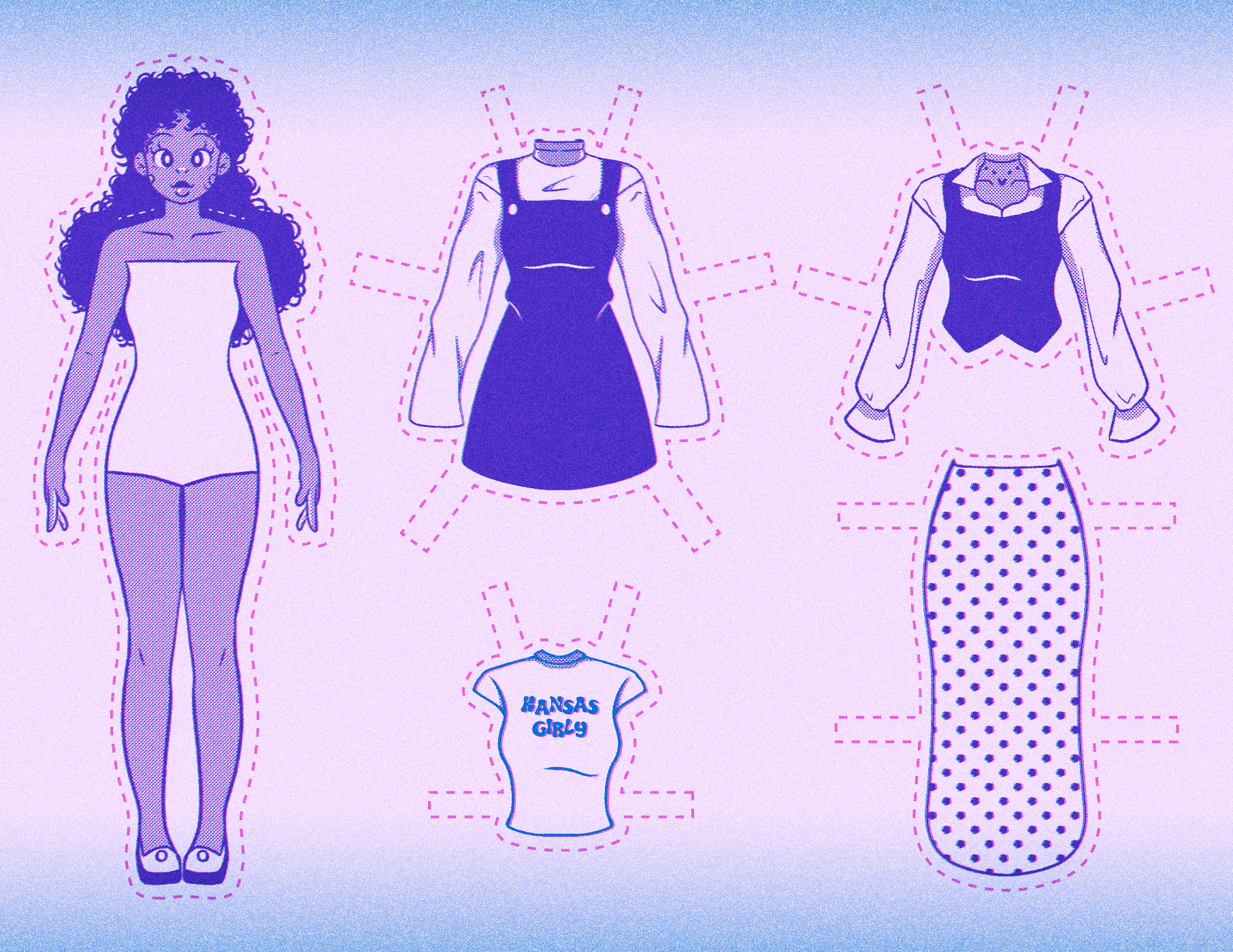
Dorothy is a young woman from Kansas who wants to find her way back home. After hearing about this Wizard fella, she decides she could ask him to whip up a potion or something that zips her straight back to Kansas. Acting as the leader of the crew, Dorothy often finds herself putting others problems before her own, but that's okay, right? Sometimes she just wants to be a girl, have fun, and not worry about all that has landed on her plate!
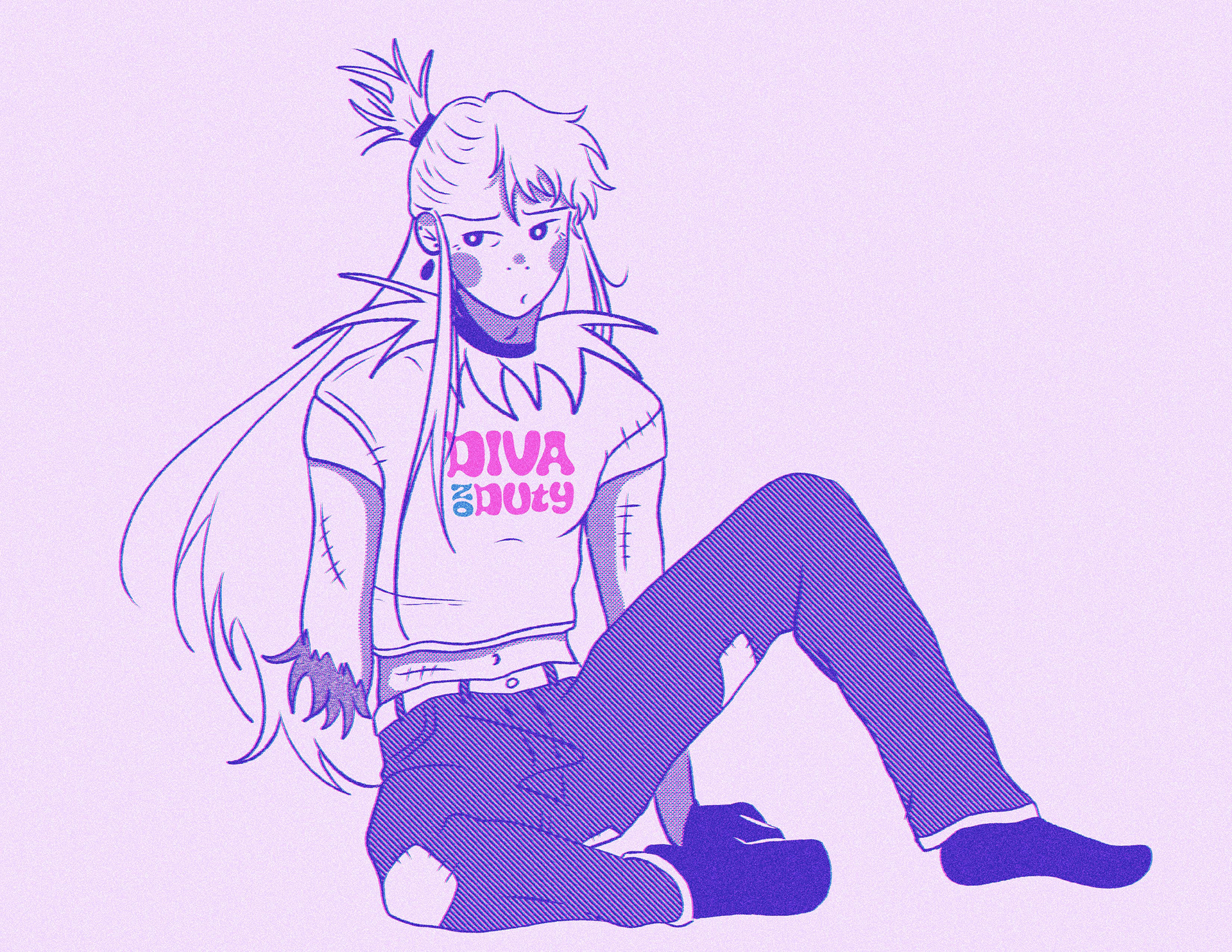
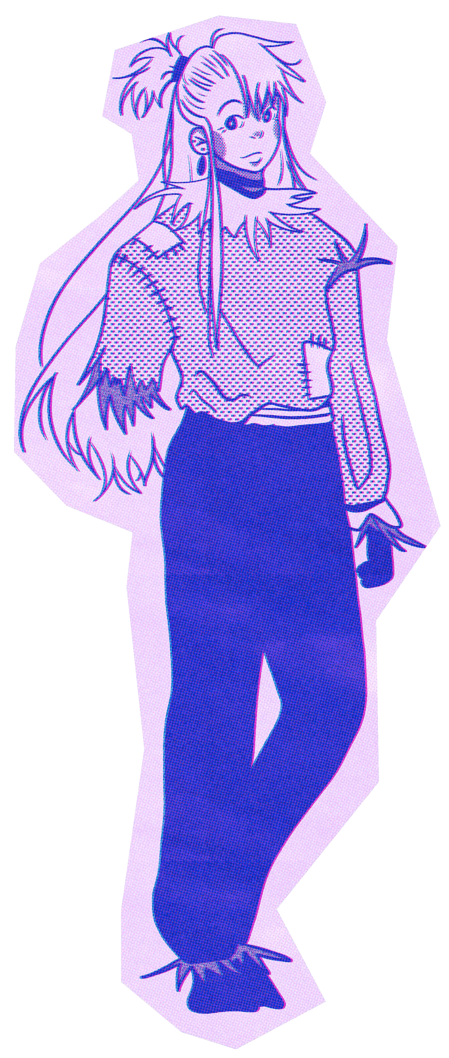
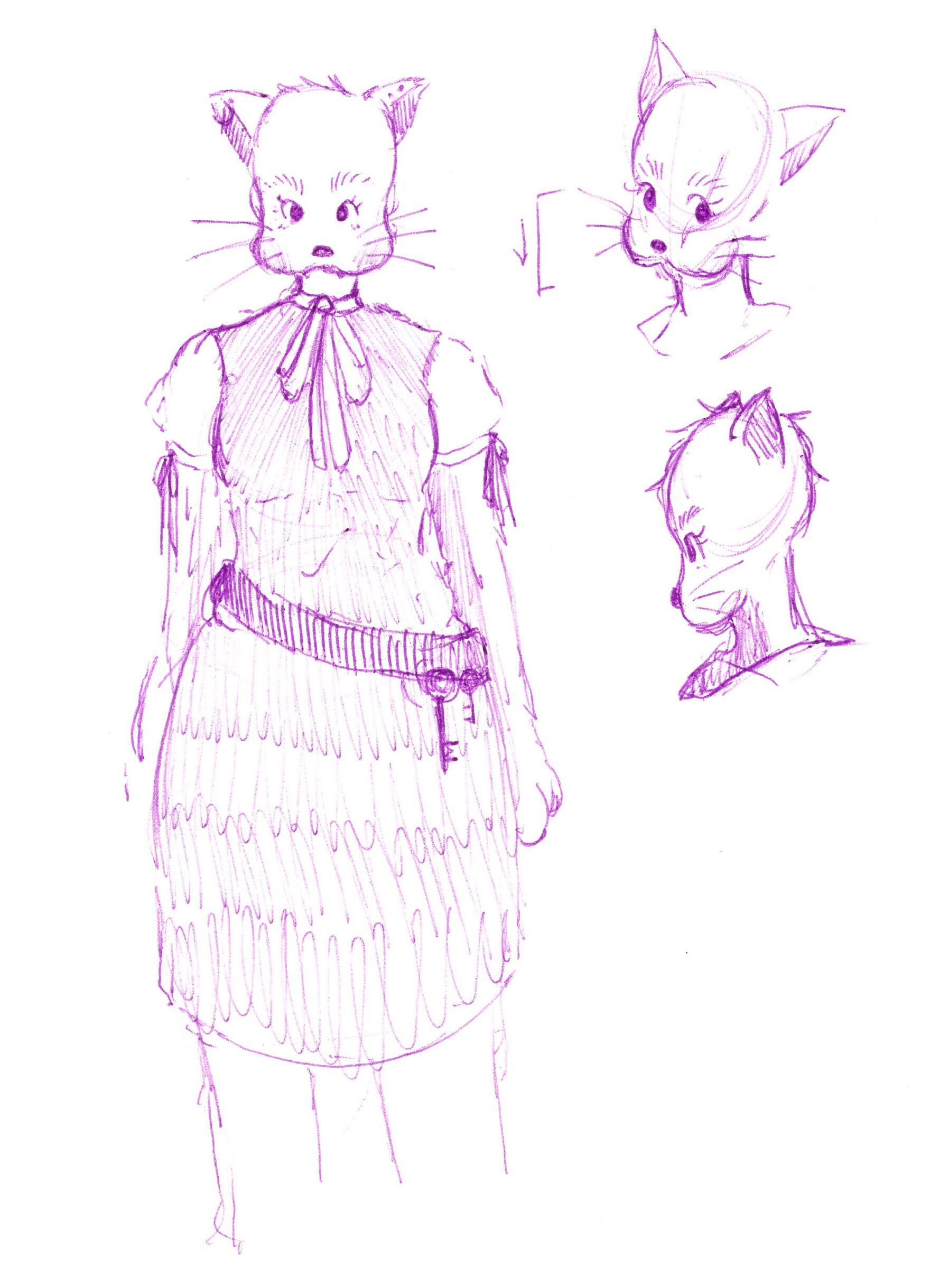
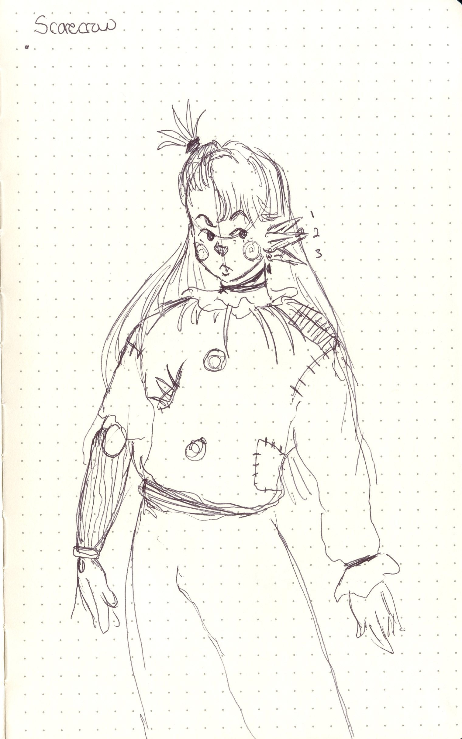
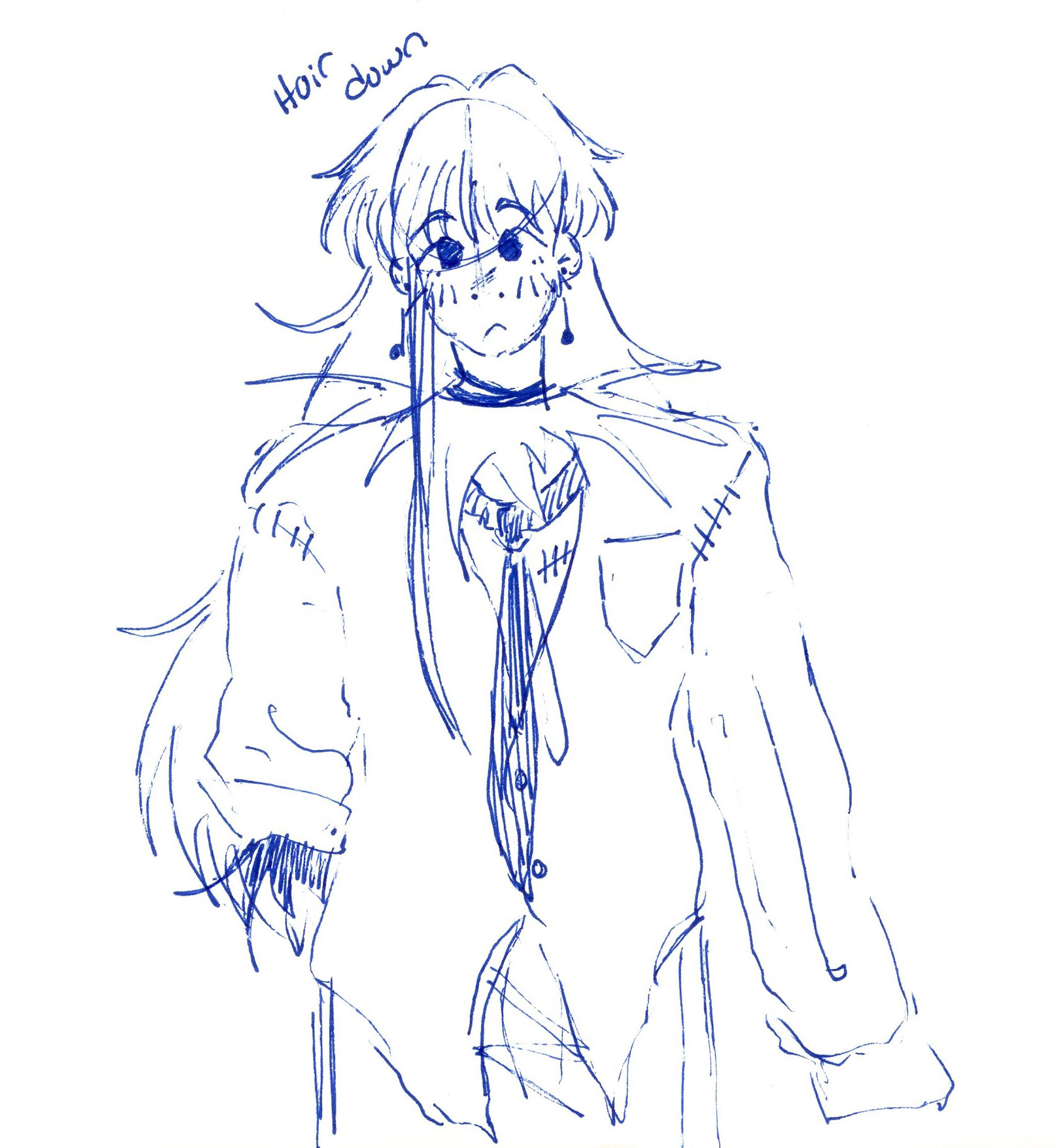
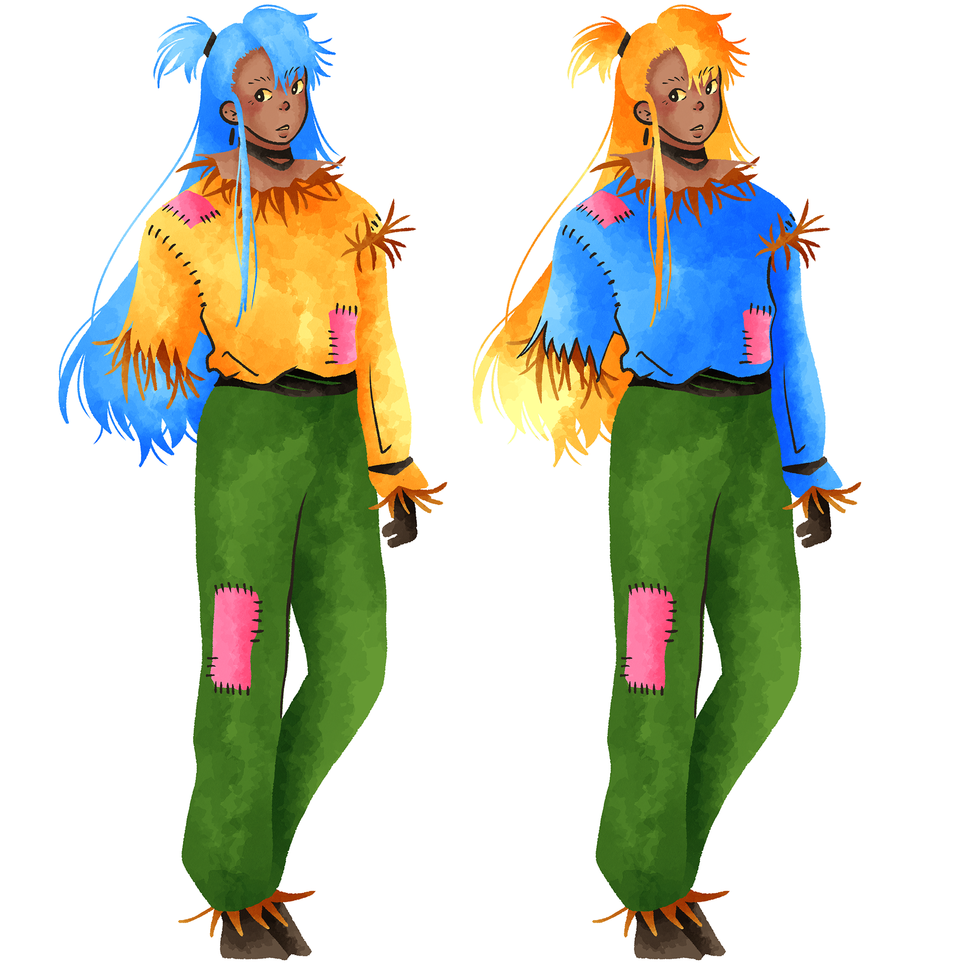
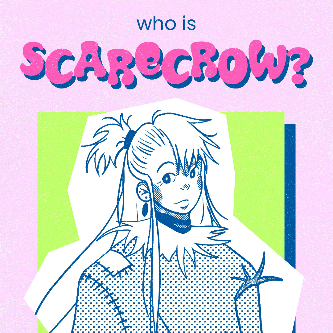
Scarecrow
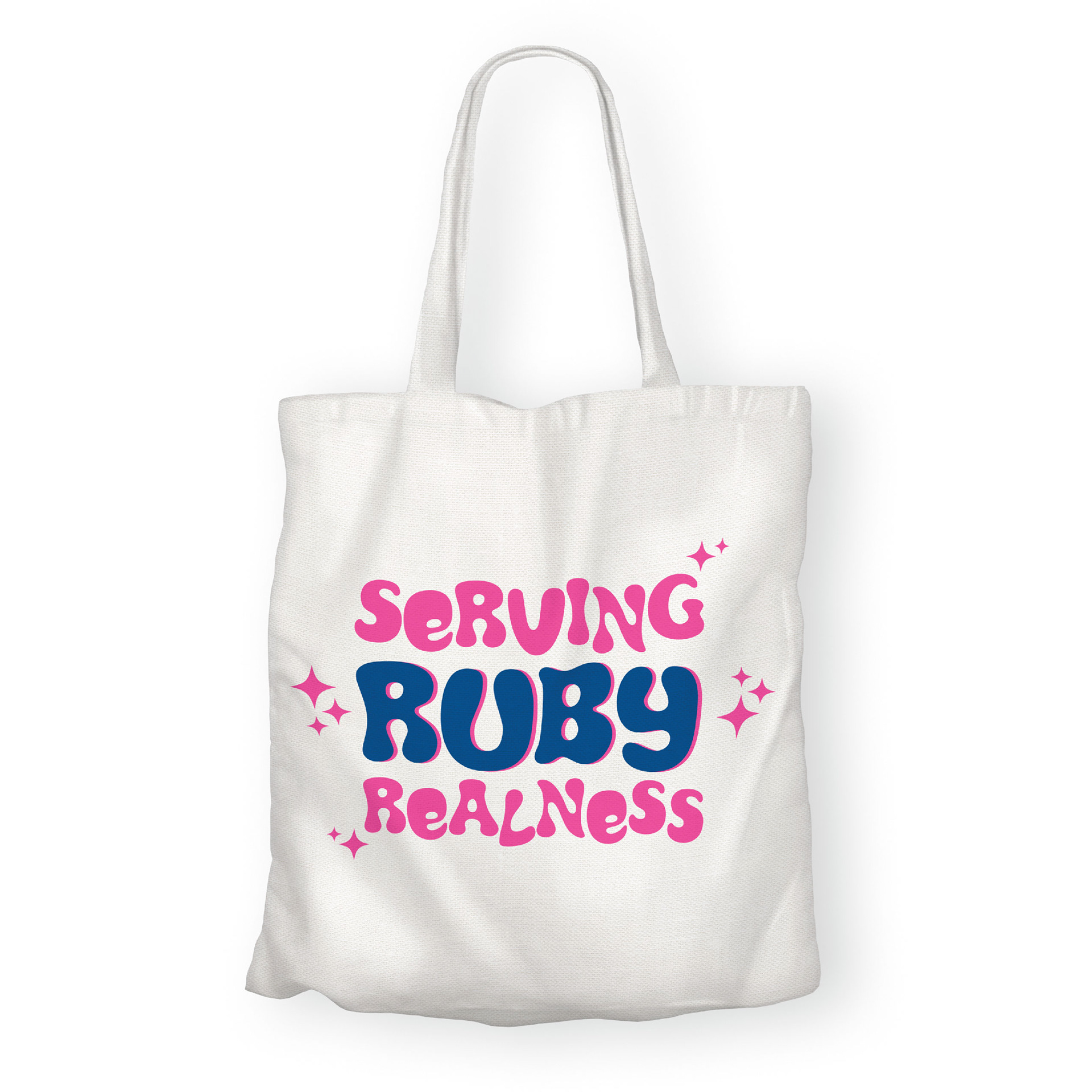
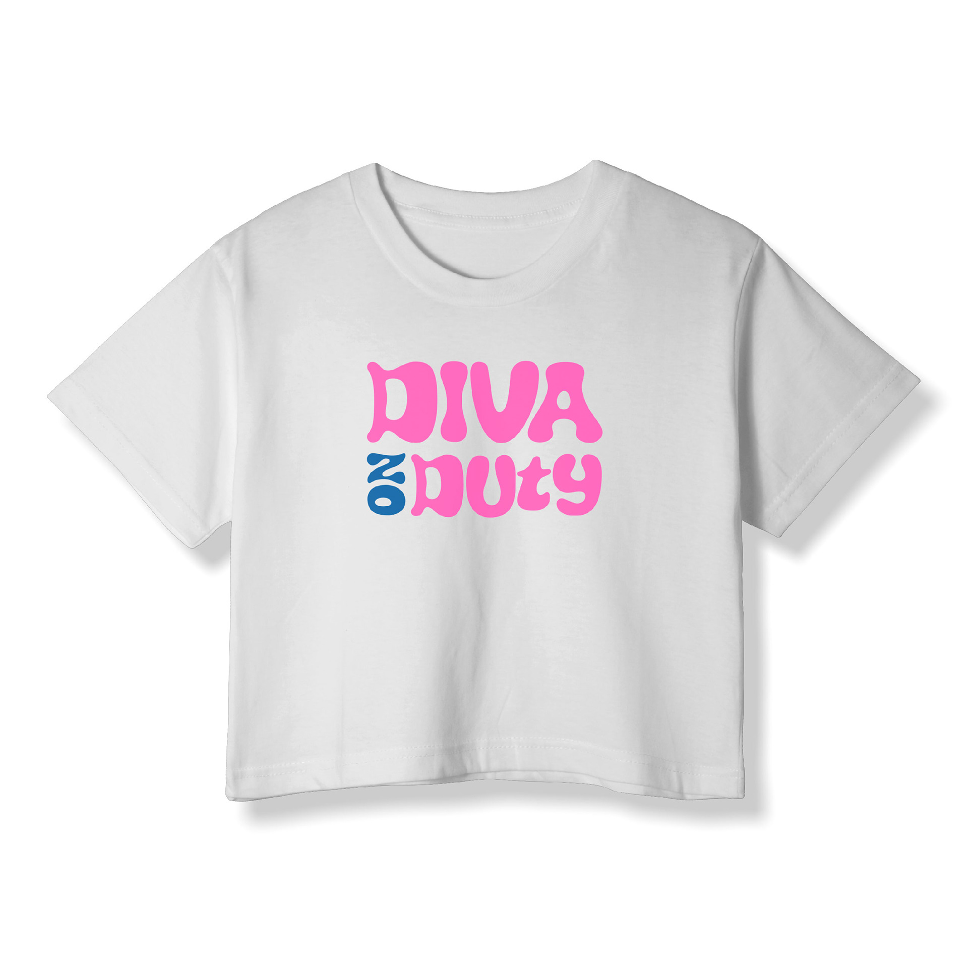
Scarecrow, ironically, is scared of everything. He's a diva with astronomical levels of anxiety and worry, but that's okay! Scarecrow would like to ask Oz for a brain as he feels it will help him manage his worries better, ultimately making him less of a bother for his friends.
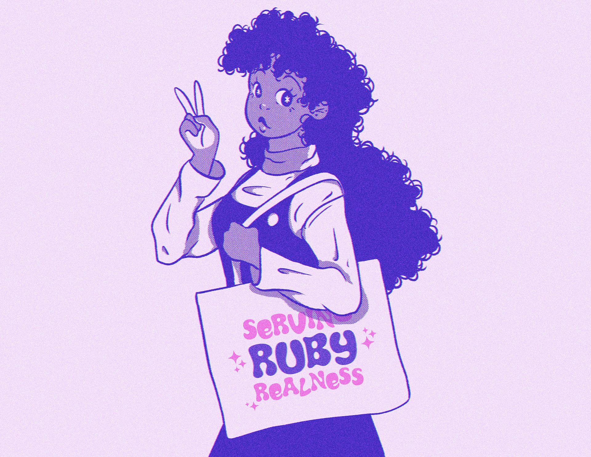
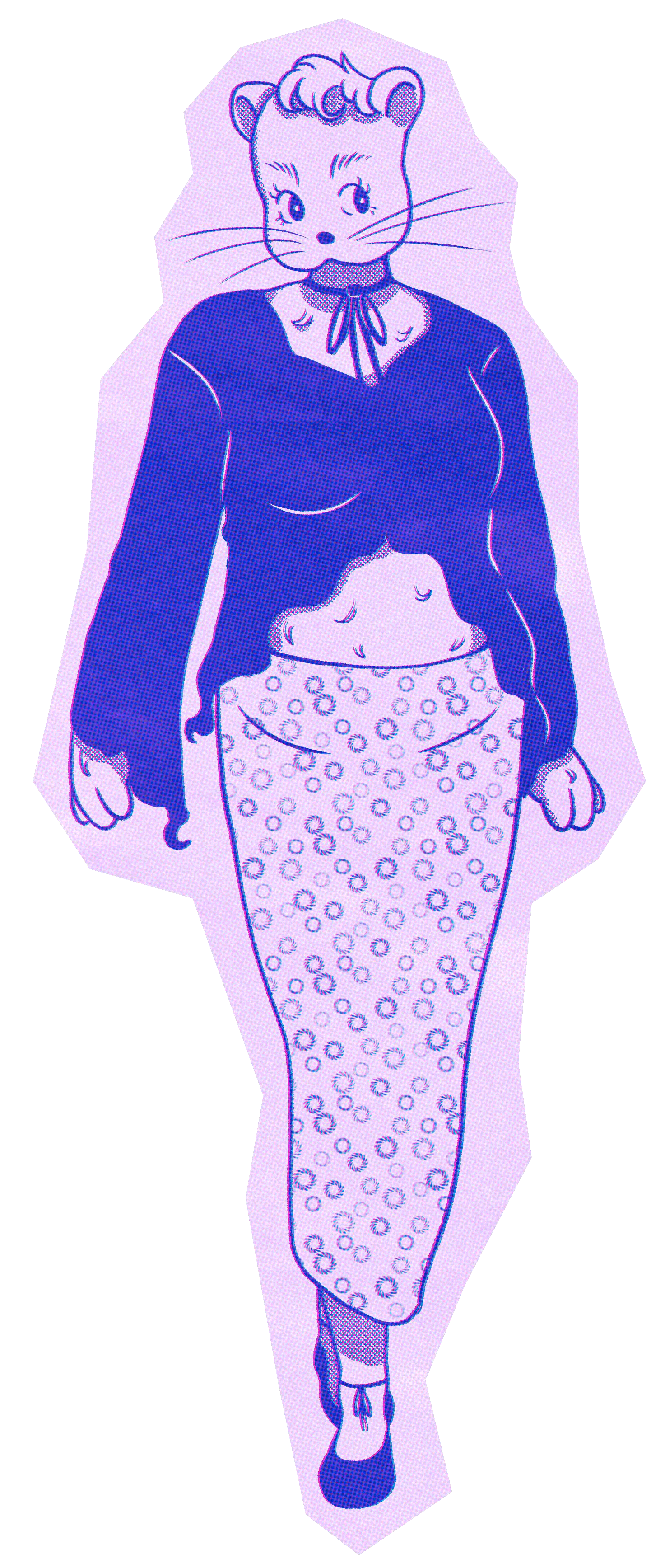
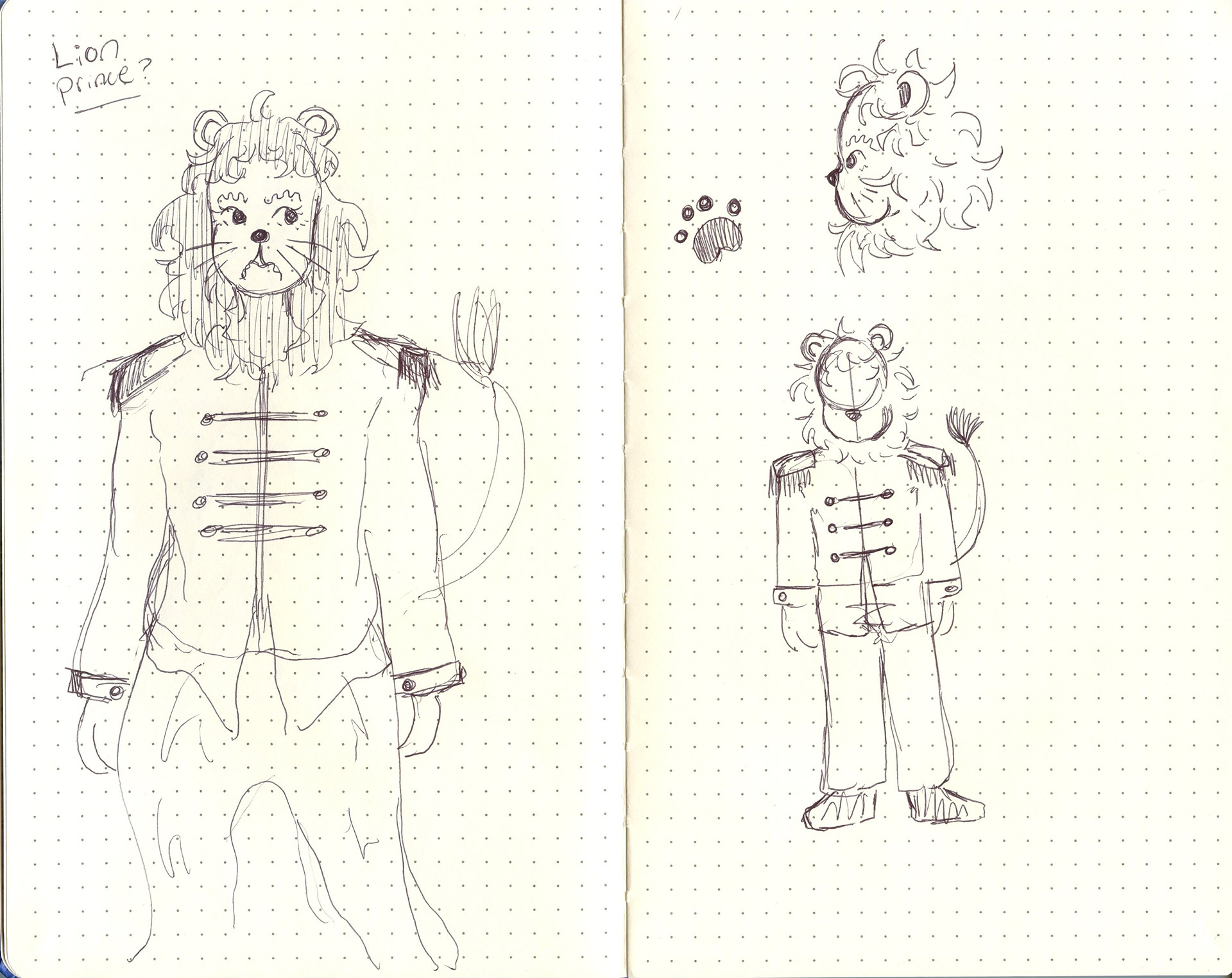
Lionne
Lionne is our Lion, well Lioness, in this version. She's the Princess of the Emerald Forest Kingdom and longs to break free from her father's grasp. Lionne dreams of finding the woman of her dreams and living happily ever after. She wants to ask the Wizard for courage so she can stand up to her father and finally live out this fantasy.
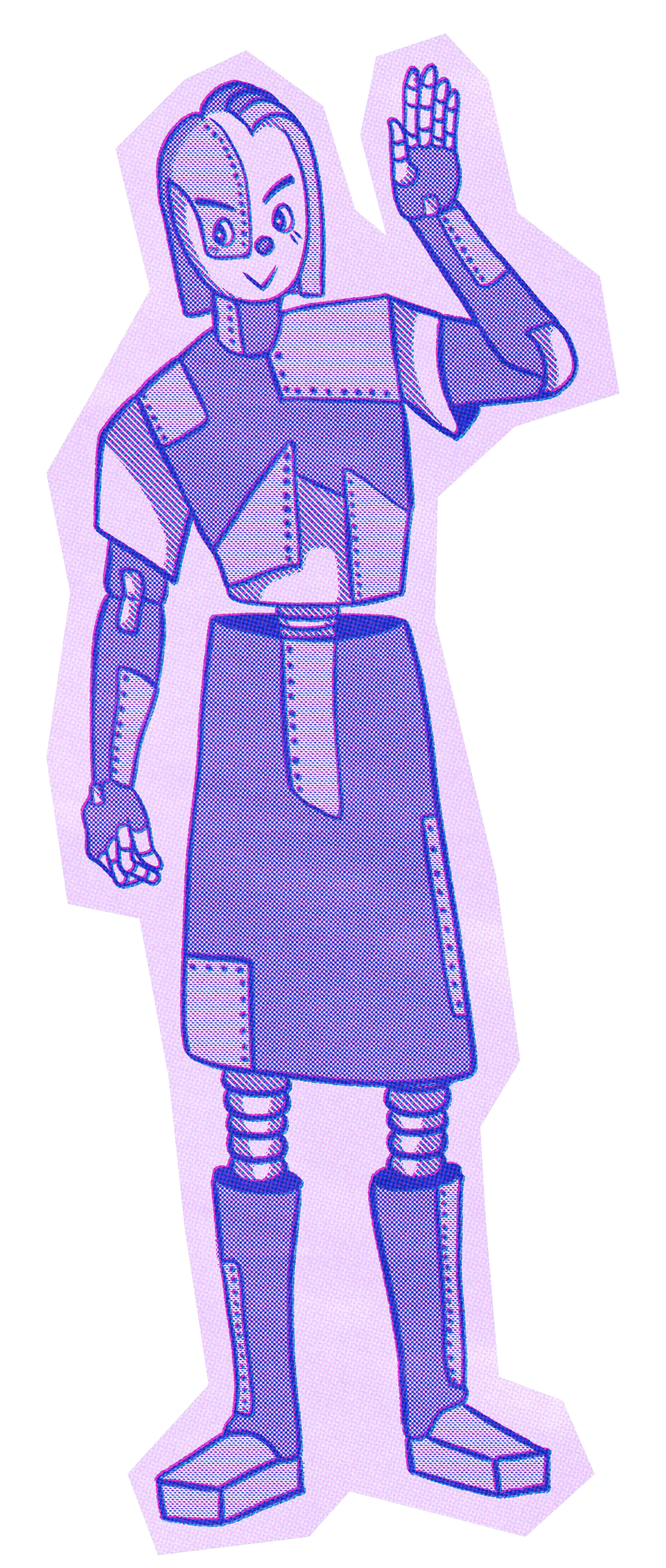
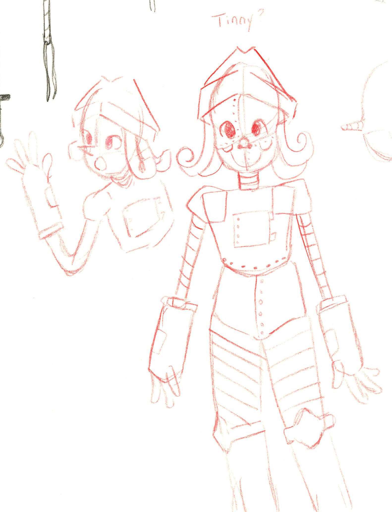
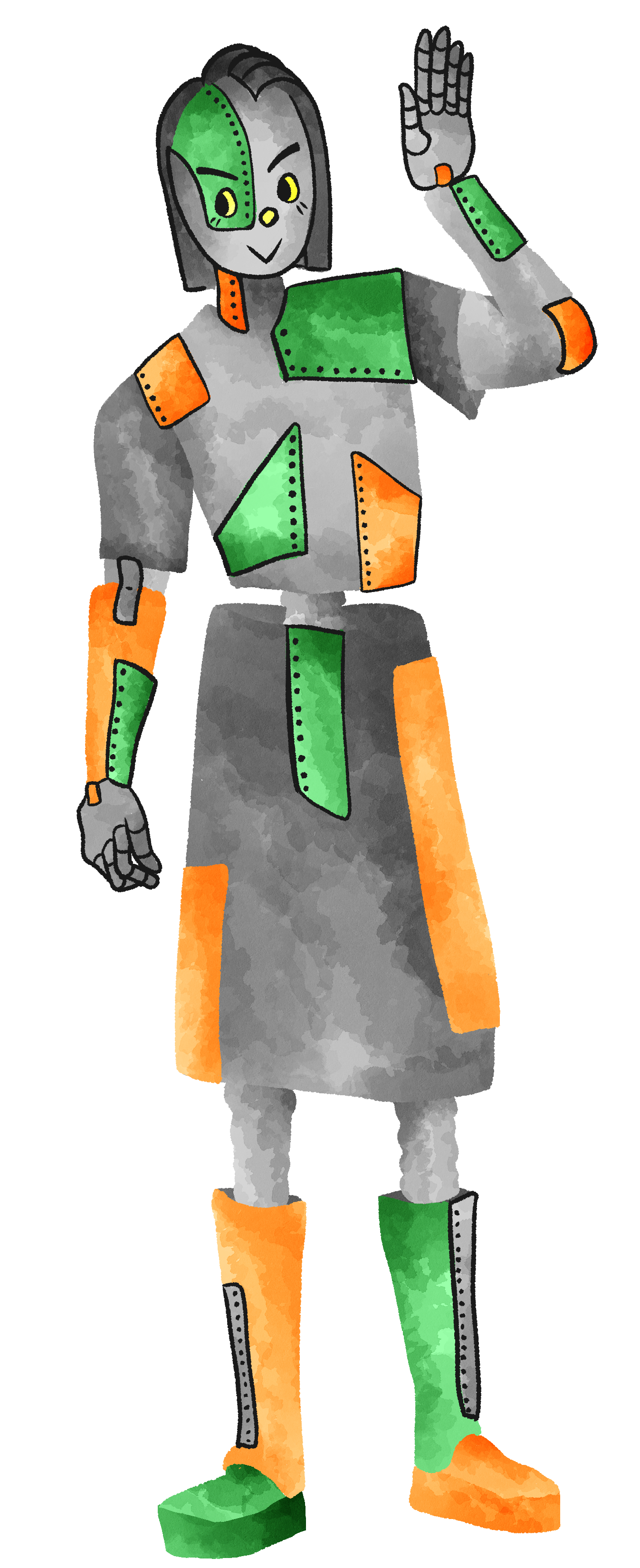
Tinny
Tinny is our "tin person" in this story. Dorothy and Scarecrow stumbled upon Tinny all rusted up in the forest one day. After a quick oil change, the two were able to help them get back on their feet (literally). Tinny doesn't speak much, so they want to ask Oz for a heart as they feel this could help them open up and be expressive like everyone else.
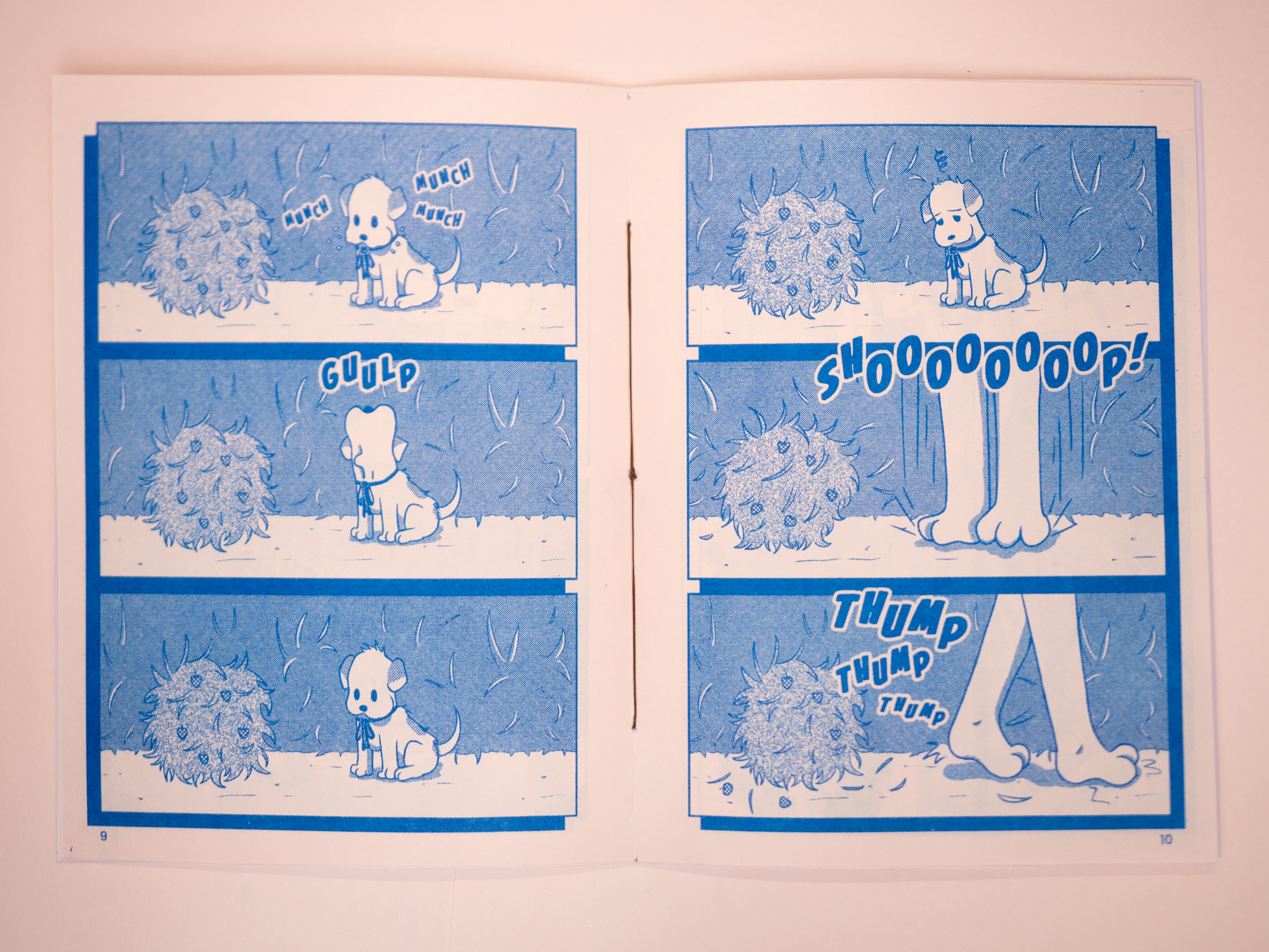
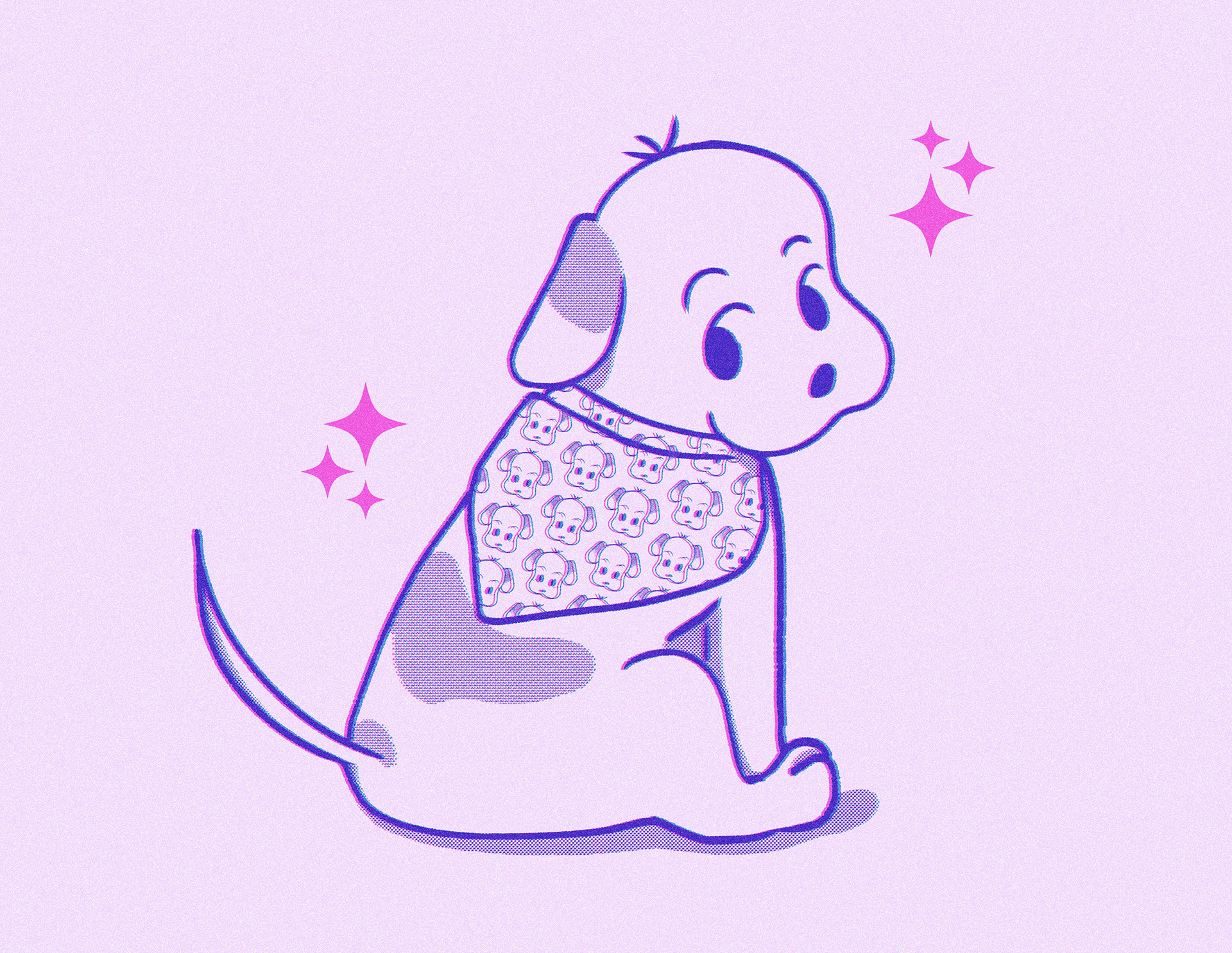
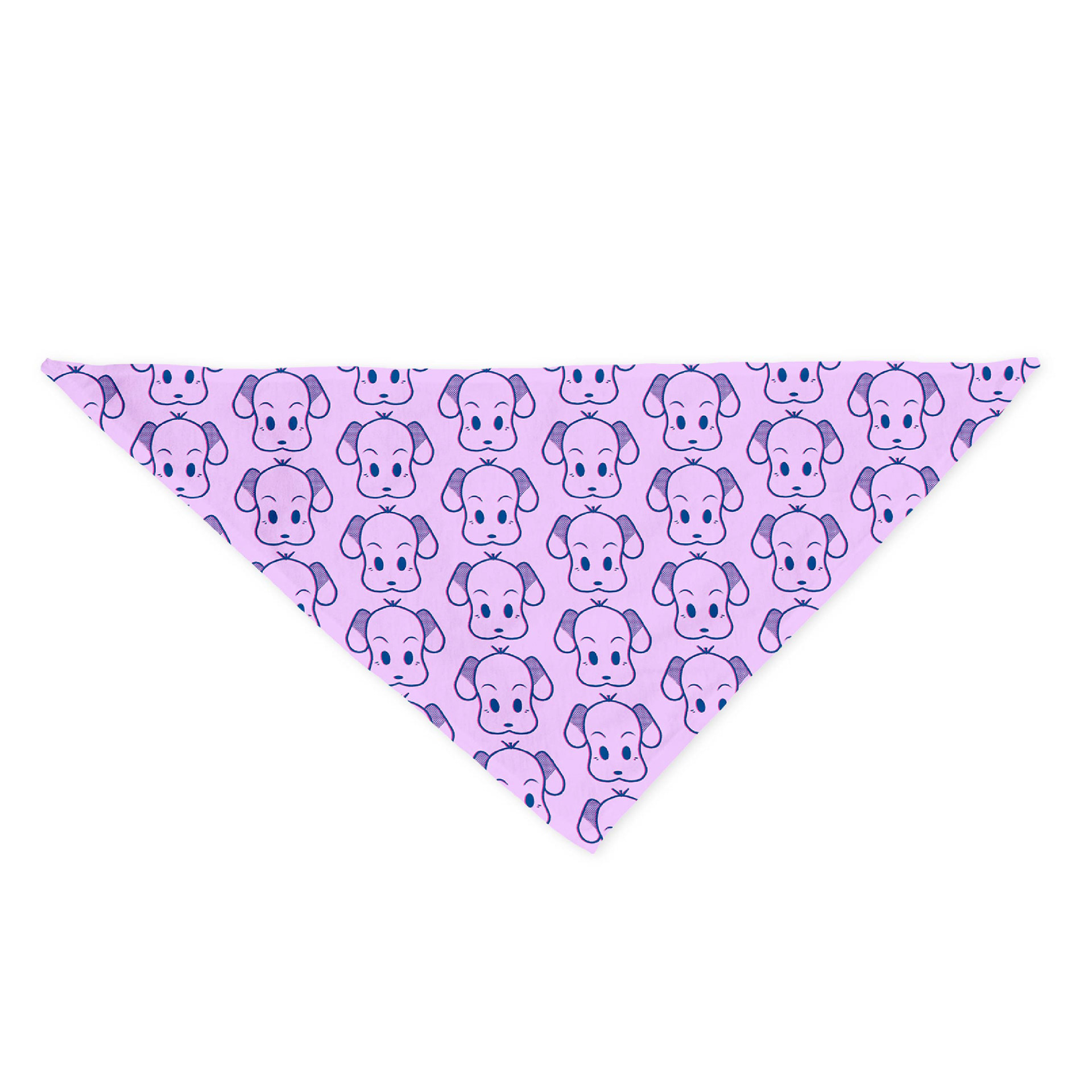
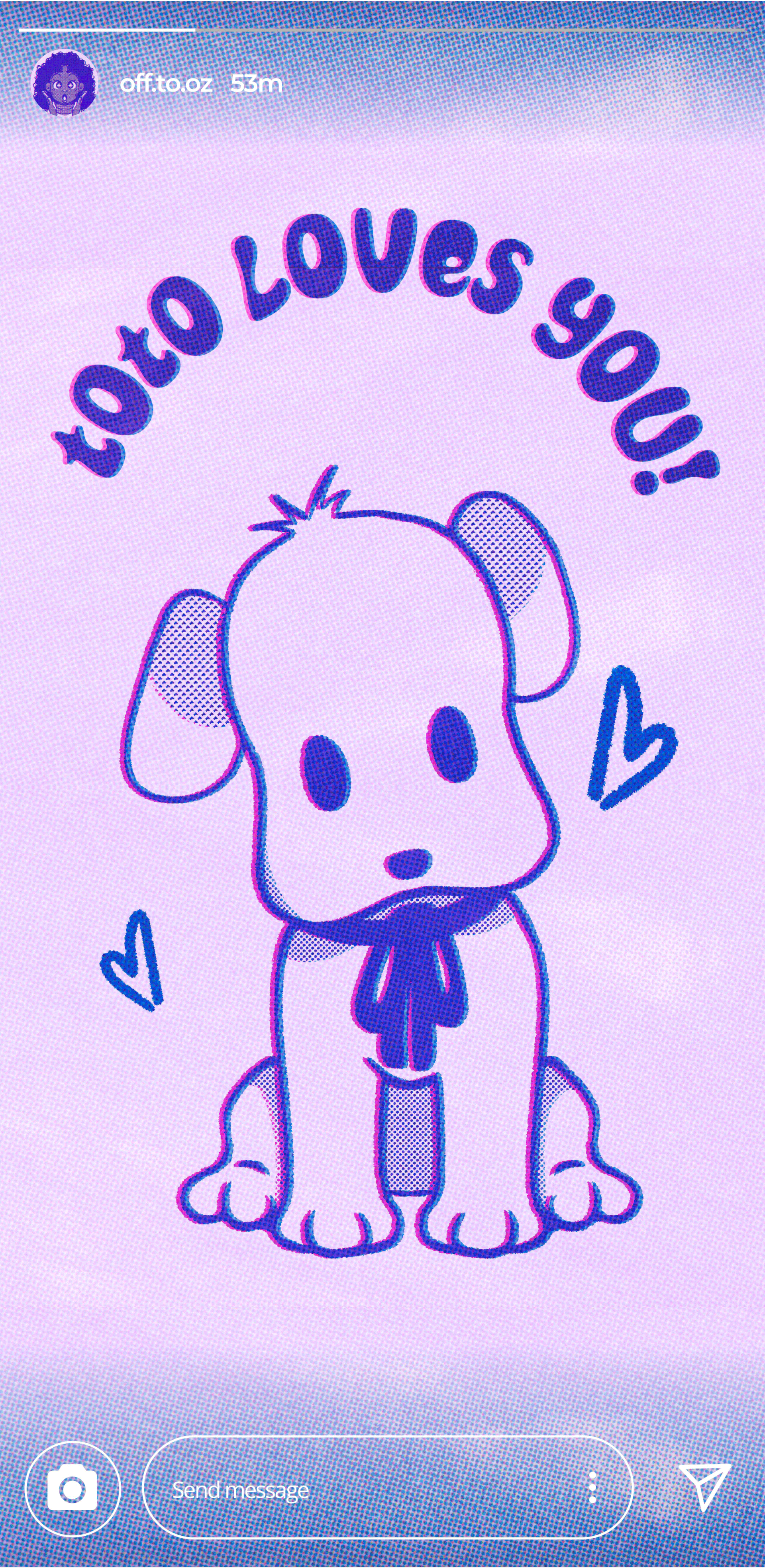
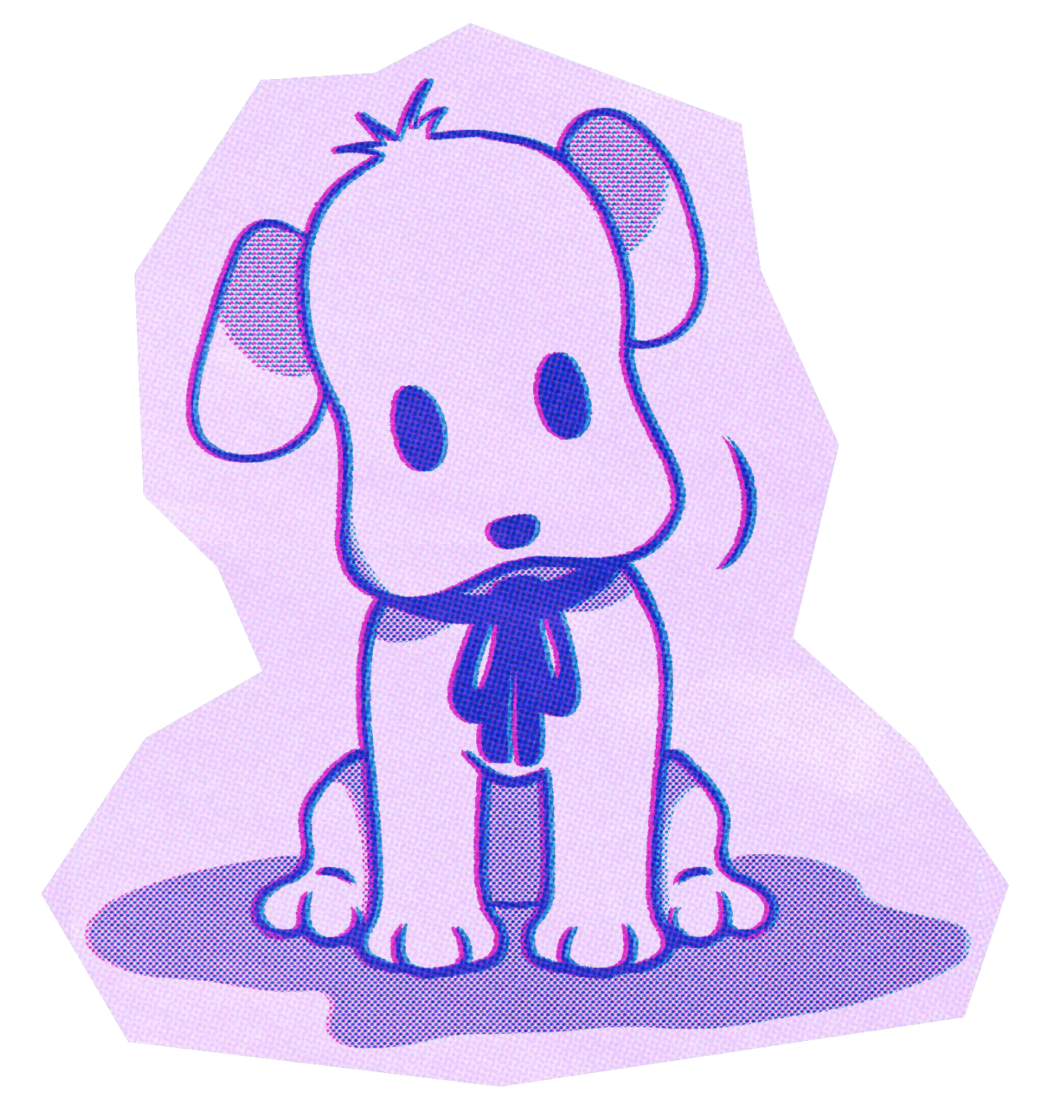
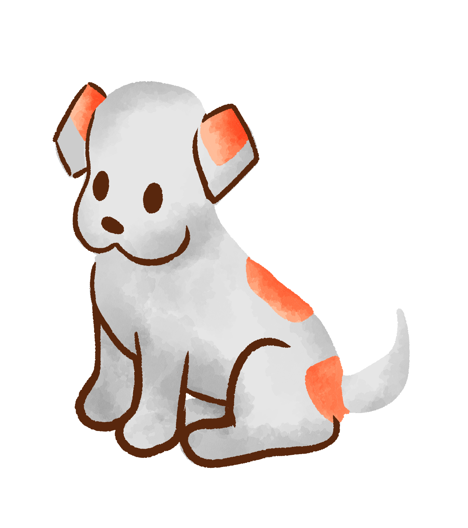
Toto
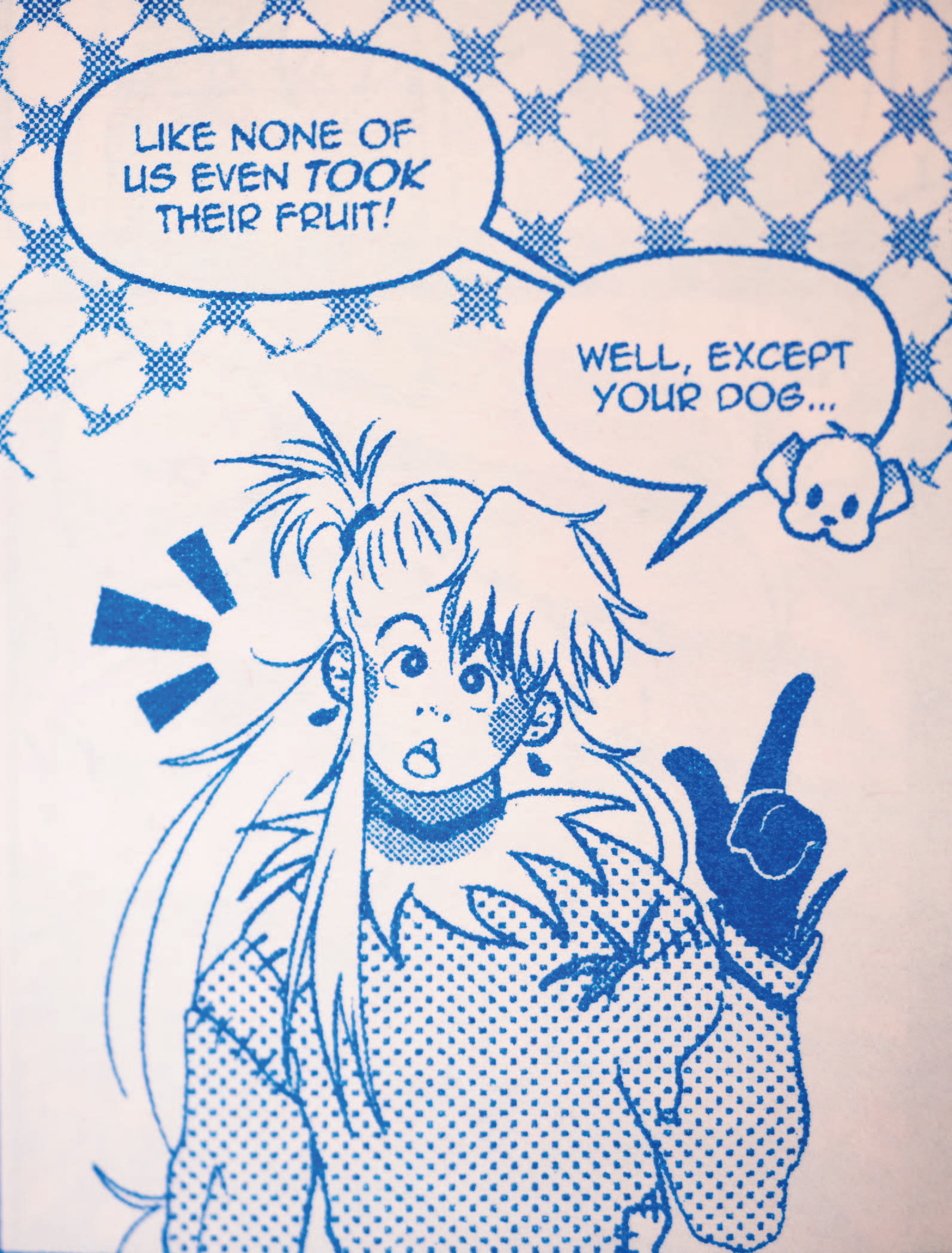
And then there's little Toto. Toto is Dorothy's best friend, but often finds himself in sticky situations. He means well but he's also a dog, and sometimes he just can't ignore his little dog tendencies. We still adore him though!
Type
The typography system is split into two parts: one for branding and one specifically for the comics.
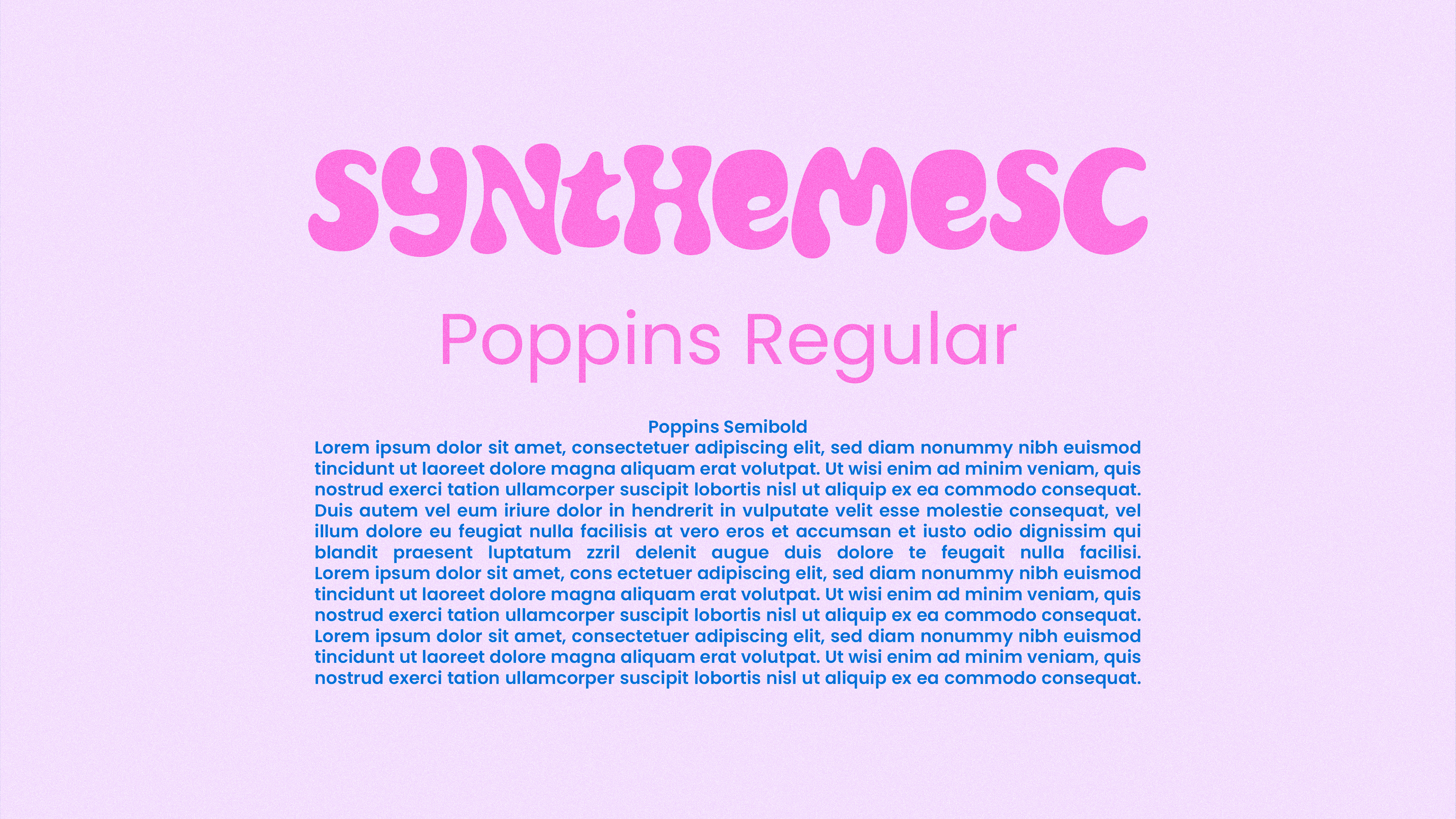
Branding:
Synthemesc is the primary brand typeface, chosen for its whimsical character and legibility. Poppins Regular and Poppins Semibold support the system with a clean, simple contrast to Synthemesc’s more expressive form.
Synthemesc is the primary brand typeface, chosen for its whimsical character and legibility. Poppins Regular and Poppins Semibold support the system with a clean, simple contrast to Synthemesc’s more expressive form.
Comic typography:
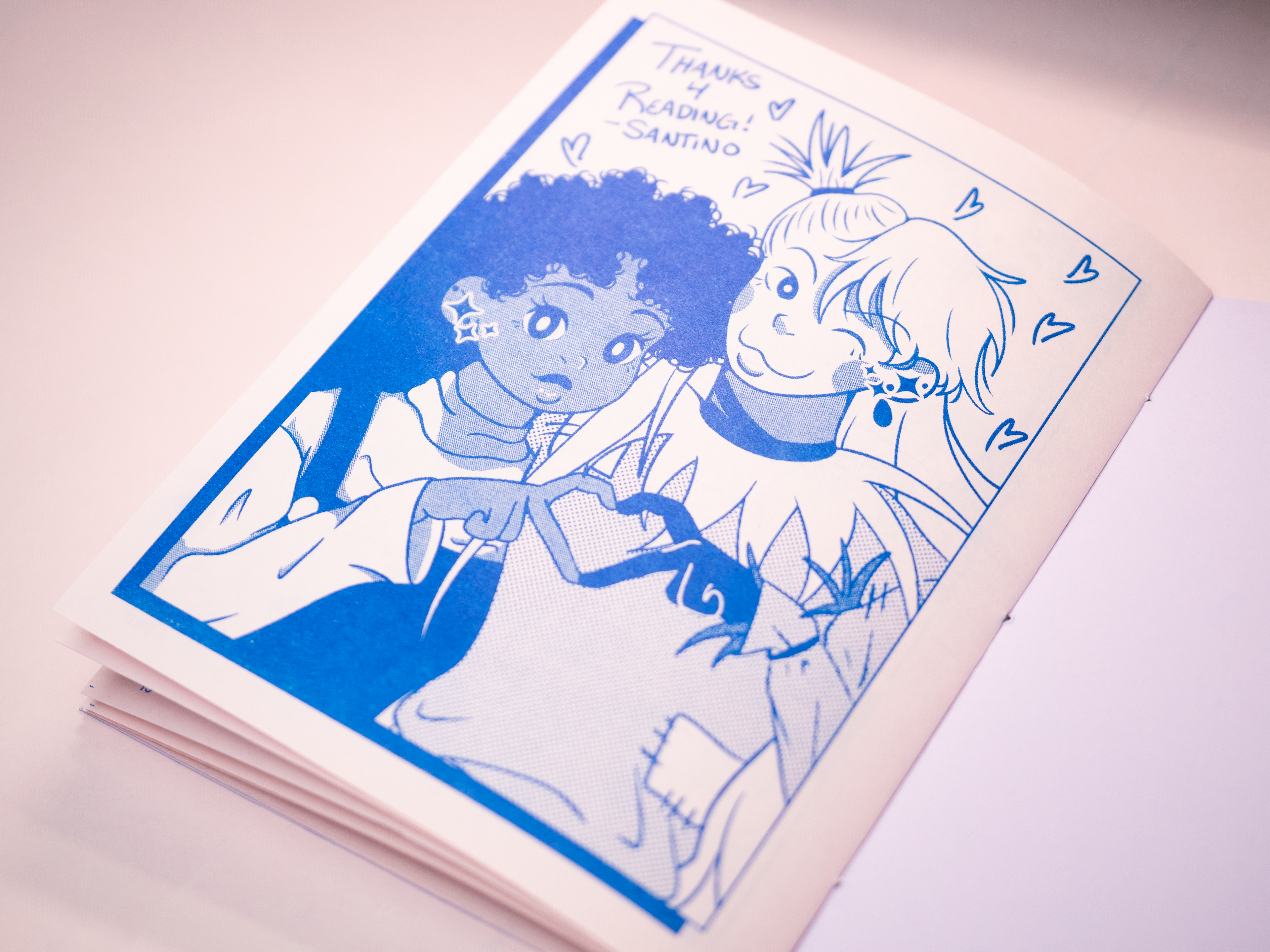
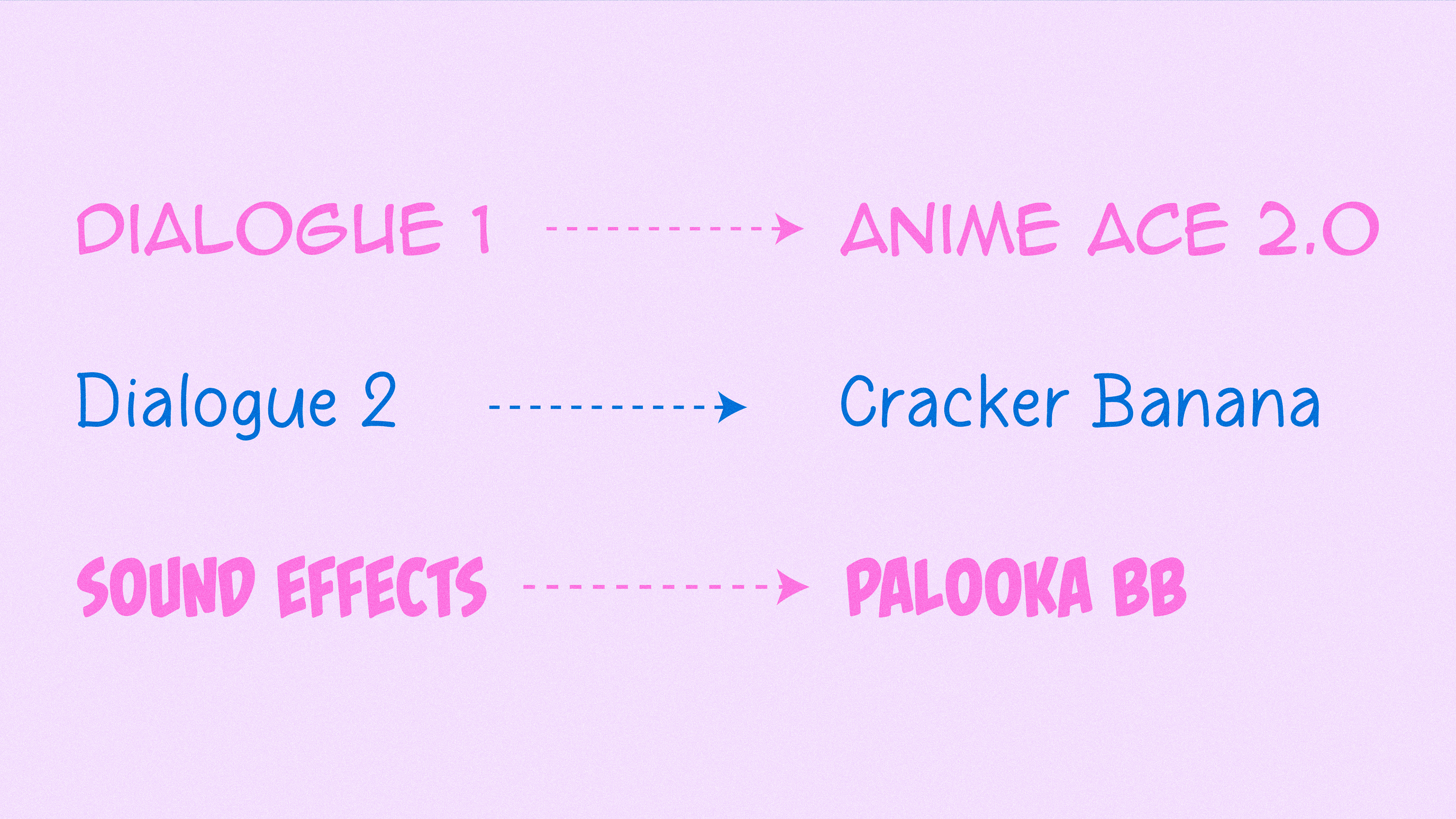
The comic type system is designed to feel familiar to readers of classic graphic novels and manga. Anime Ace 2.0 is used for main dialogue, Cracker Banana for smaller, quieter dialogue, and Palooka BB for sound effects.
The comic type system is designed to feel familiar to readers of classic graphic novels and manga. Anime Ace 2.0 is used for main dialogue, Cracker Banana for smaller, quieter dialogue, and Palooka BB for sound effects.
Color
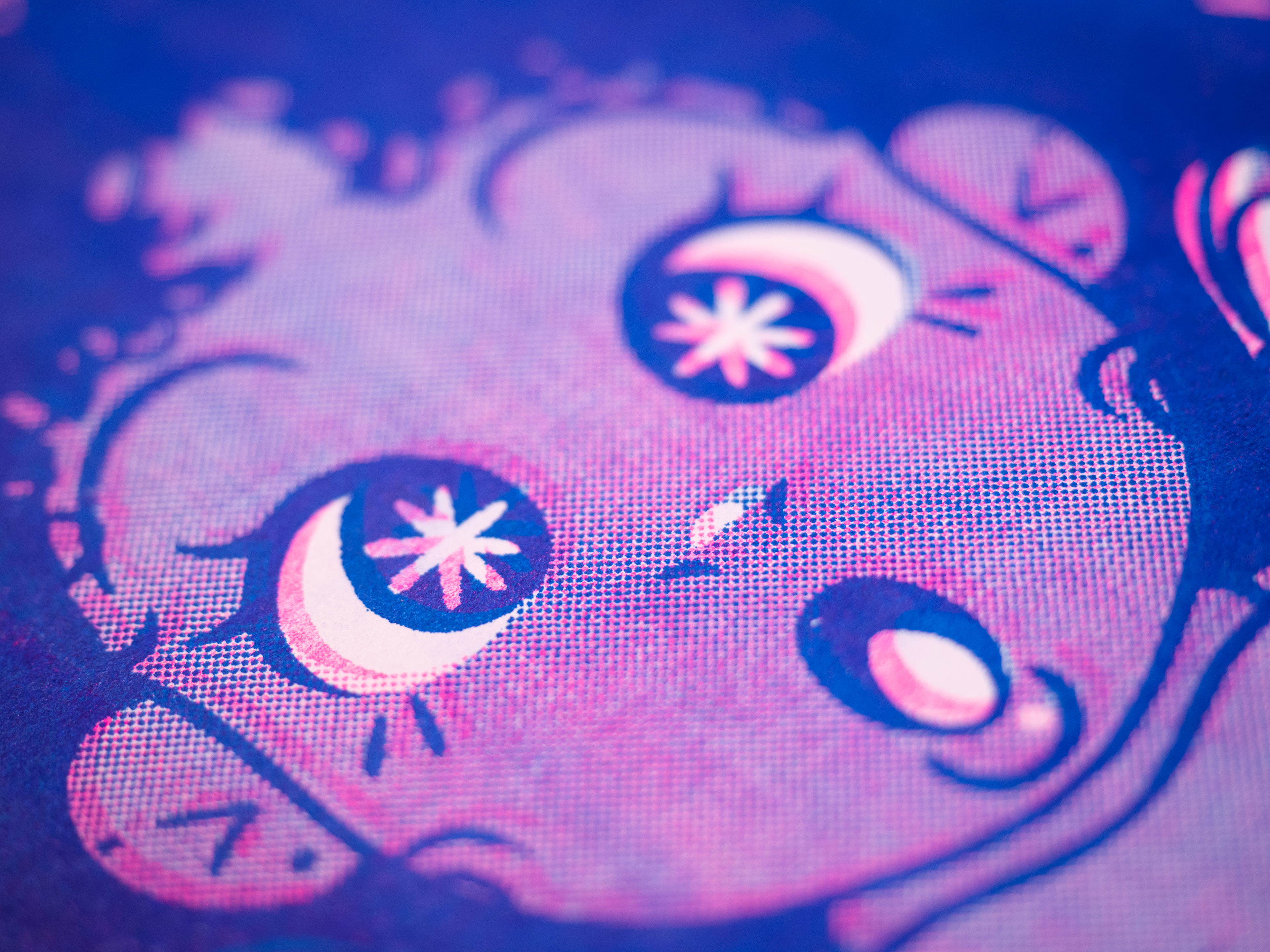
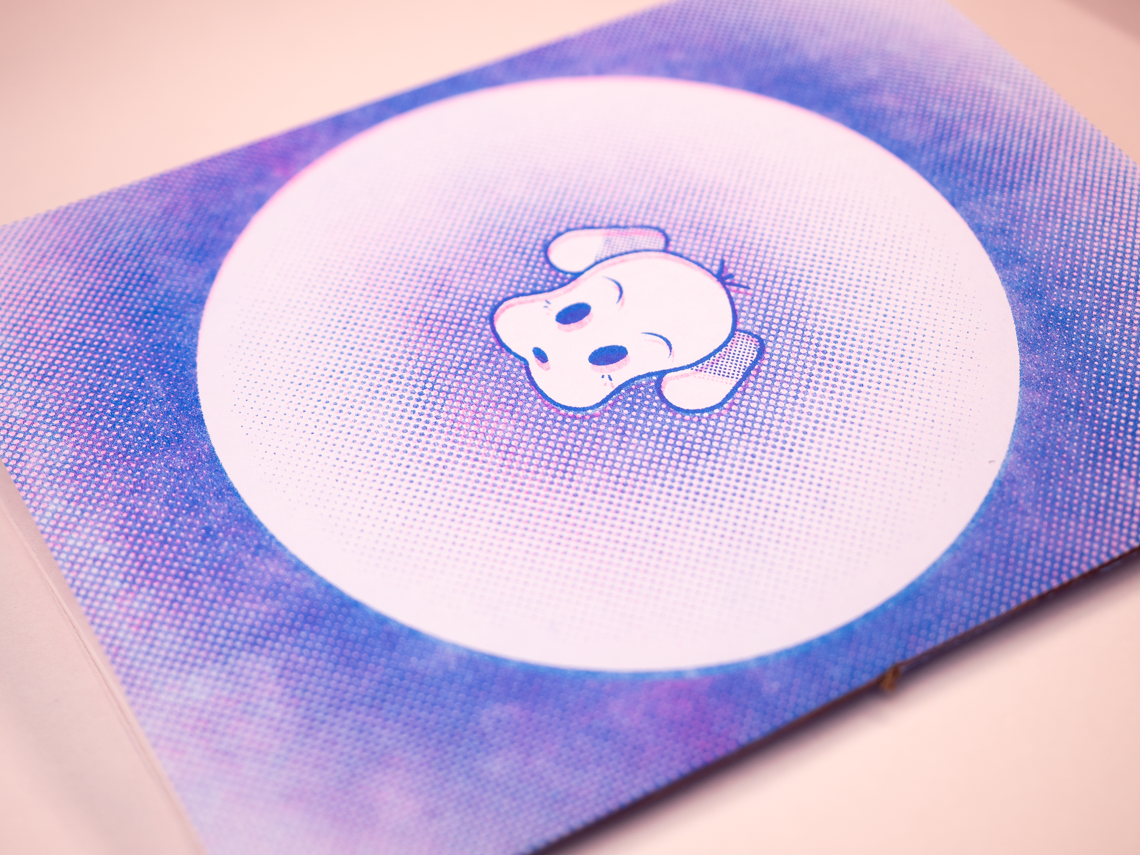
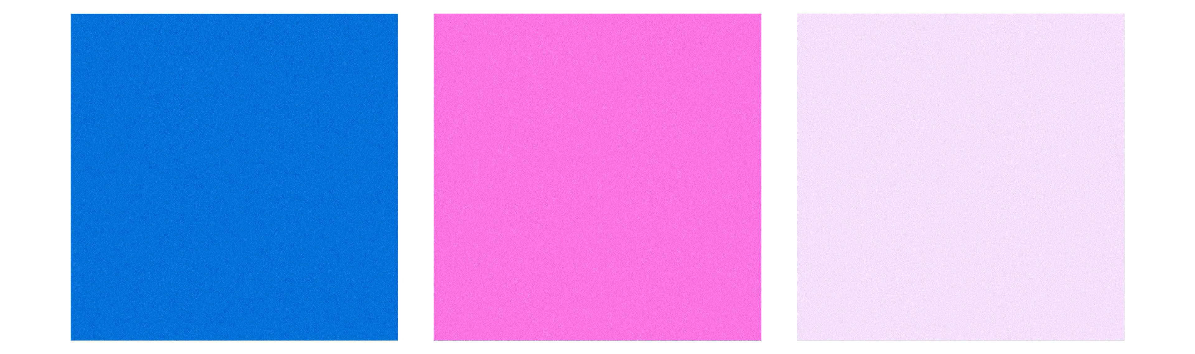
The color palette was selected to reflect the zine’s physical production. Cobalt blue and bright pink reference the riso ink colors, while a pale purple-pink represents the paper stock. A digital grain texture was added to unify the riso and paper elements and emulate the tactile feel of the printed piece.
Concepts
Below are initial sketches and explorations for both character design and branding.


Mockups and texture used designed by Freepik, tirachard, and Vectonauta.