Retro pieces with a custom fit
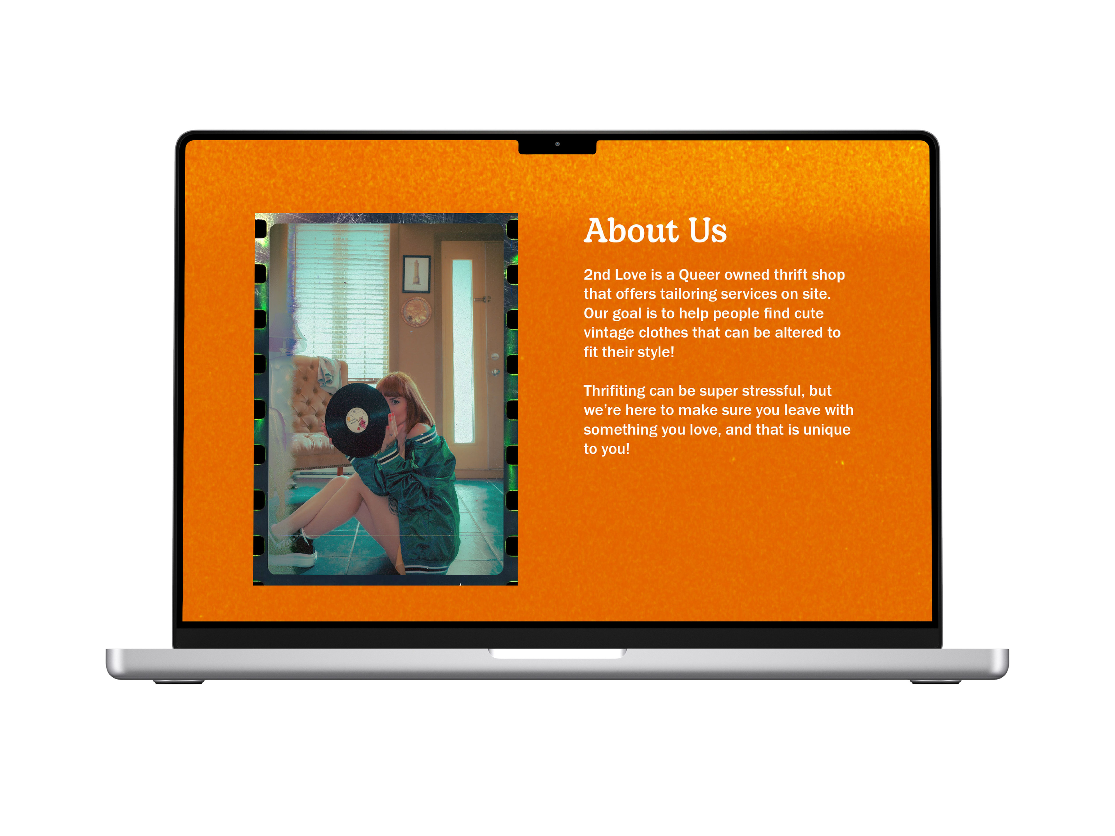
2nd Love is a 60s-inspired thrift store offering on-site tailoring services. The brand helps people express their authentic selves by finding vintage pieces that can be altered to fit their needs.
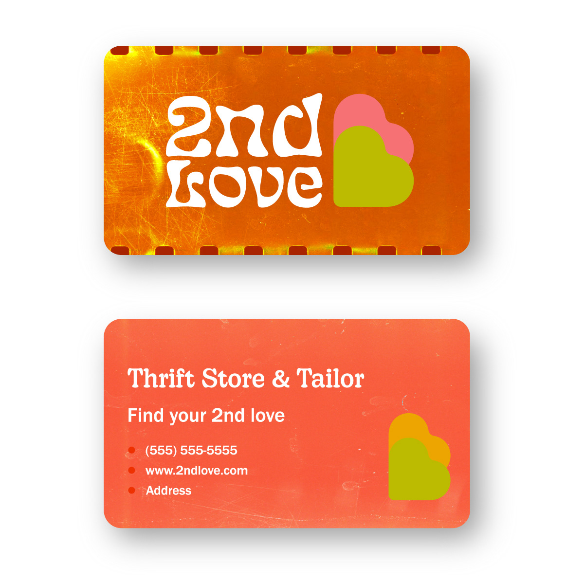
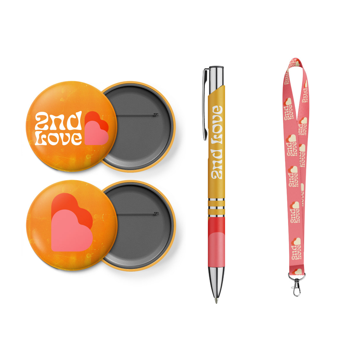
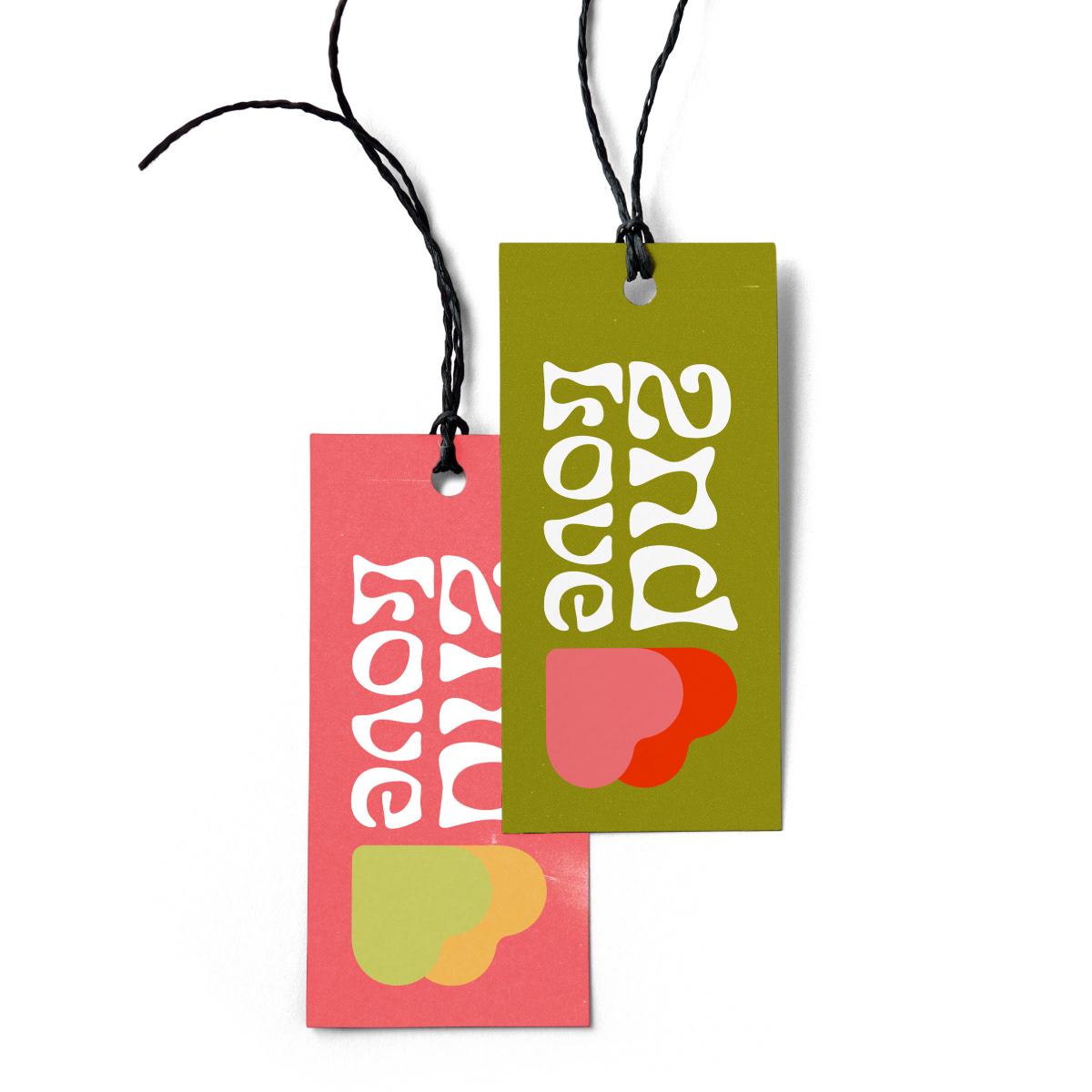
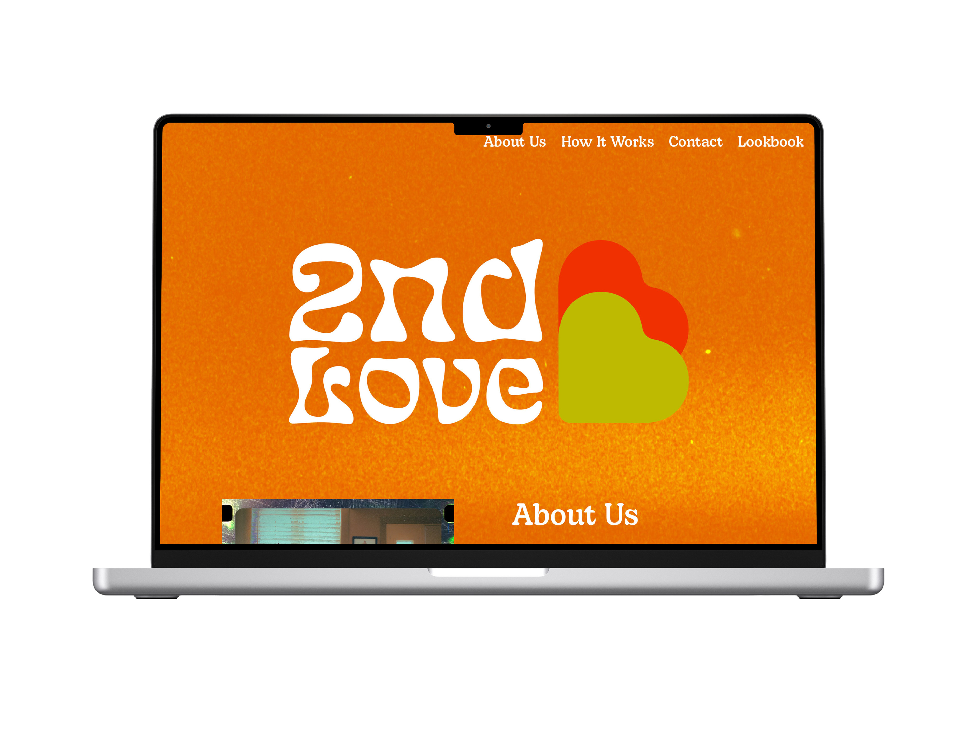
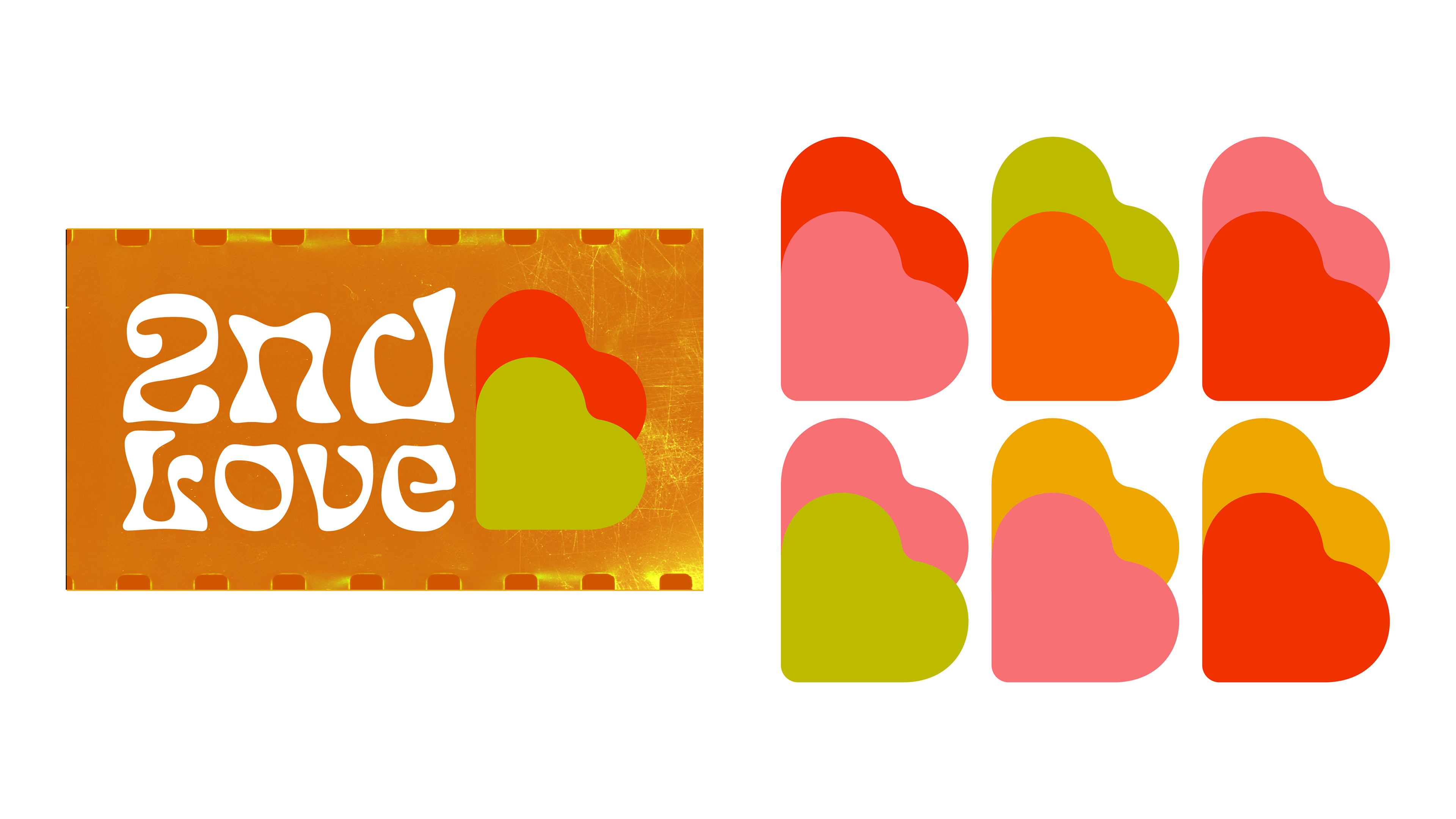
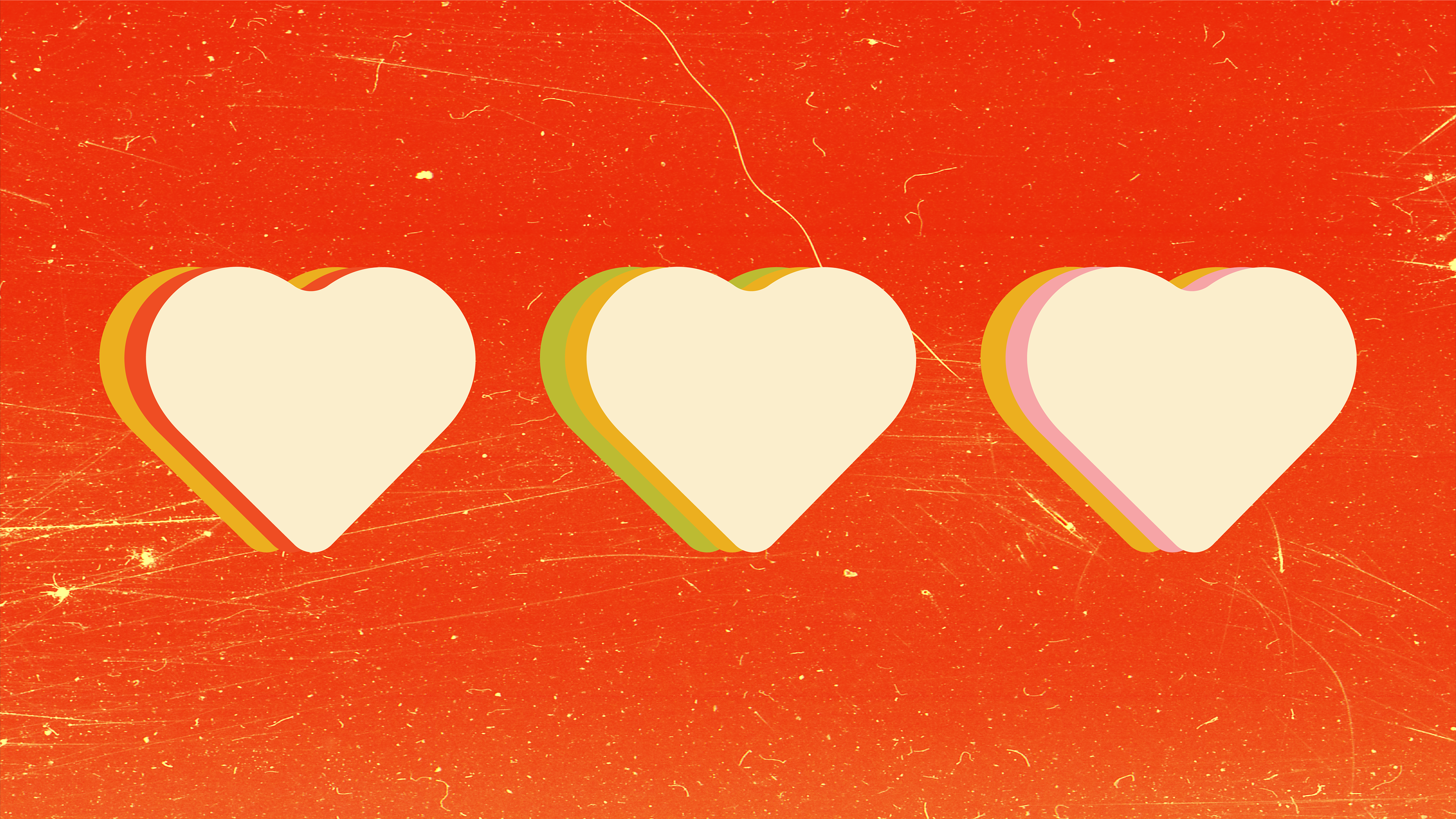
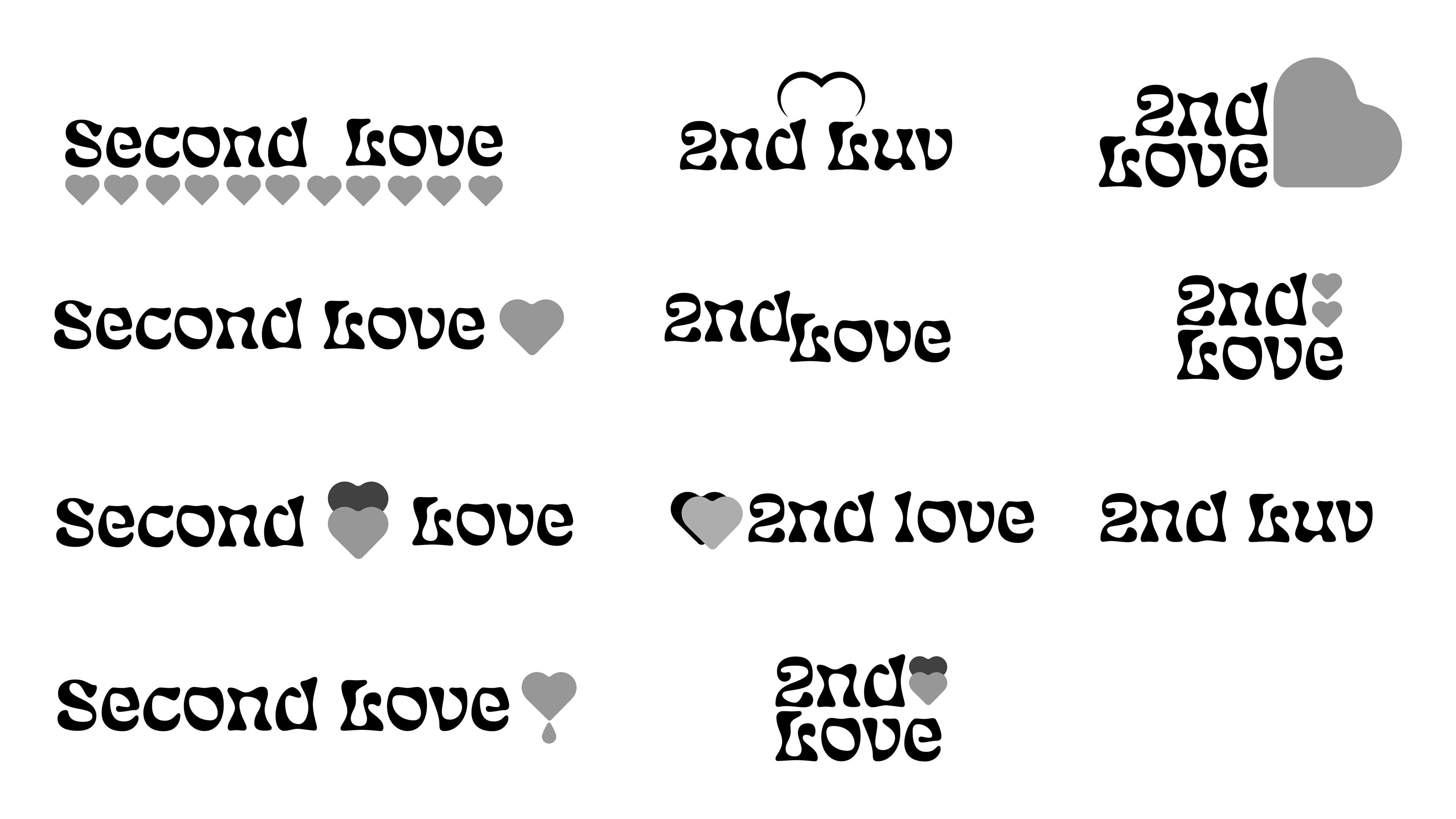
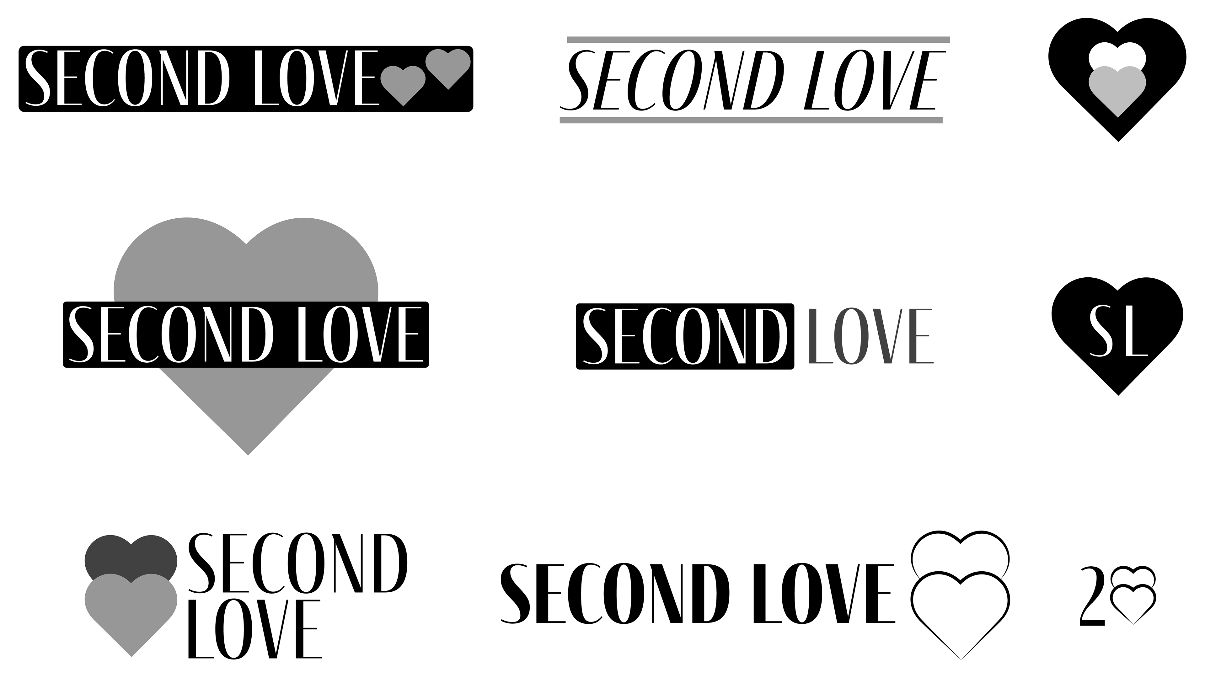
Logo
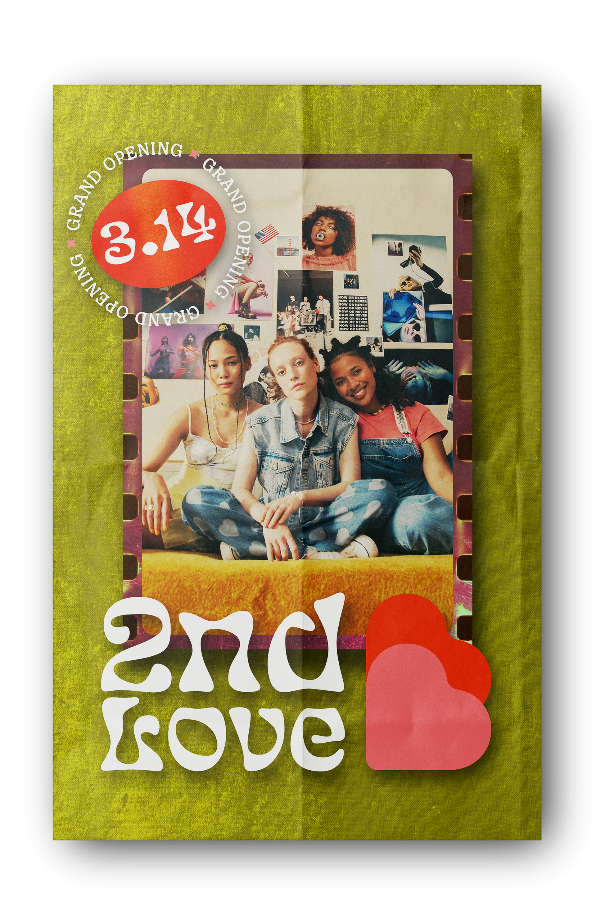
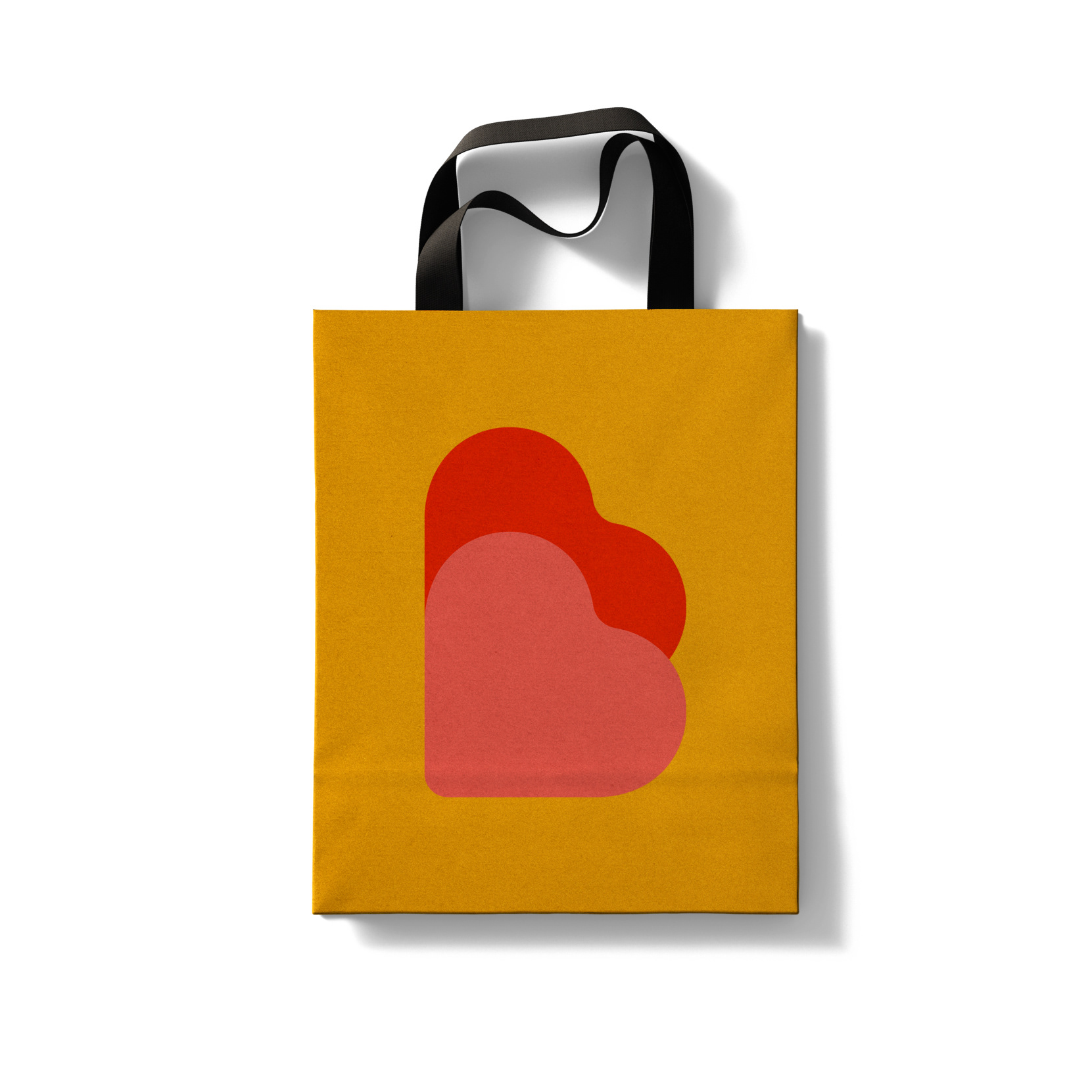
The hearts in the logo represent having one's back. 2nd Love wants to represent itself as feeling welcoming and empowering to people of all different backgrounds, and the double heart does just that. Heart colors can be adjusted to support different layouts and applications.
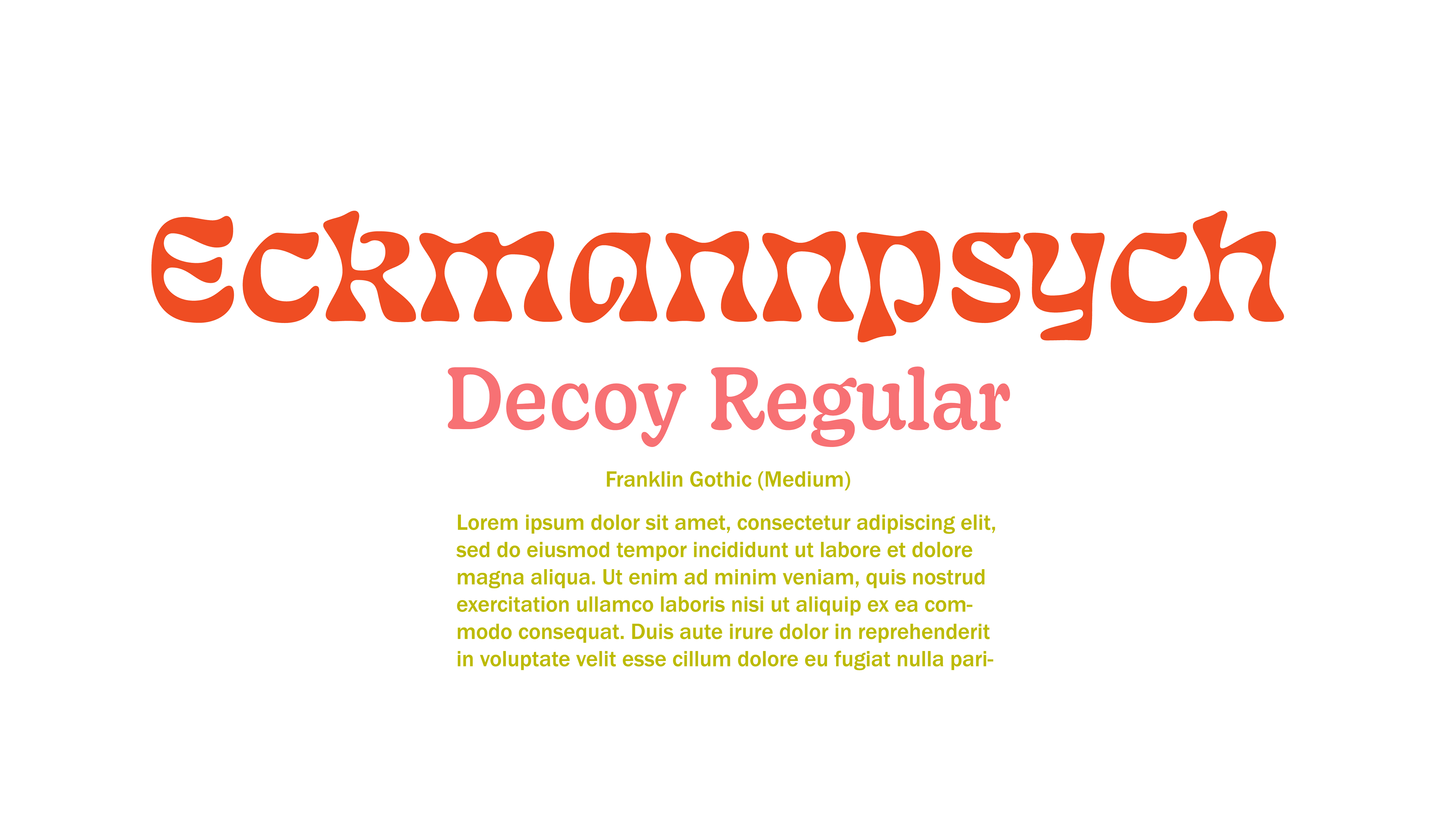
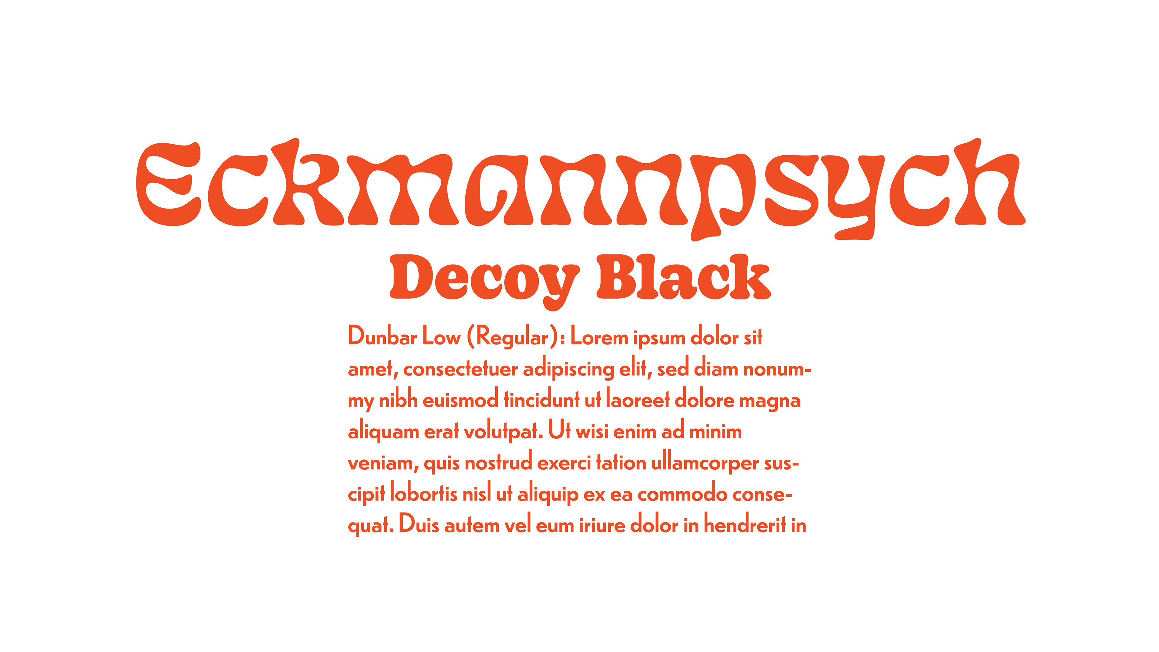
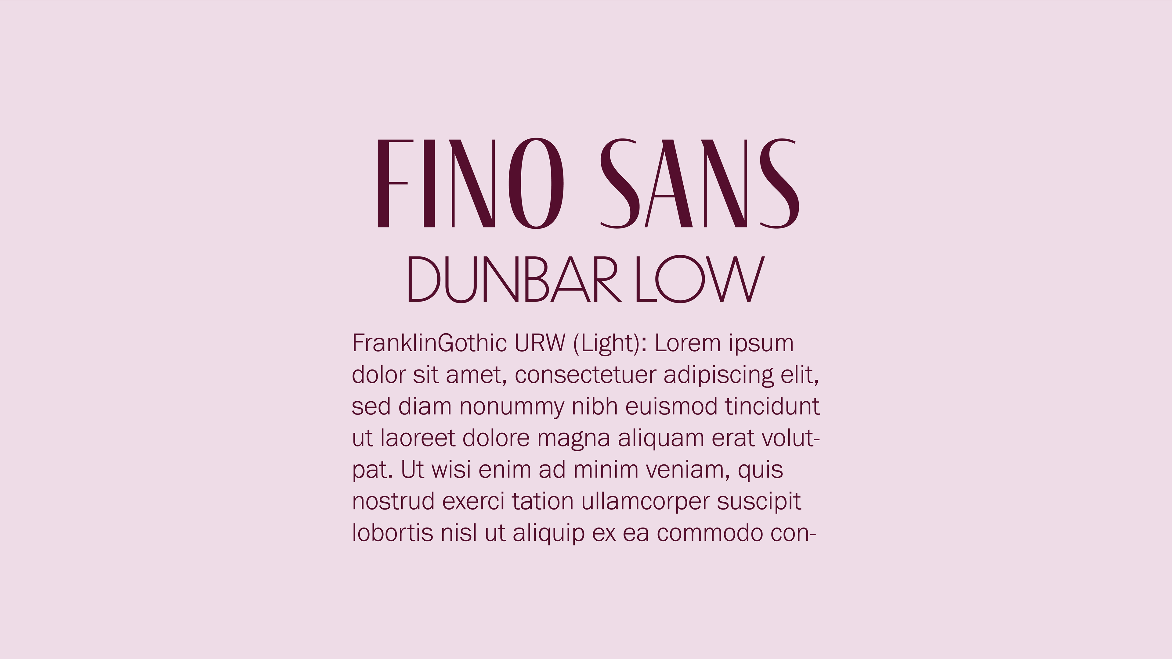
Type
The typography system for 2nd Love draws from 1960s visual culture while remaining legible and versatile. Eckmannpsych anchors the system with references to psychedelic design, while Decoy introduces structure and readability with a distinct retro character. Franklin Gothic balances the system as a clean sans serif, providing contrast and cohesion across applications.
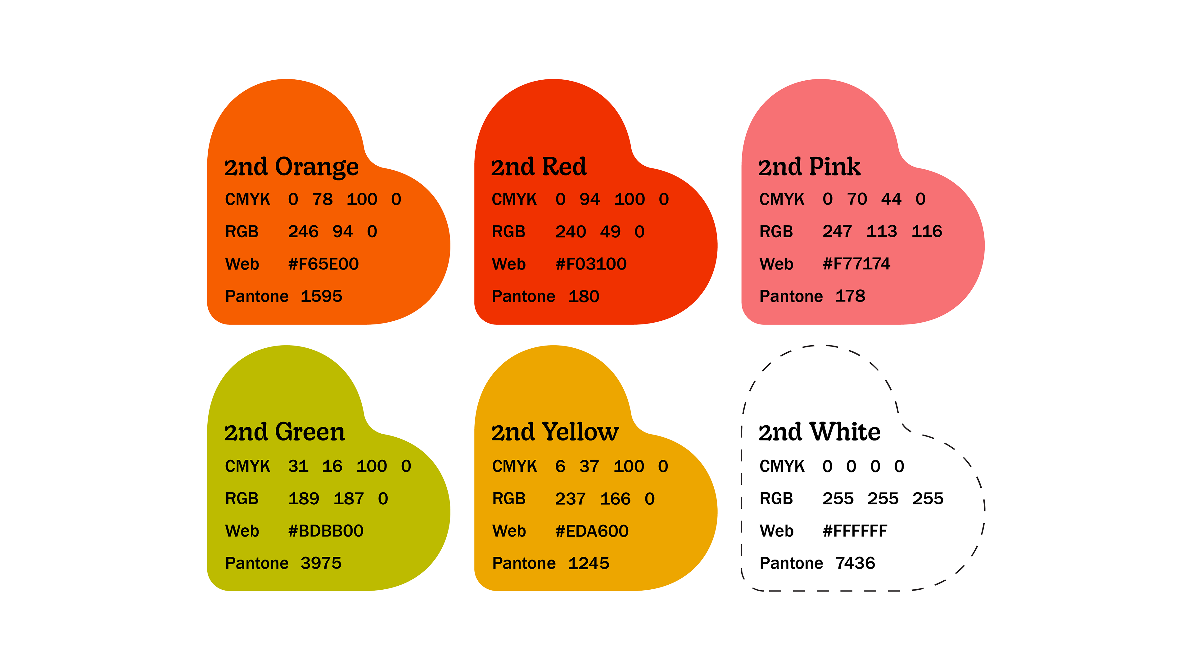
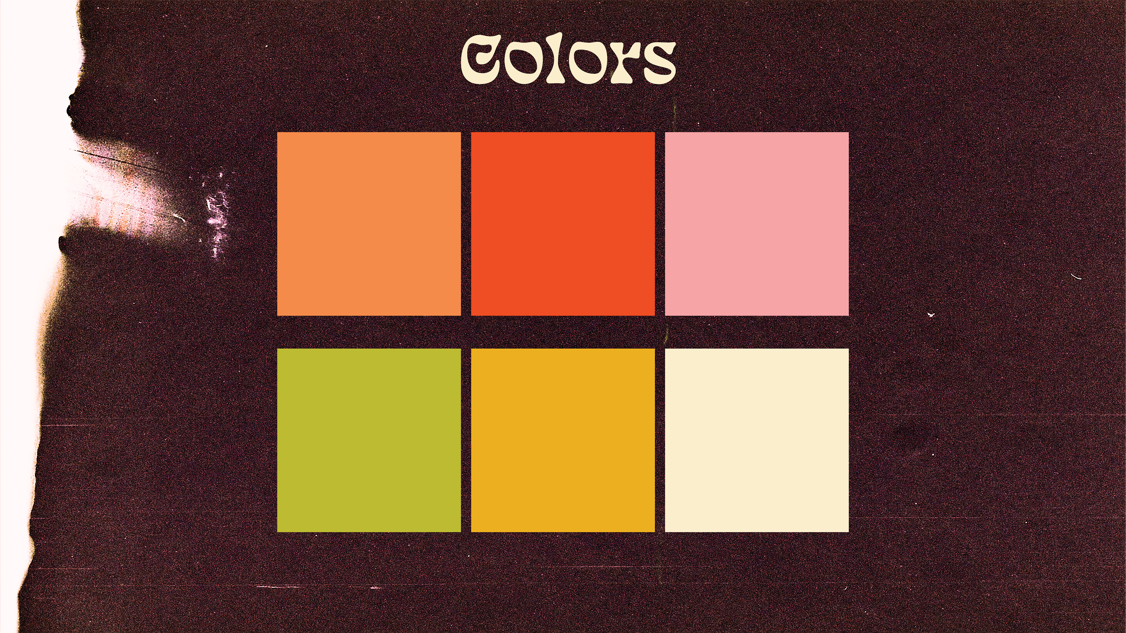
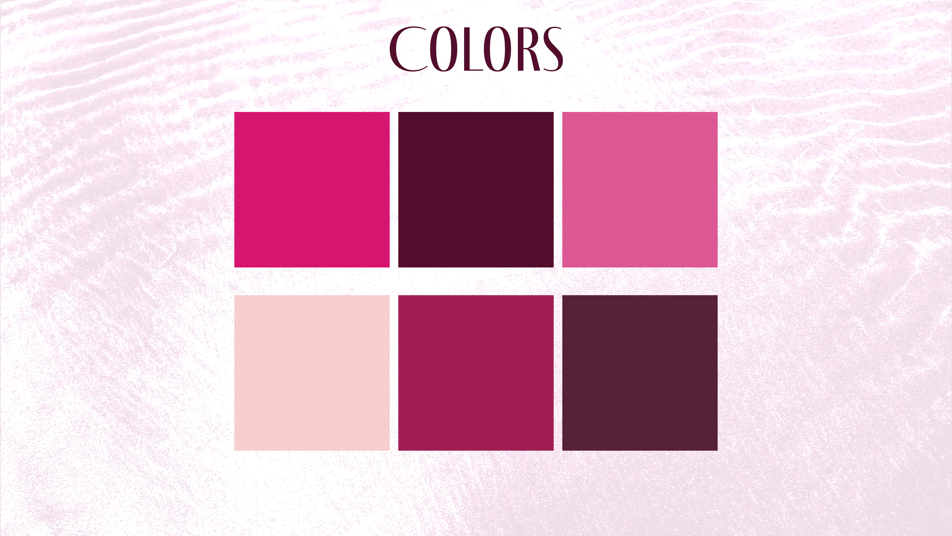
Color
The color palette reflects the brand’s 1960s inspiration through warm, groovy tones that feel both nostalgic and inviting. This approach supports the brand’s goal of creating a welcoming, approachable in-store experience.
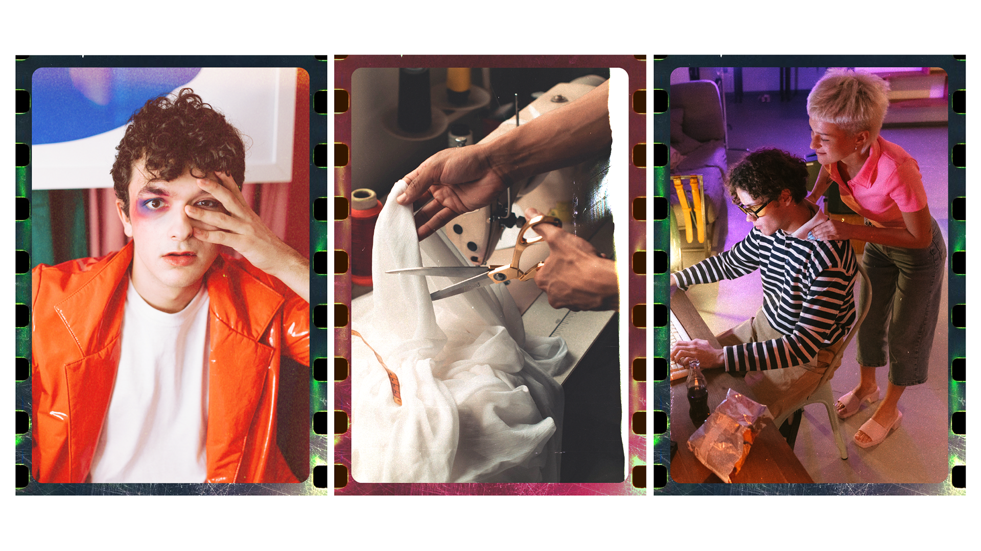
Photos
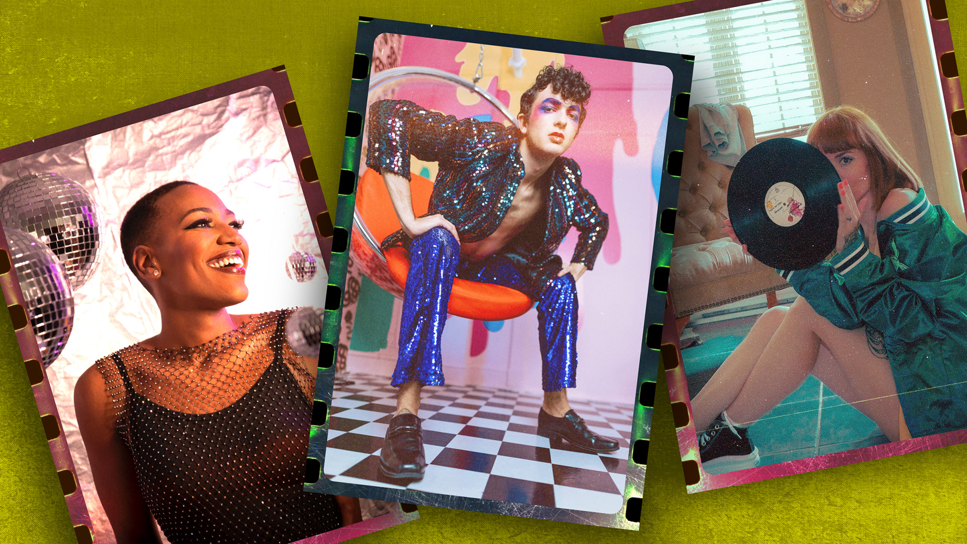
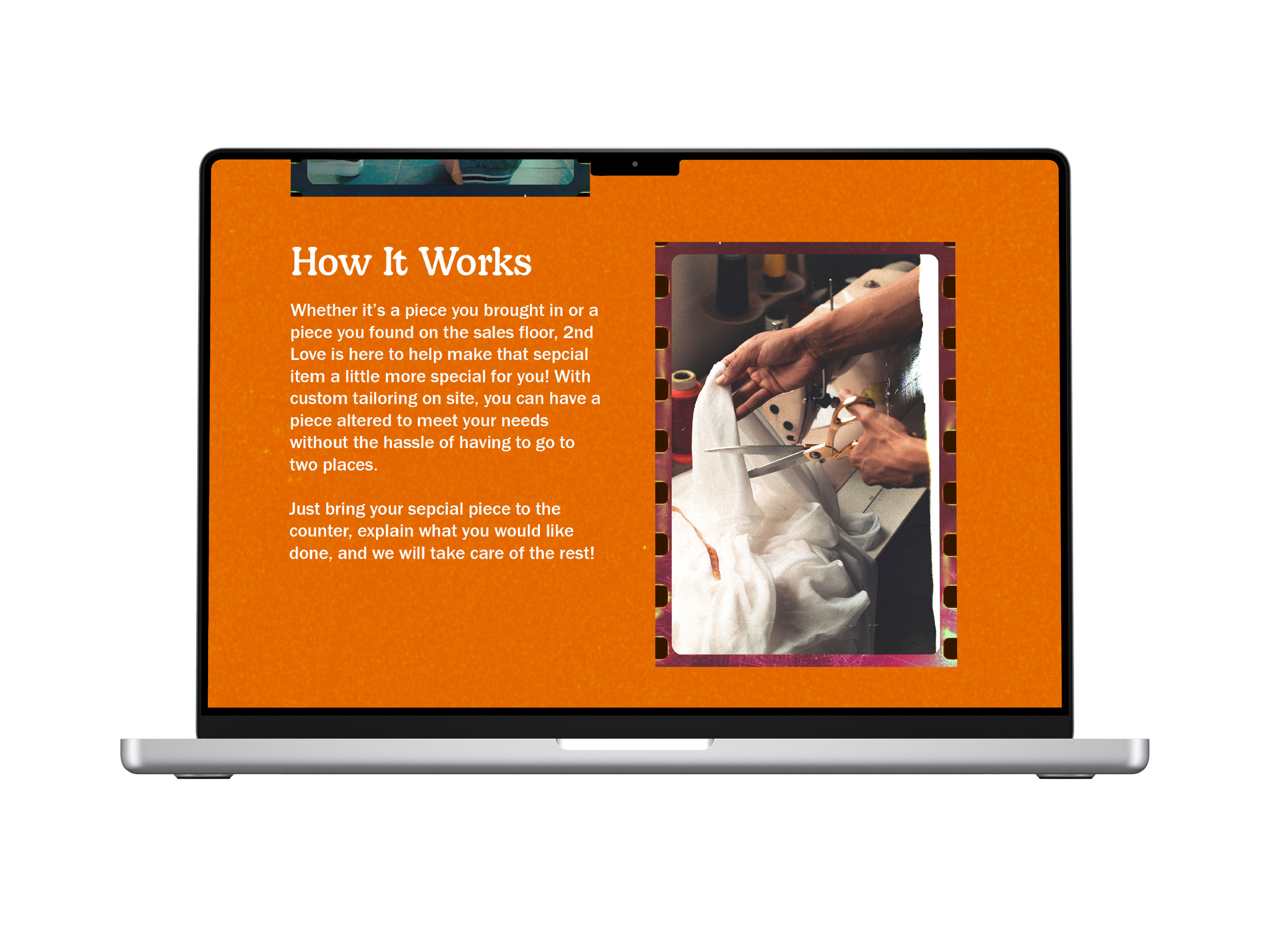
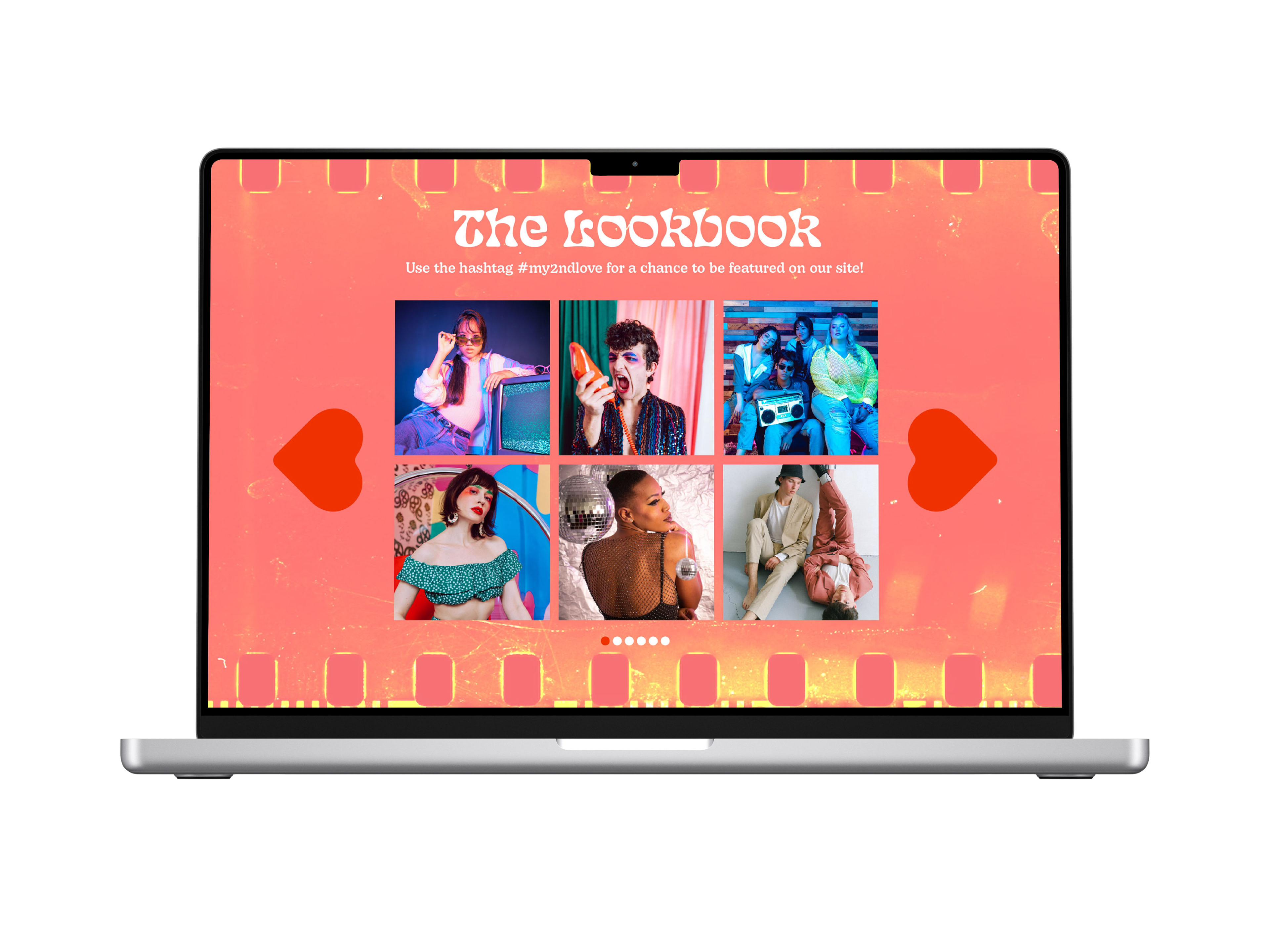
Brand photography highlights a diverse range of people styled in retro-inspired fashion while showcasing the tailoring process that sets 2nd Love apart. Images are framed within color-treated film strips as a nod to analog photography, reinforcing the brand’s 1960s influence. Textural treatments further enhance this effect and unify the imagery across applications.
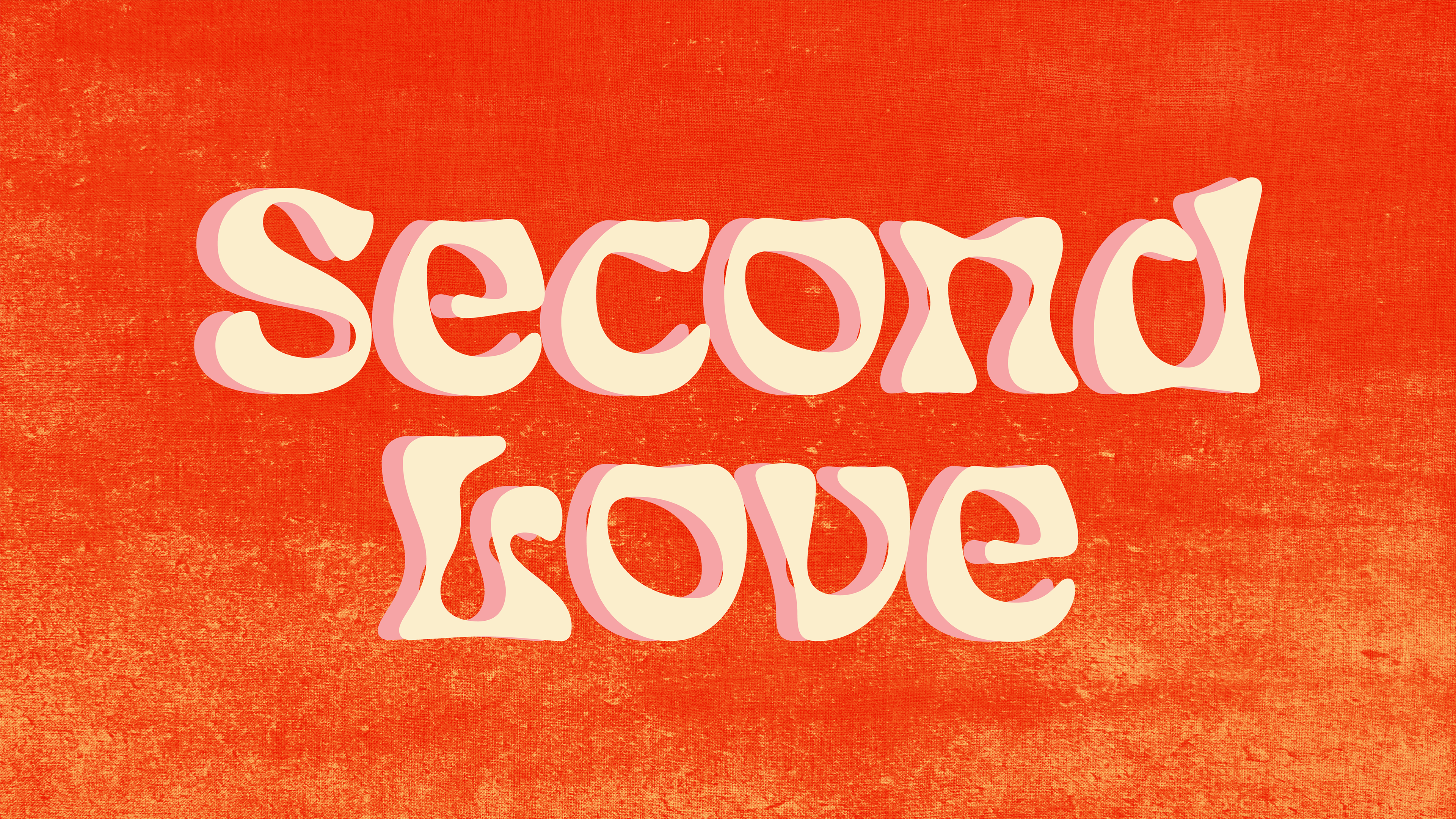
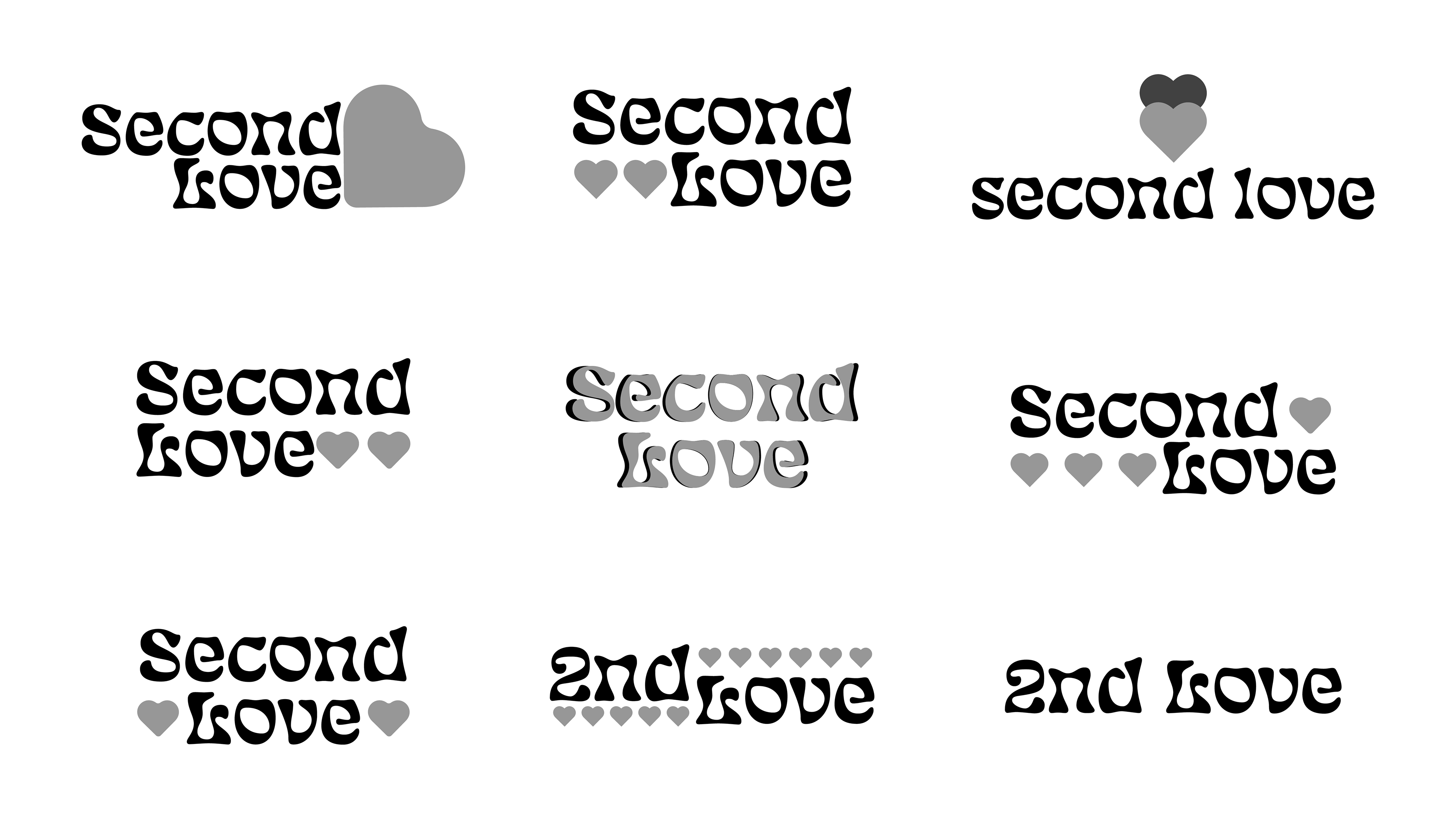
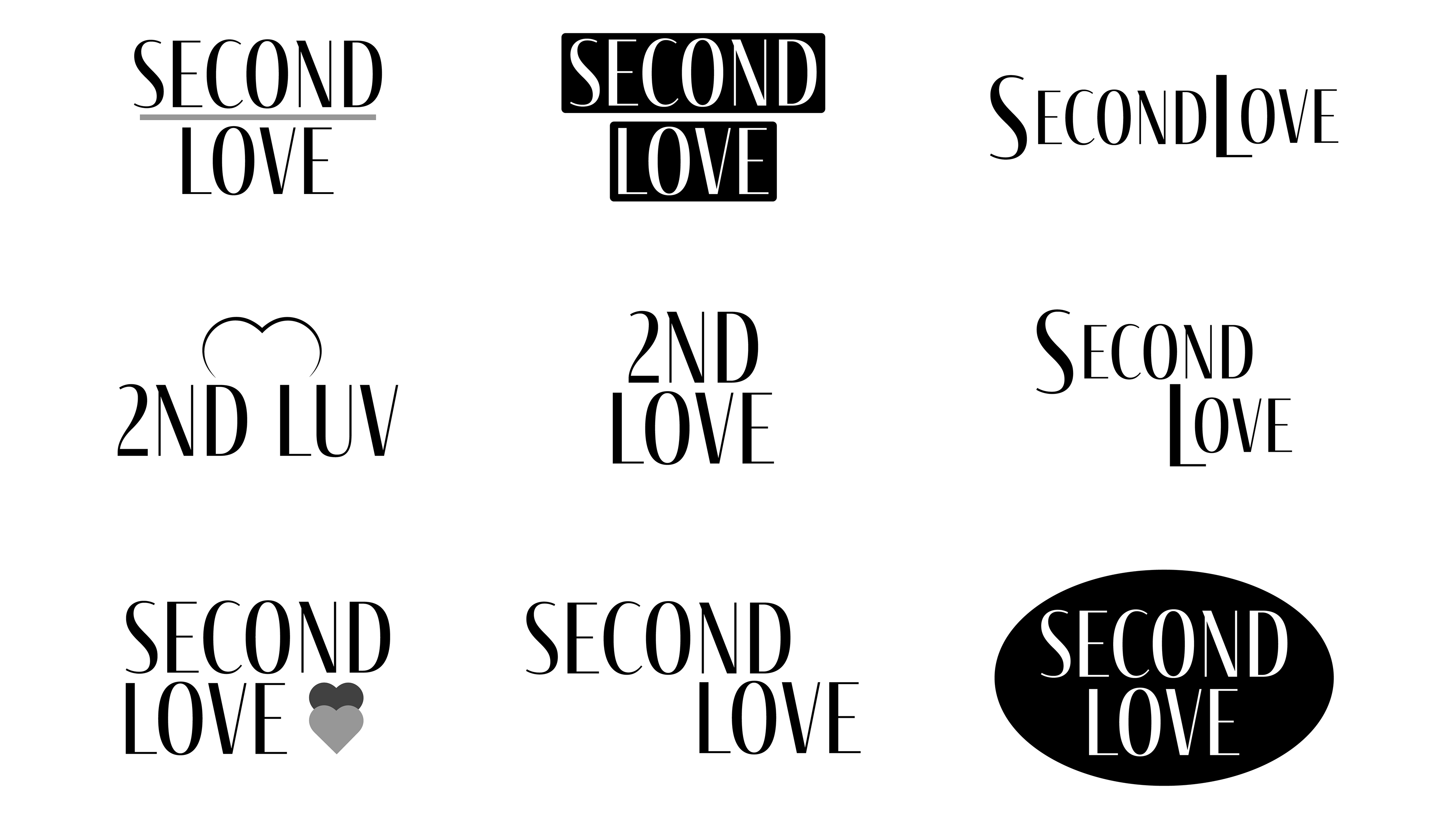
Concepts
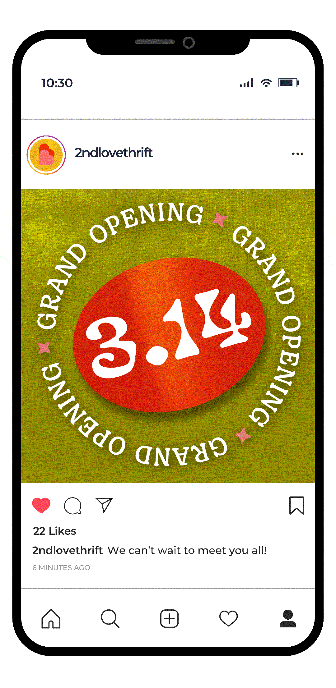
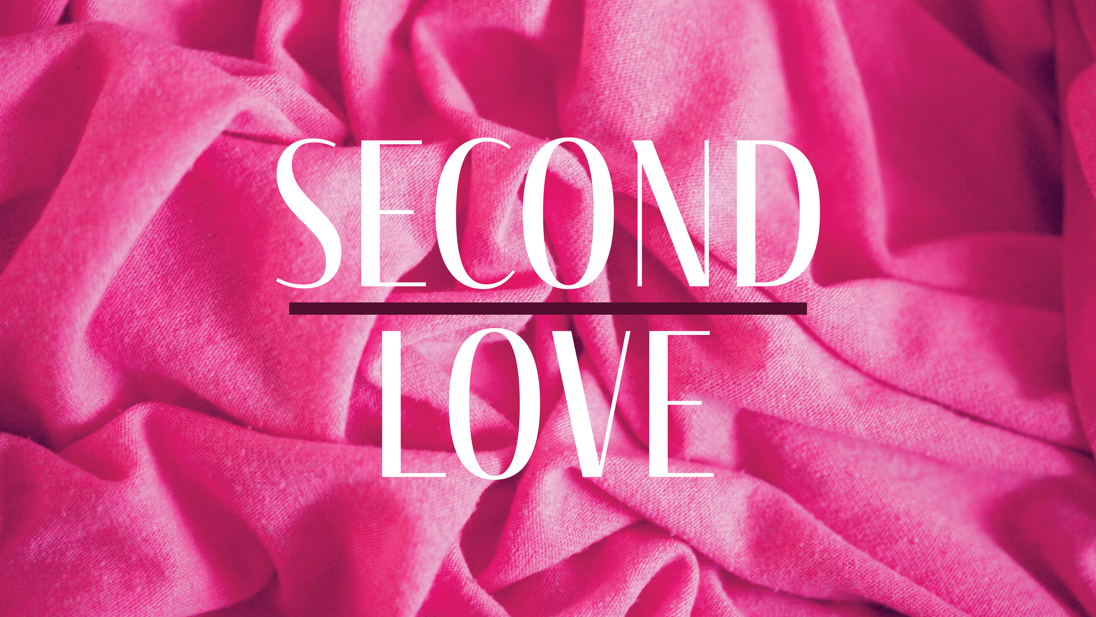
During the concept phase, I explored multiple directions to define a unique visual identity for 2nd Love. The orange concept leans into the 1960s retro aesthetic, while the pink concept emphasizes the “love” aspect of the brand.
Mocukups and textures used designed by Freepik.