
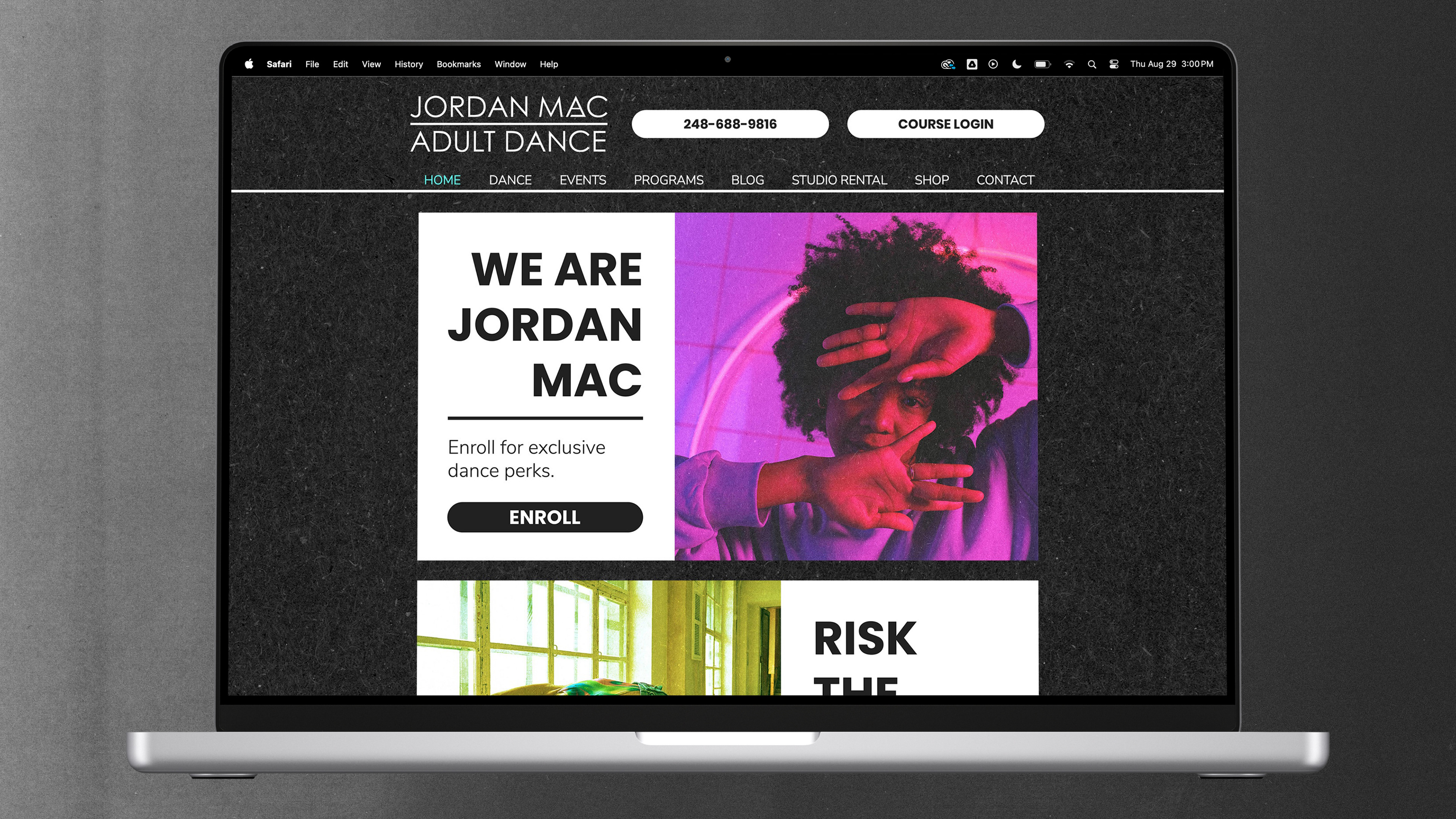
Risk the rhythm at Jordan Mac Adult Dance
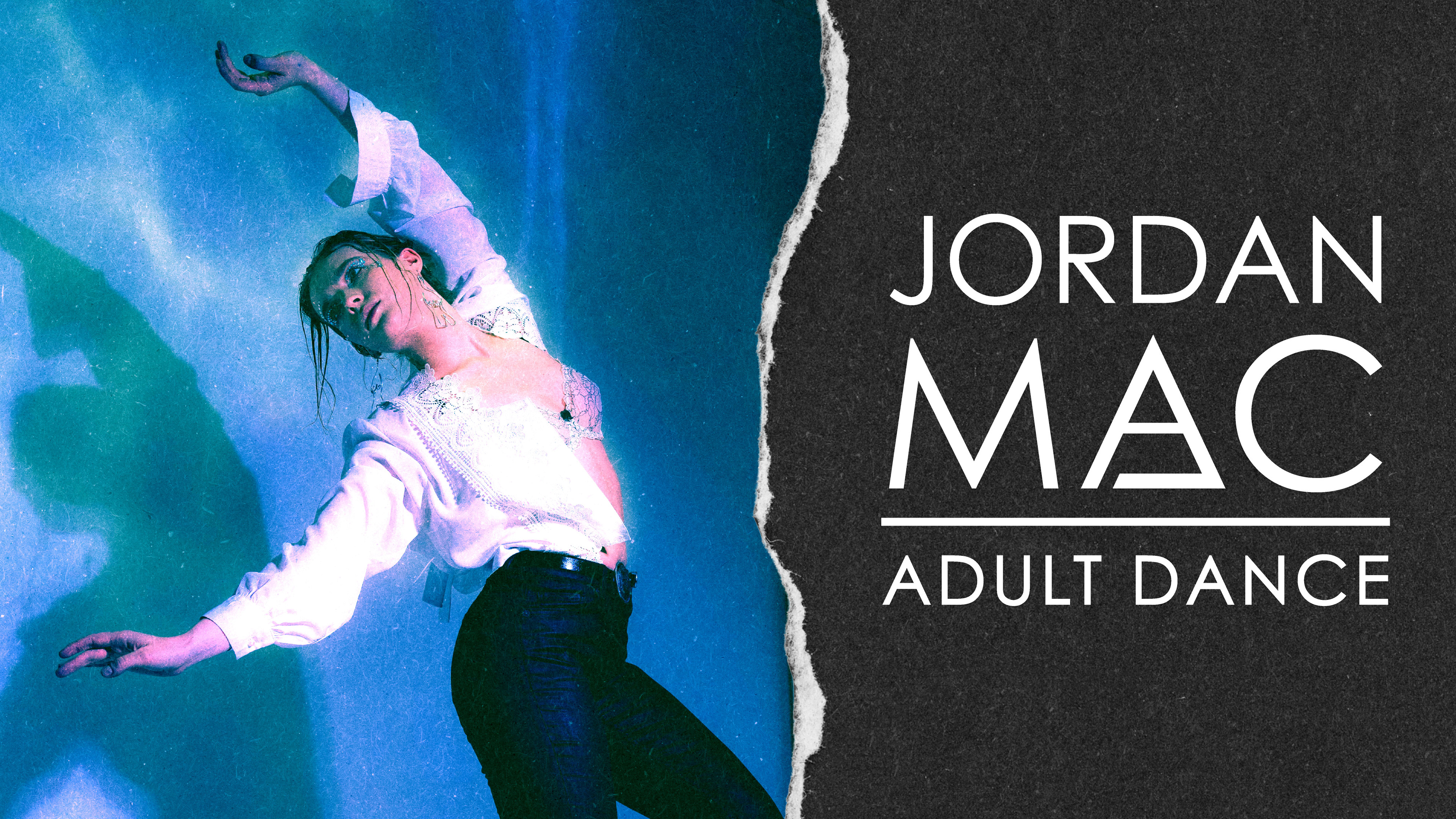
Jordan Mac Adult Dance is an adult-focused dance studio designed to make dance accessible, welcoming, and engaging at any skill level. During my time working with the team, I led a rebrand and optimized website flow across key pages to create a clearer, more cohesive digital experience.
Fixing the flow
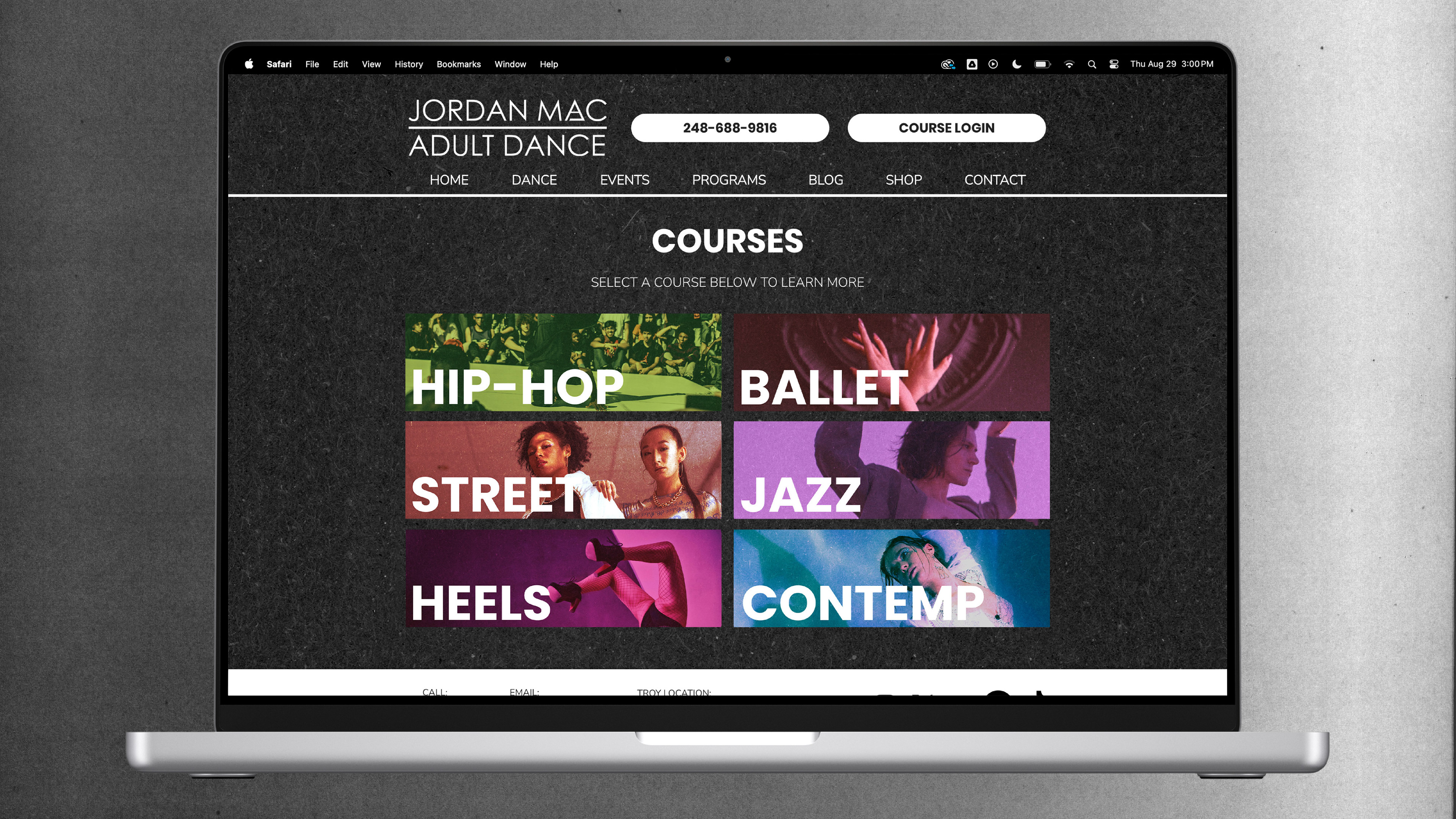
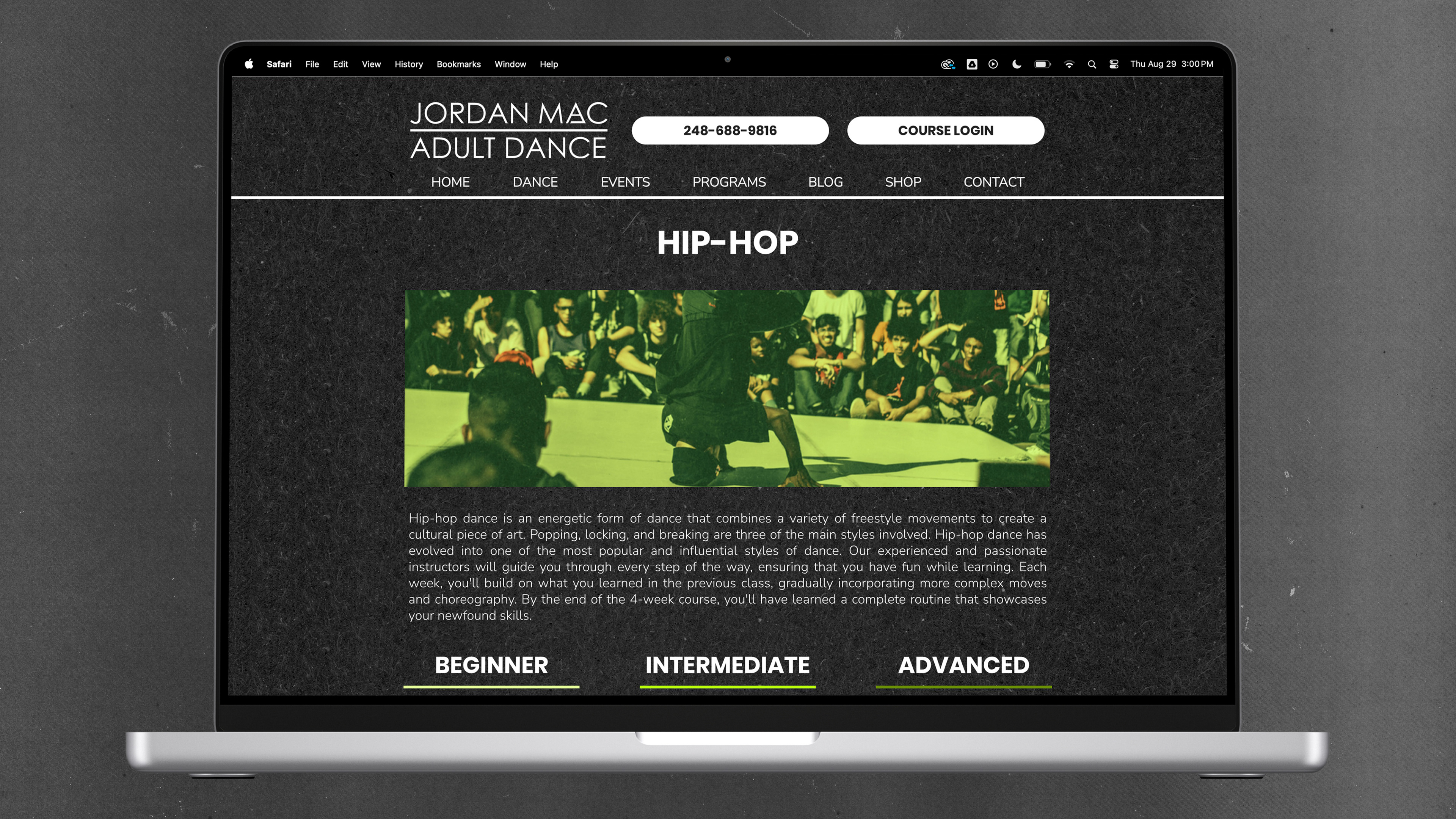
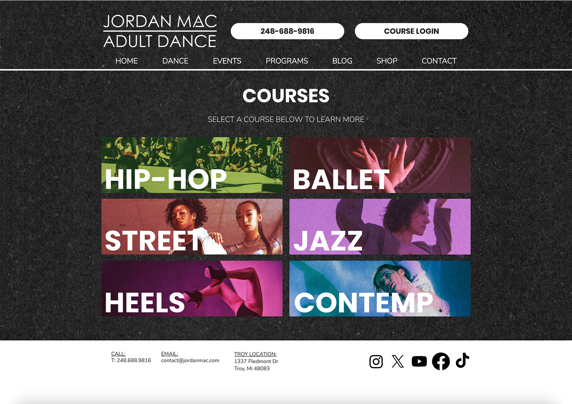
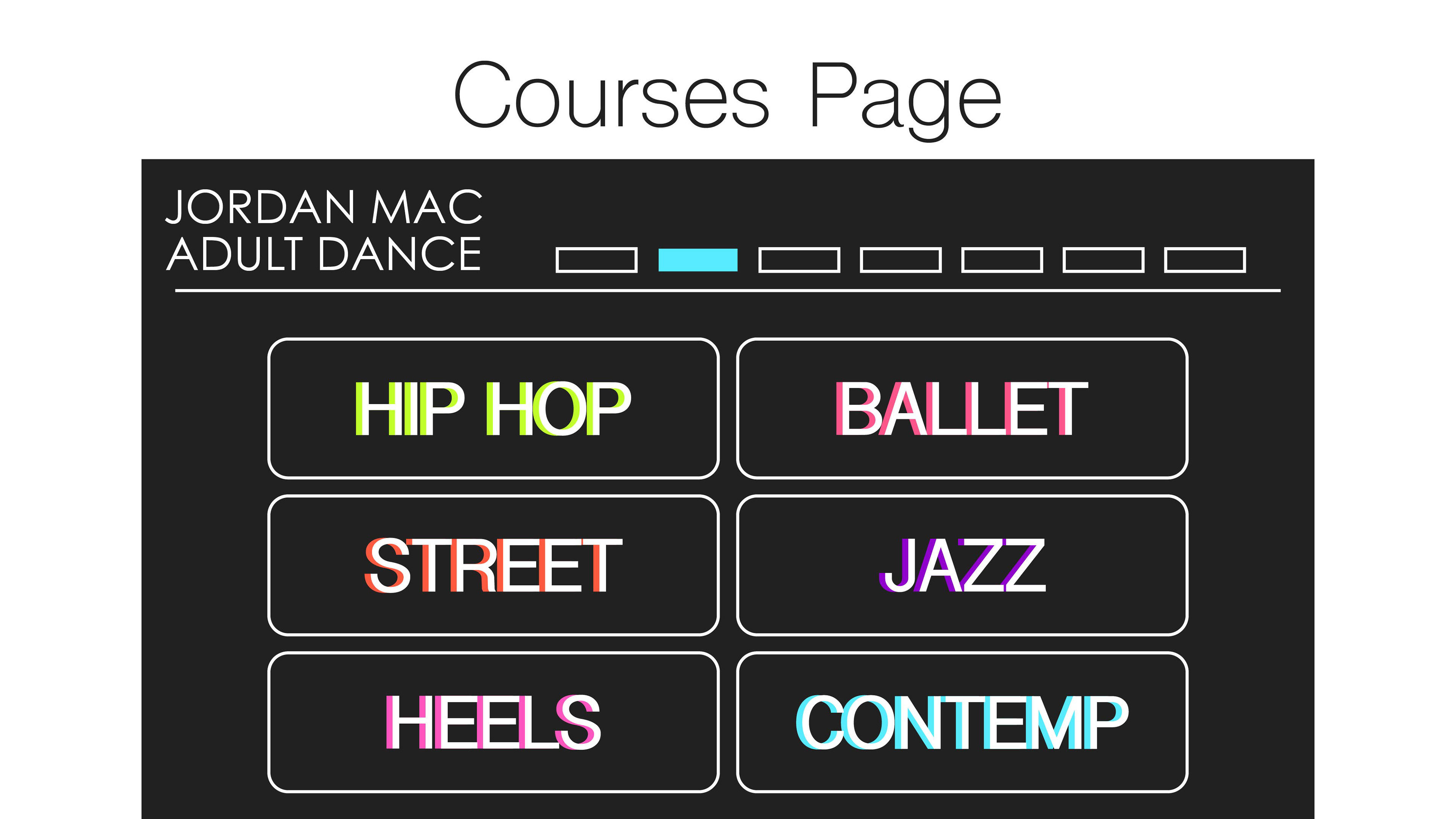
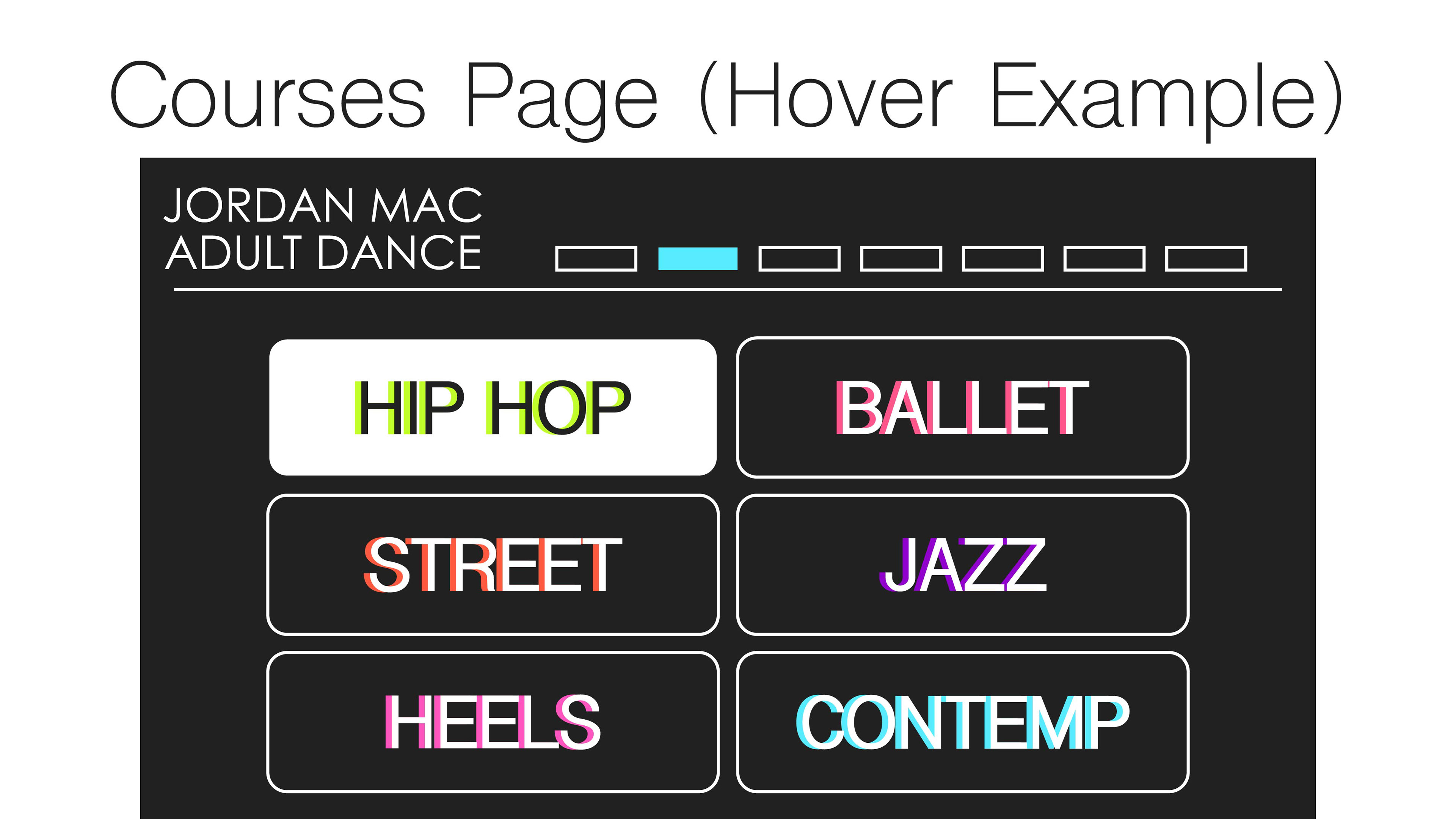
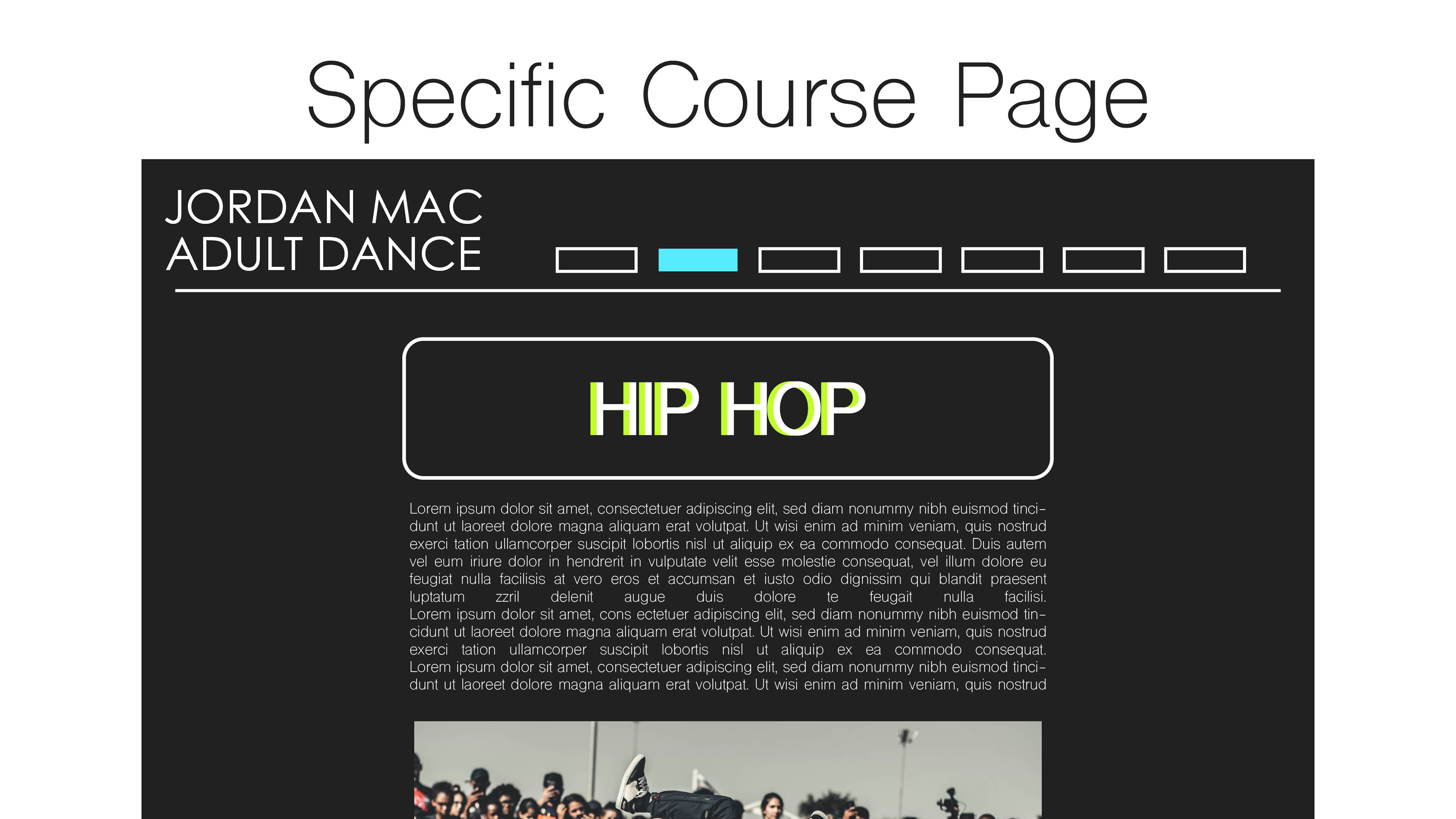
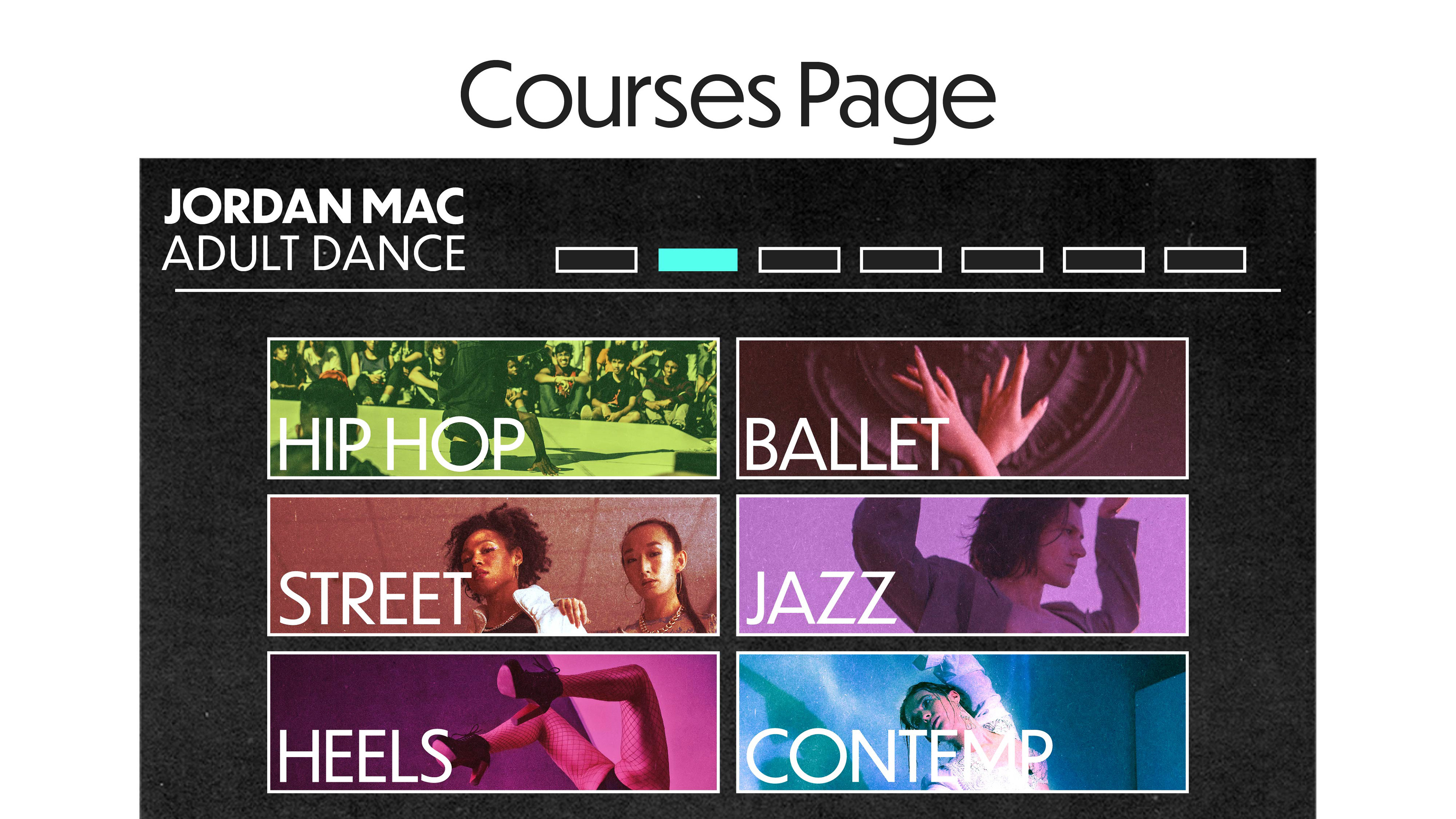
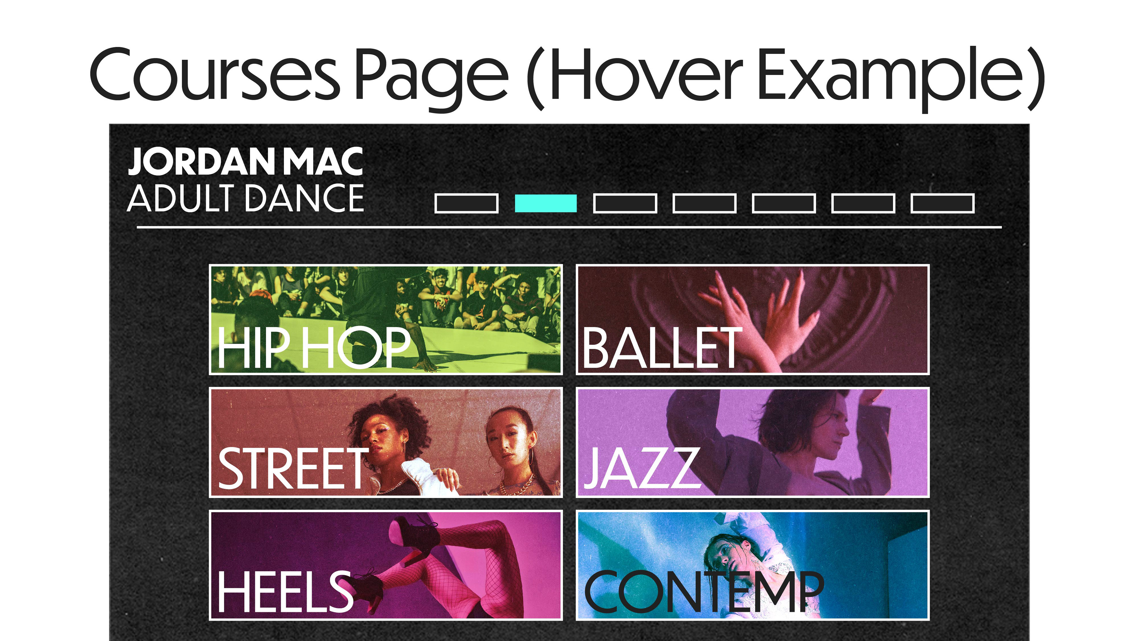
Improving the clarity of the classes experience was a central goal of this project. The original page presented all offerings within a single, lengthy dropdown organized by skill level, which limited scannability and ease of use. I redesigned the structure into a two-page system: a style directory and individual style pages that clearly outline beginner, intermediate, and advanced class levels.
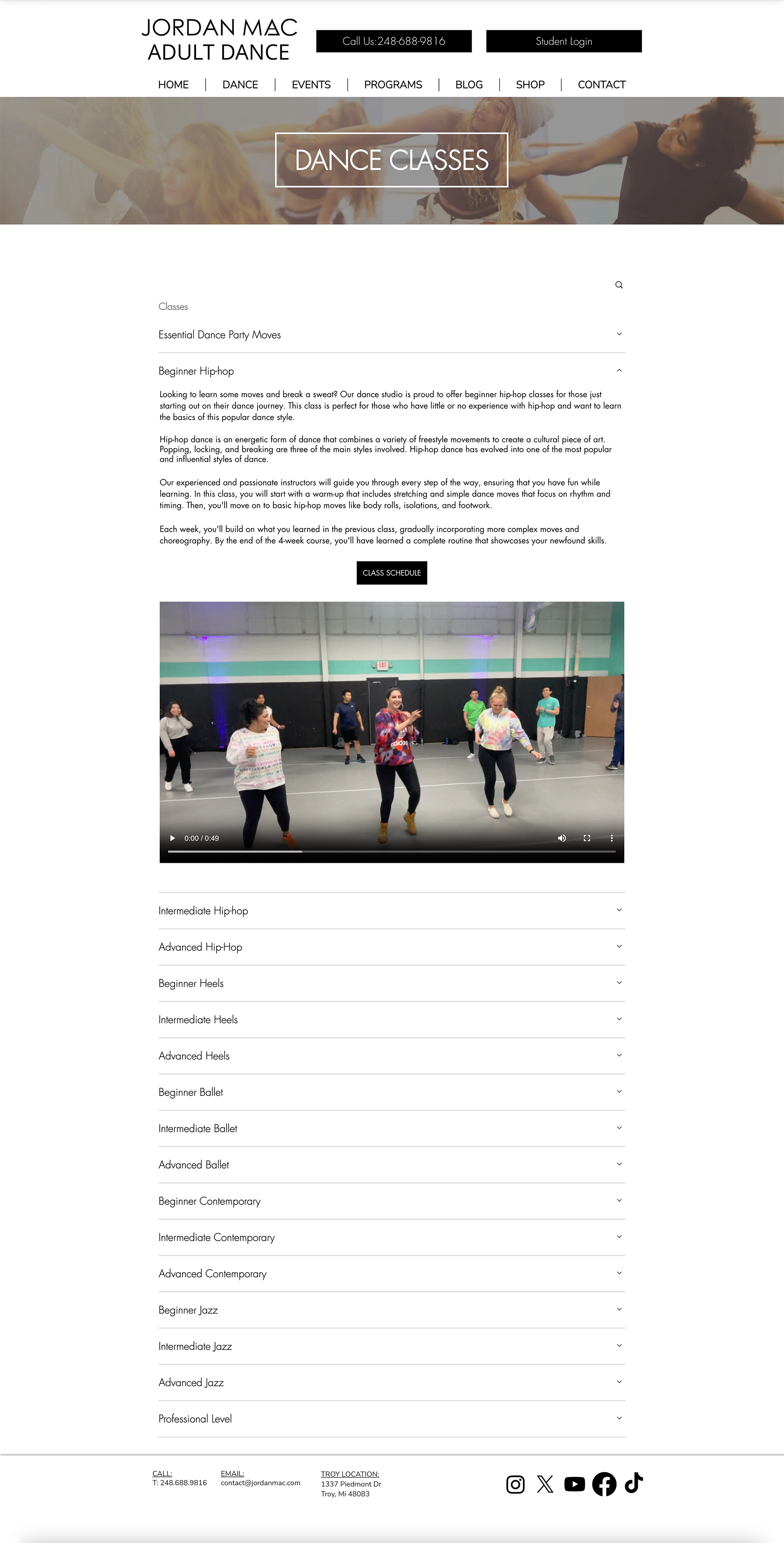
Original classes page
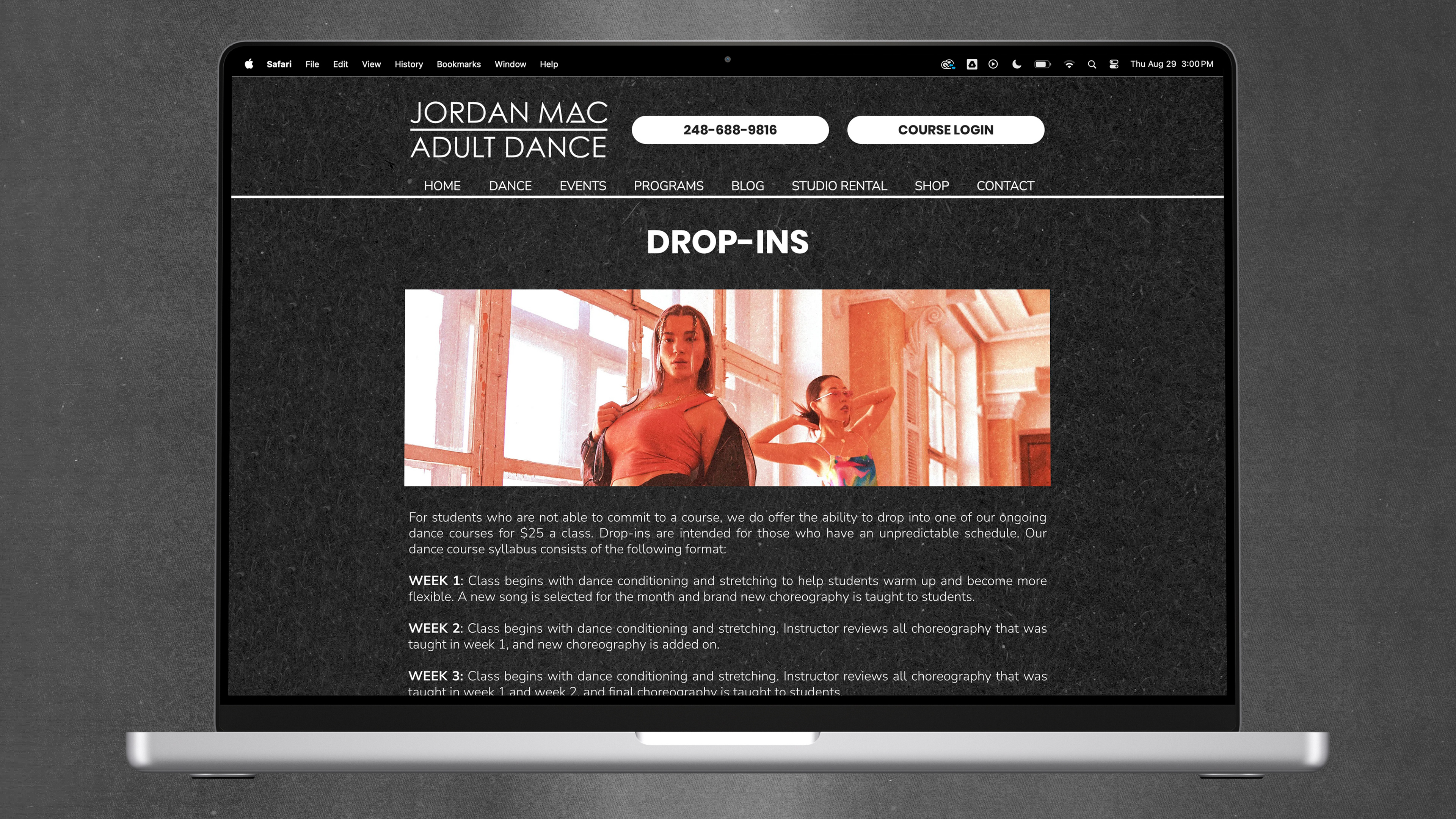
Updated classes page
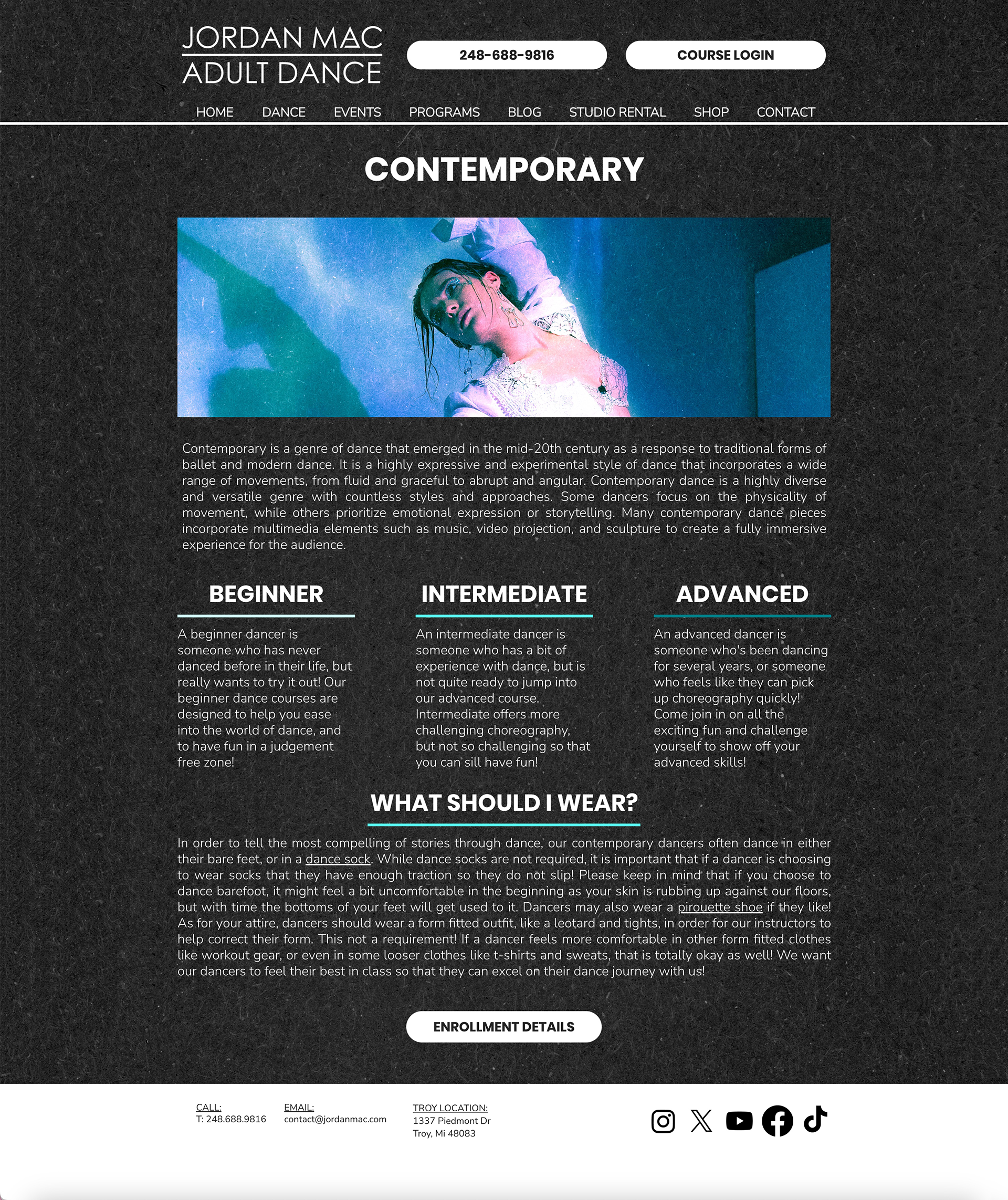
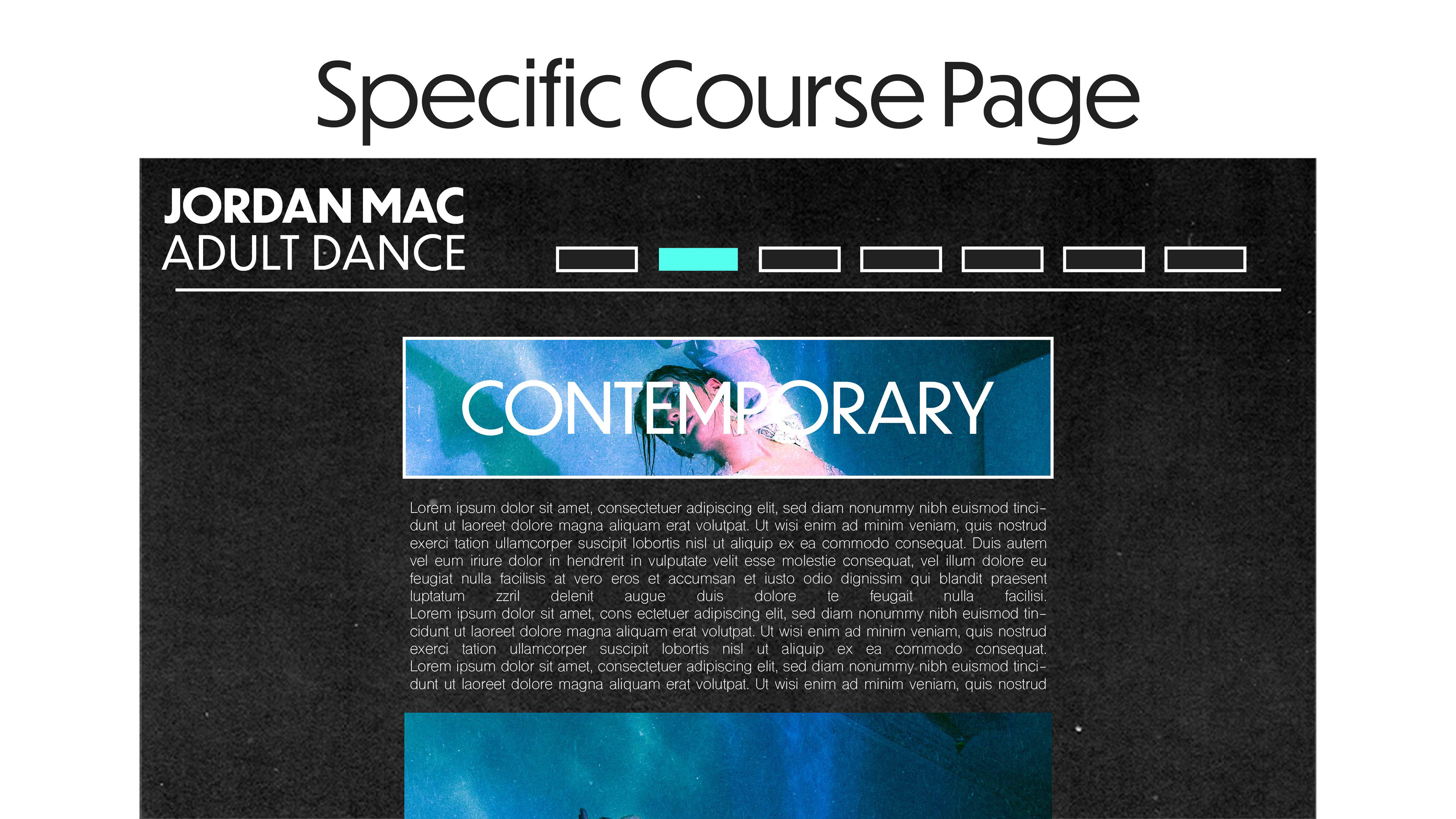
Example dance style page
The system
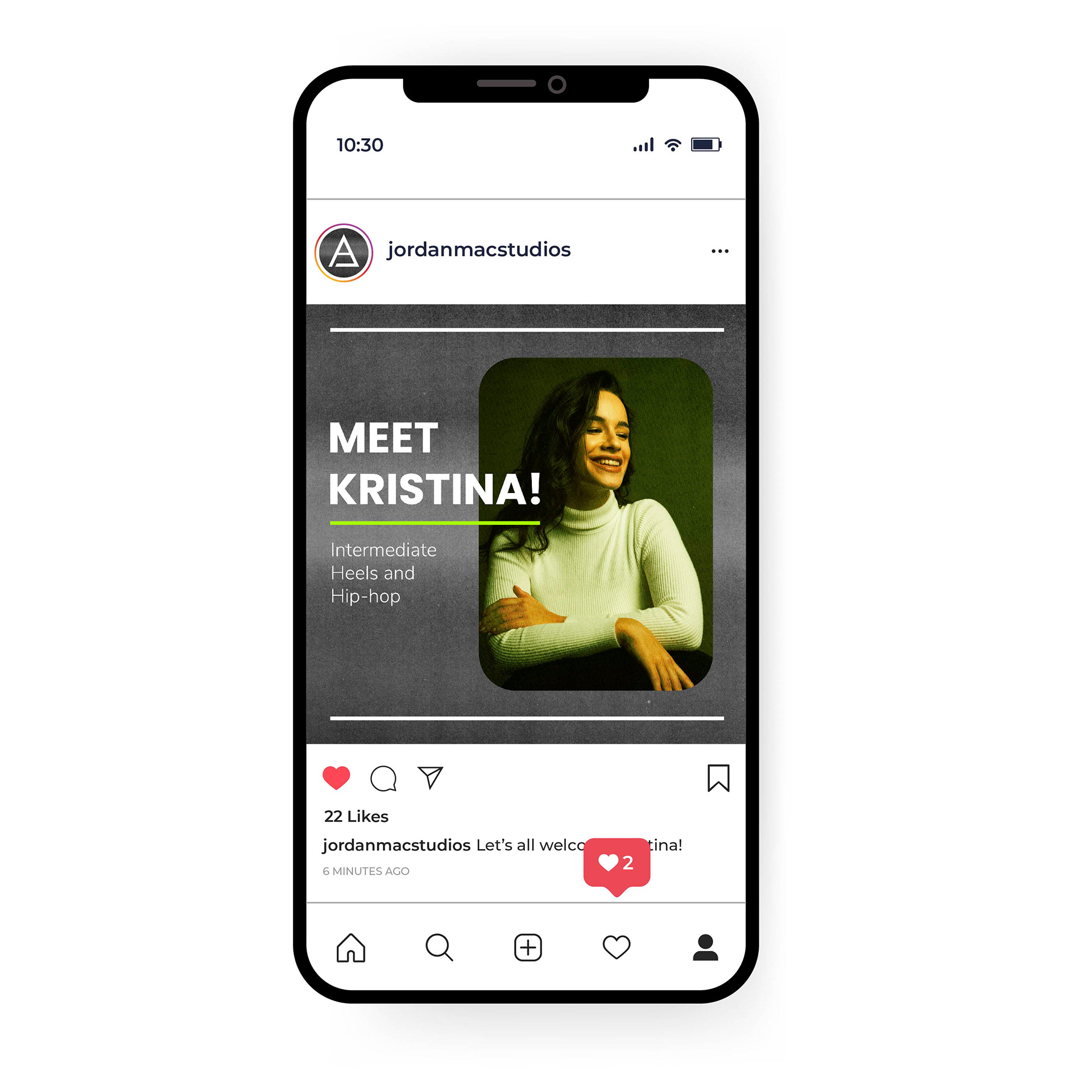
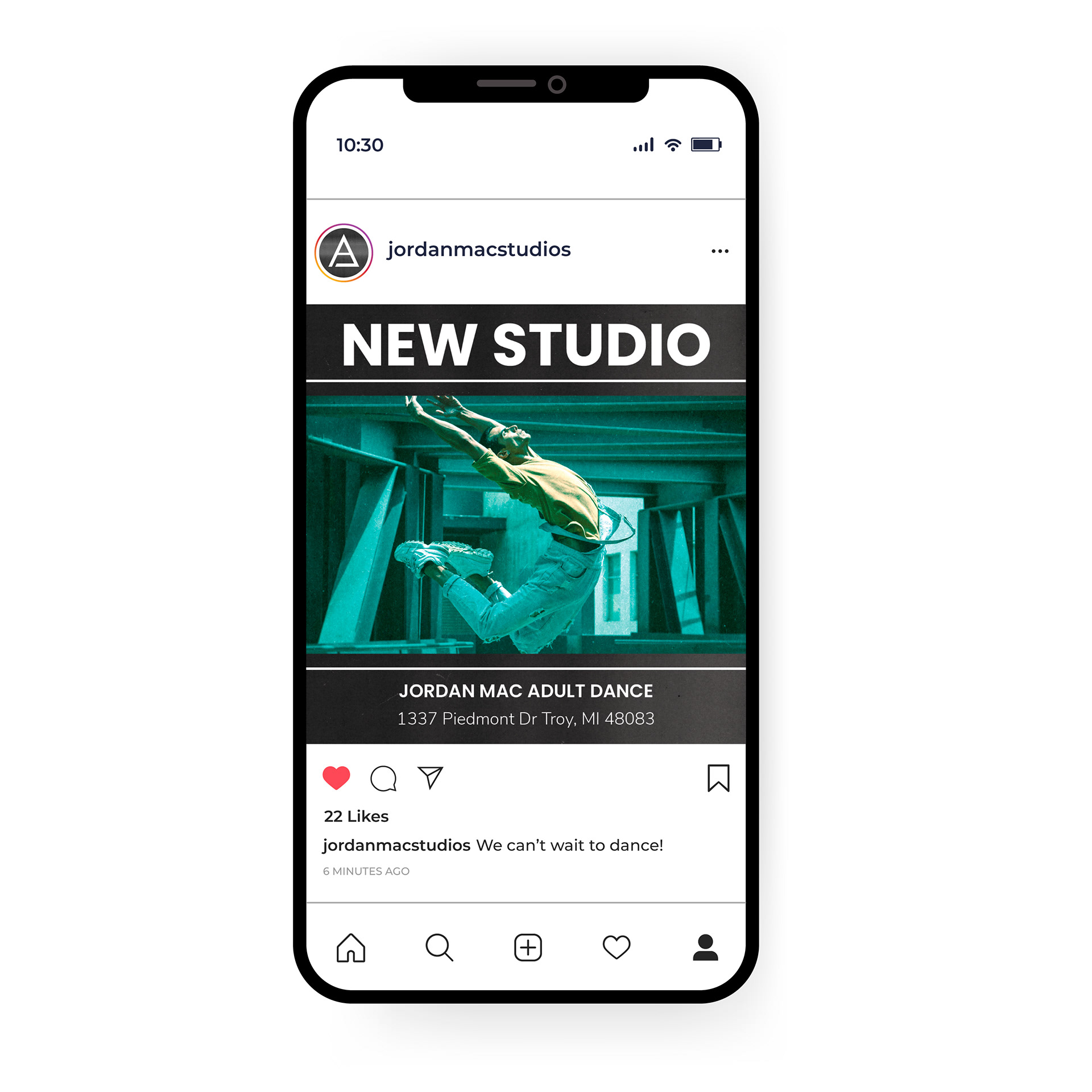
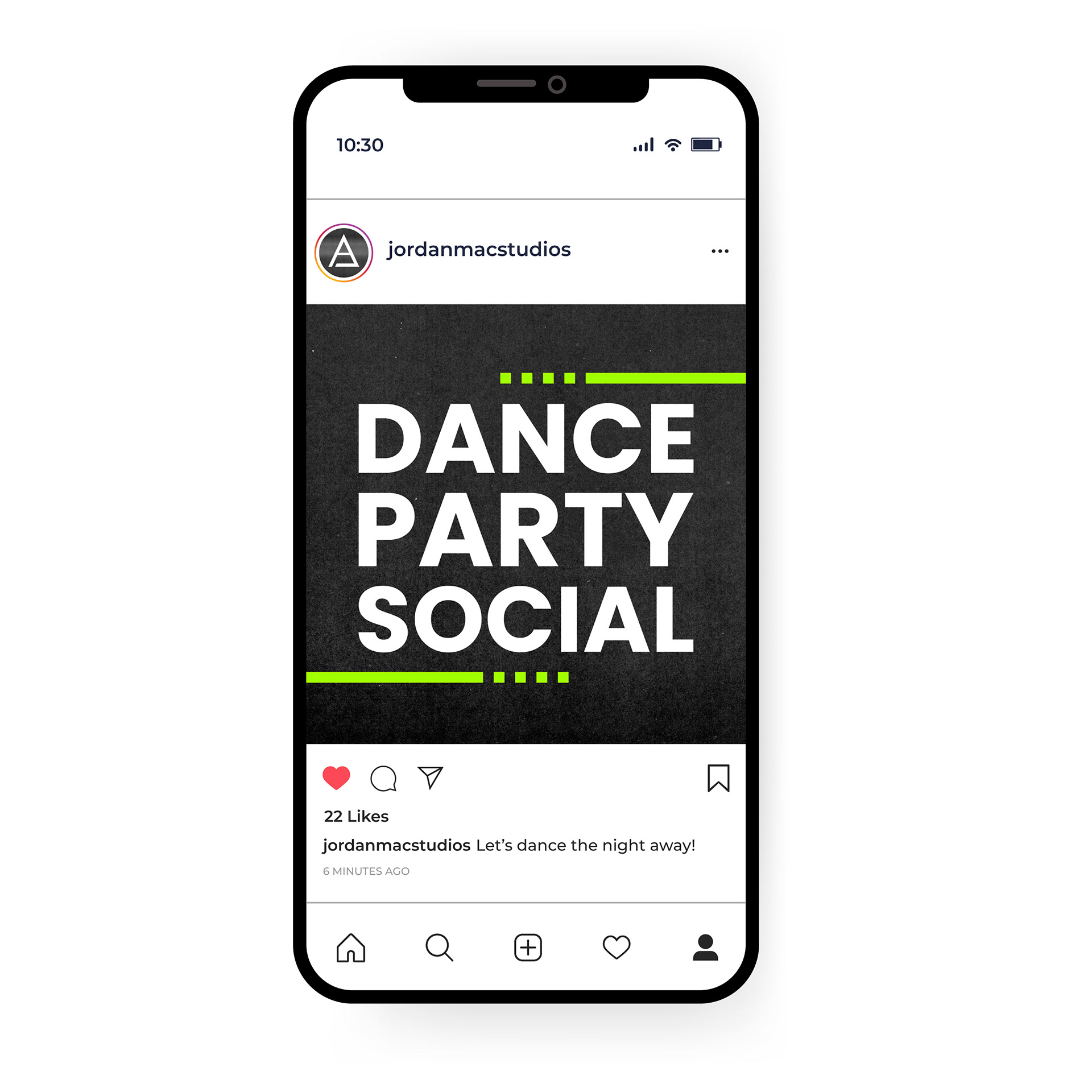
This branding system reinterprets the studio’s existing identity with a more cohesive and expressive visual approach. Where the previous system relied on minimal styling and inconsistent execution, the new direction emphasizes bold typography, artistic expression, and consistency across touchpoints. The system is designed to feel inspiring and approachable, with visual cues inspired by printed materials.
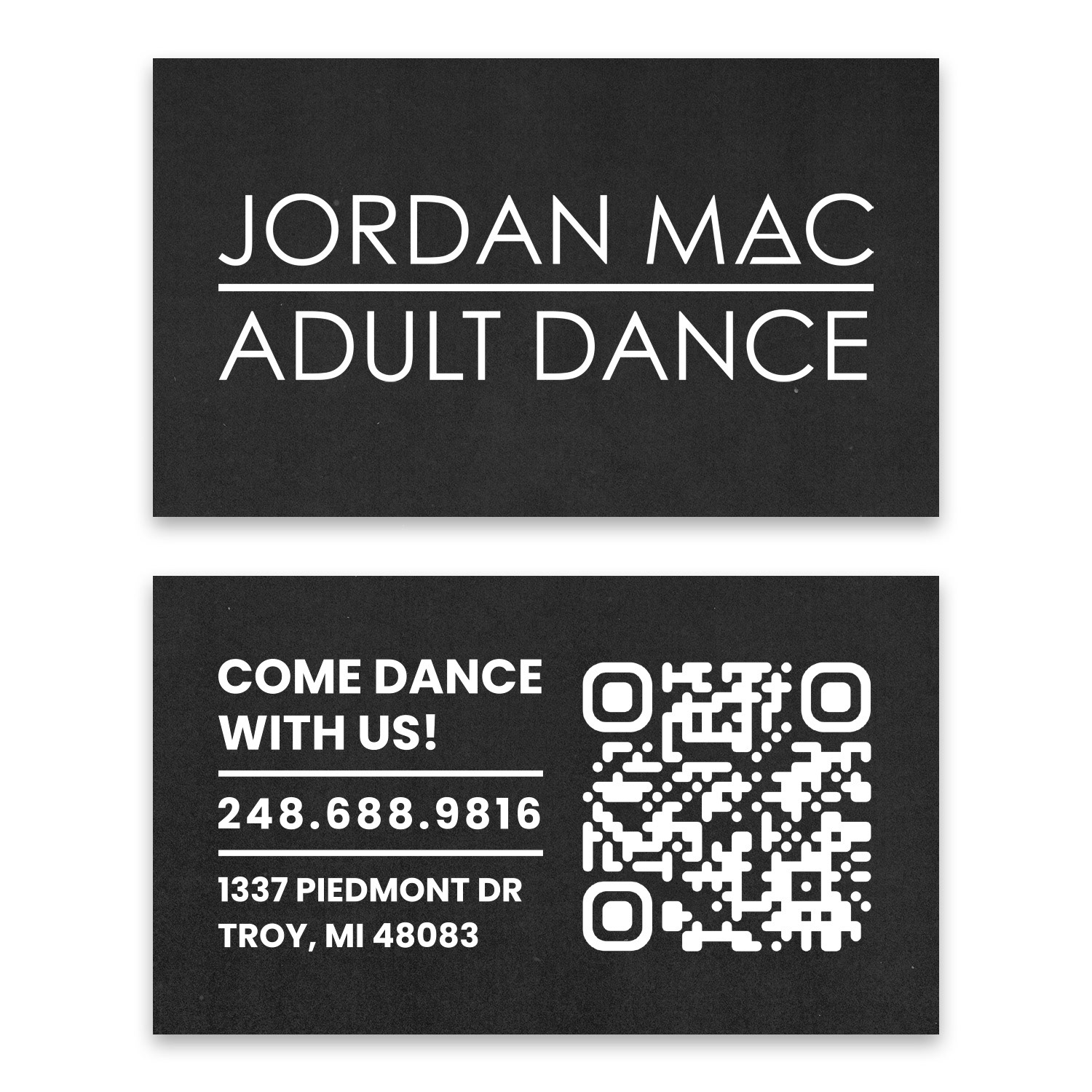
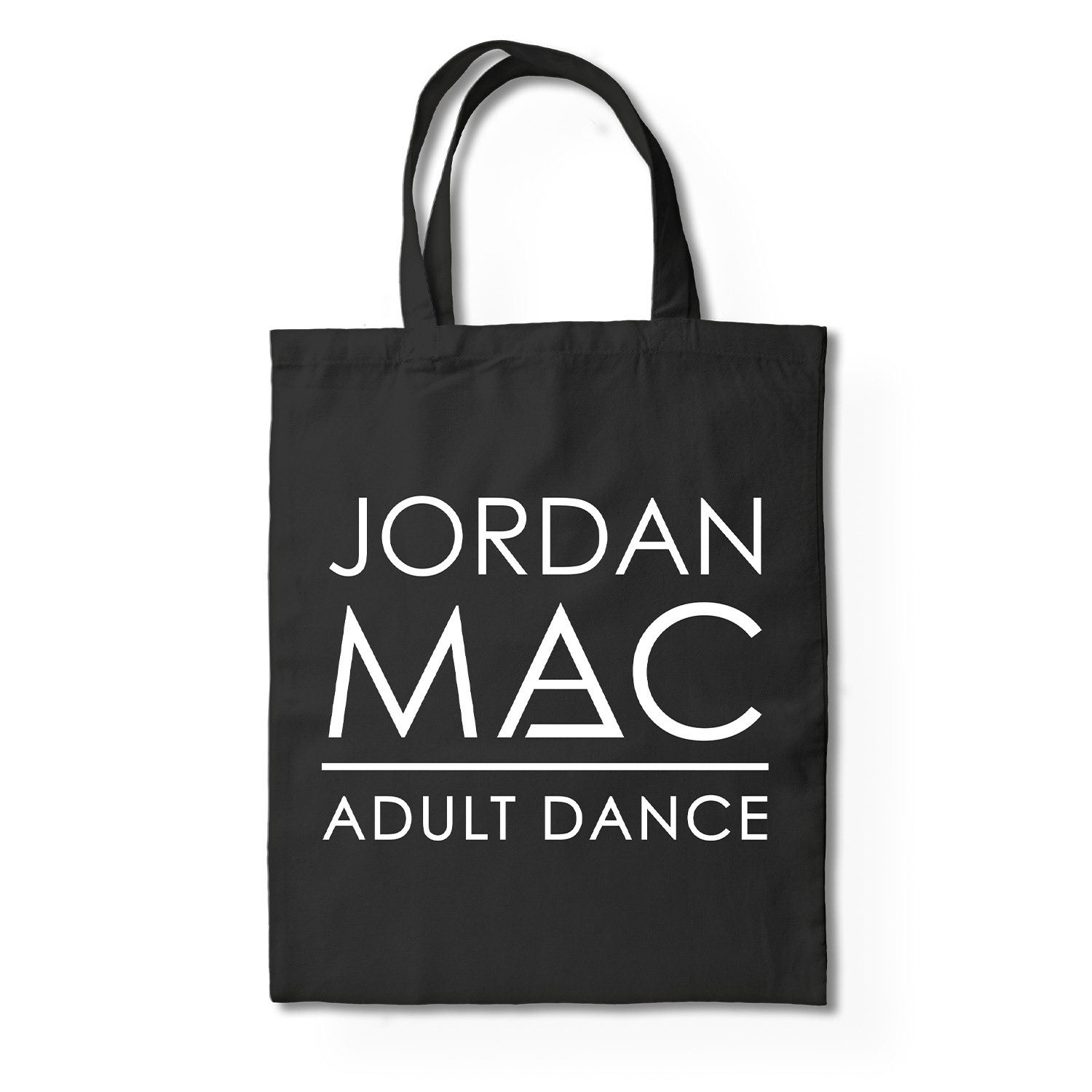
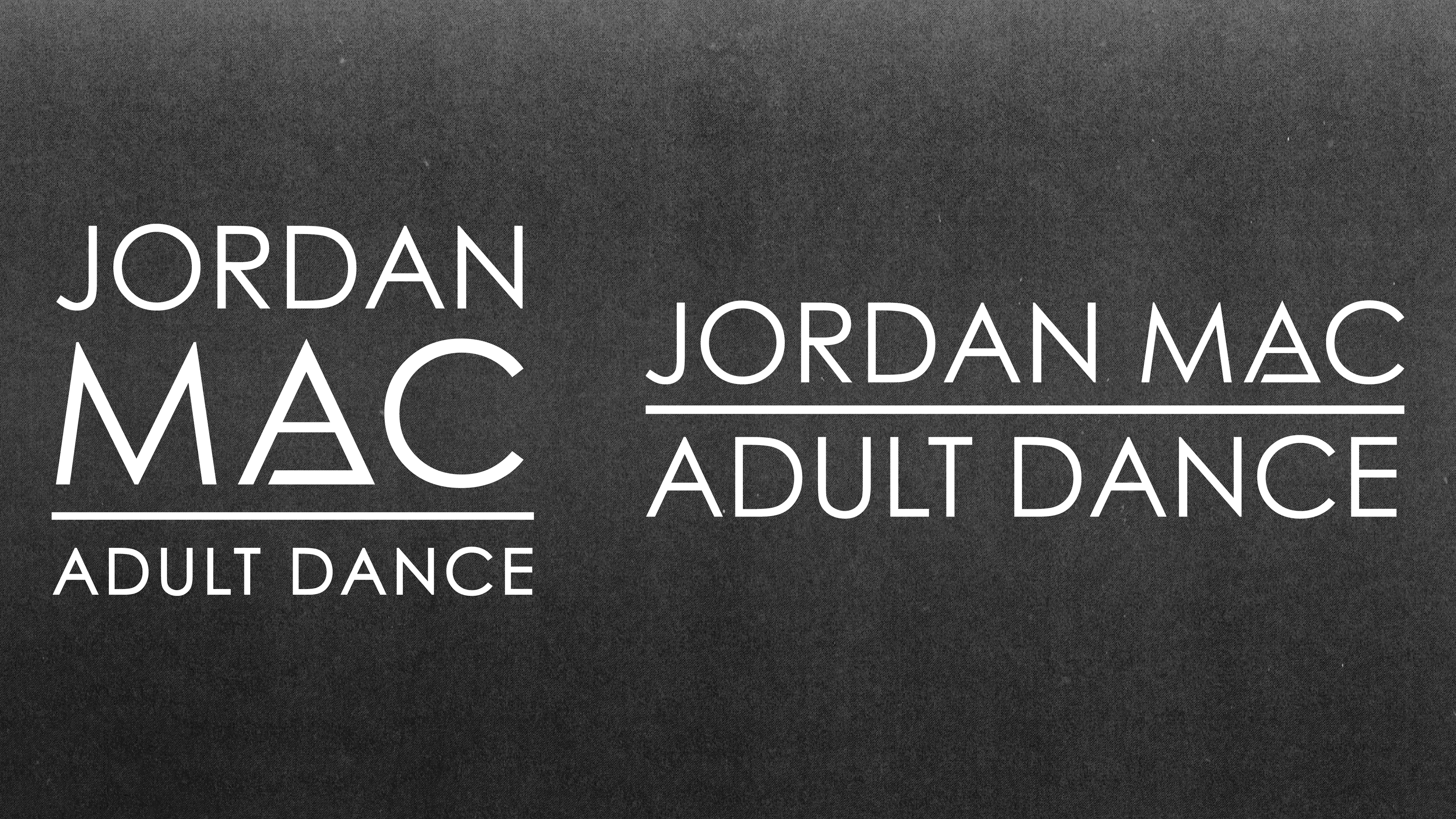
Logo
The logo builds on an existing mark that had been part of the studio’s identity for several years, with refinements made to improve flexibility and usability. The primary logo was updated to include “Adult Dance,” and a balancing bar was introduced to strengthen the overall composition while preserving the square form that was important to the studio. A secondary, horizontal logo was developed to support responsive use across digital and print applications.
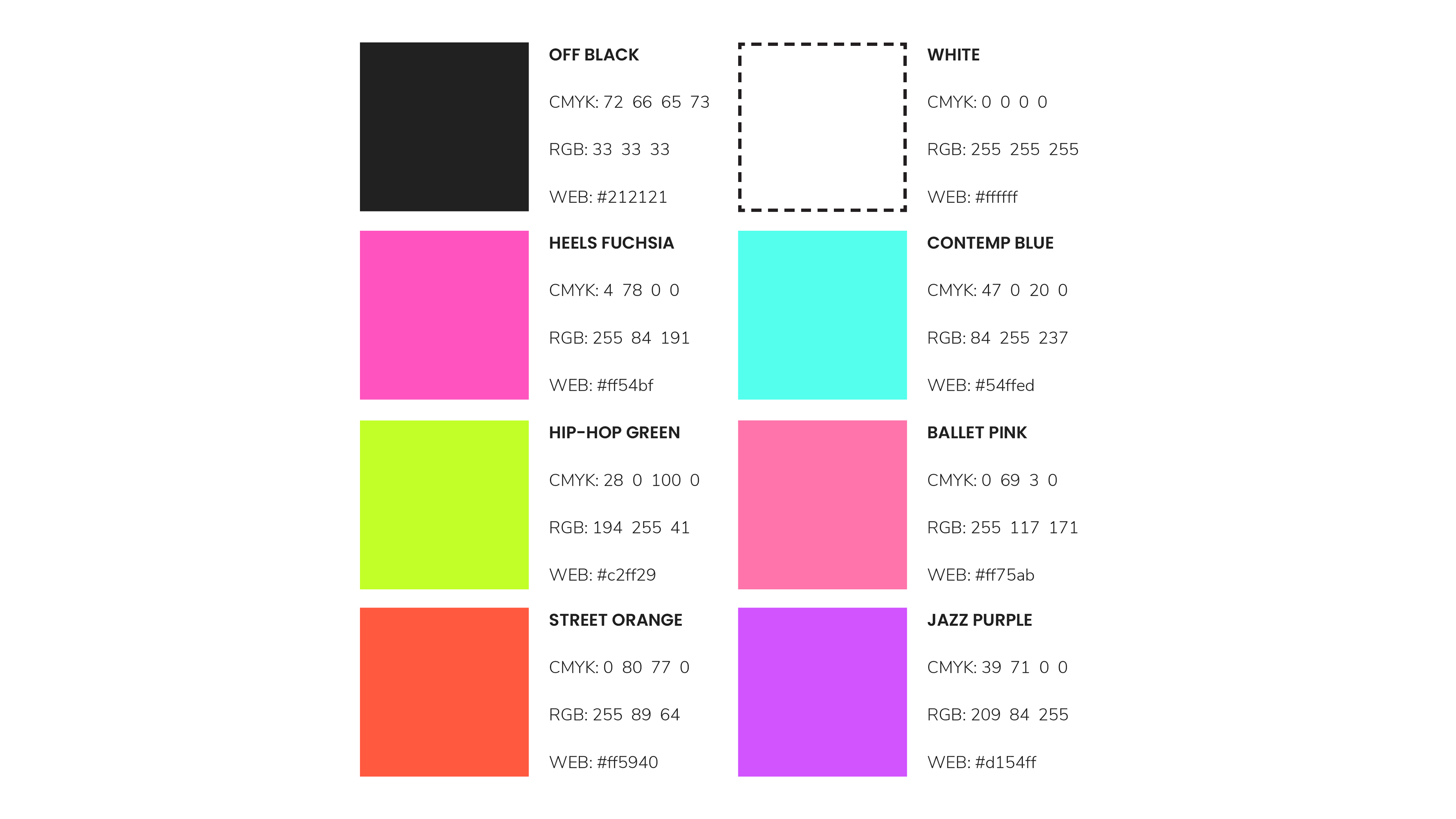
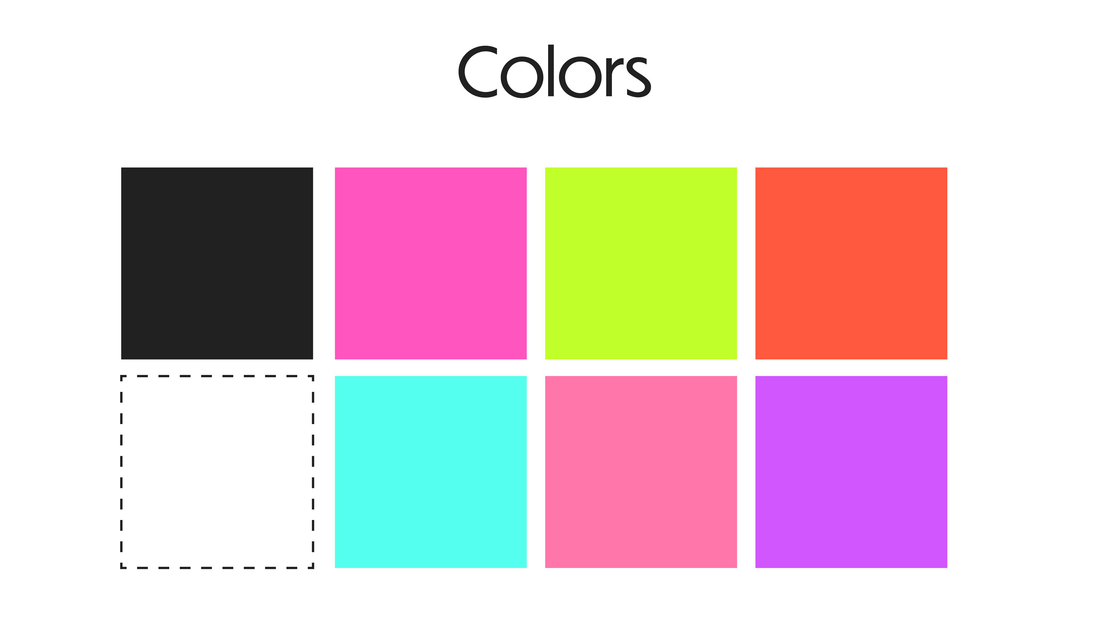
Color
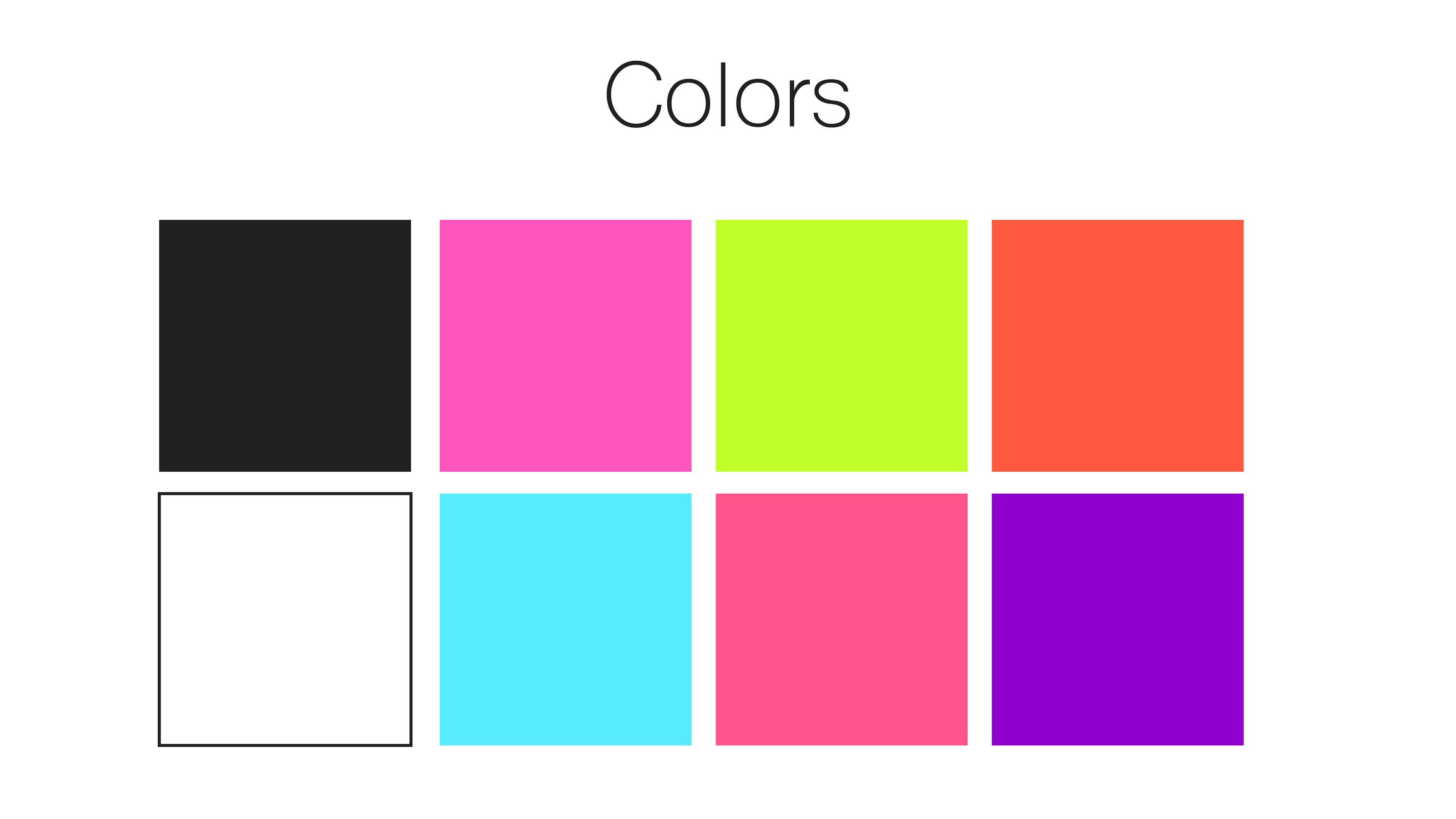
The color palette reimagines existing internal colors as a core part of the brand system. More vibrant tones were introduced to complement the darker backgrounds and create a stronger, more striking visual presence.
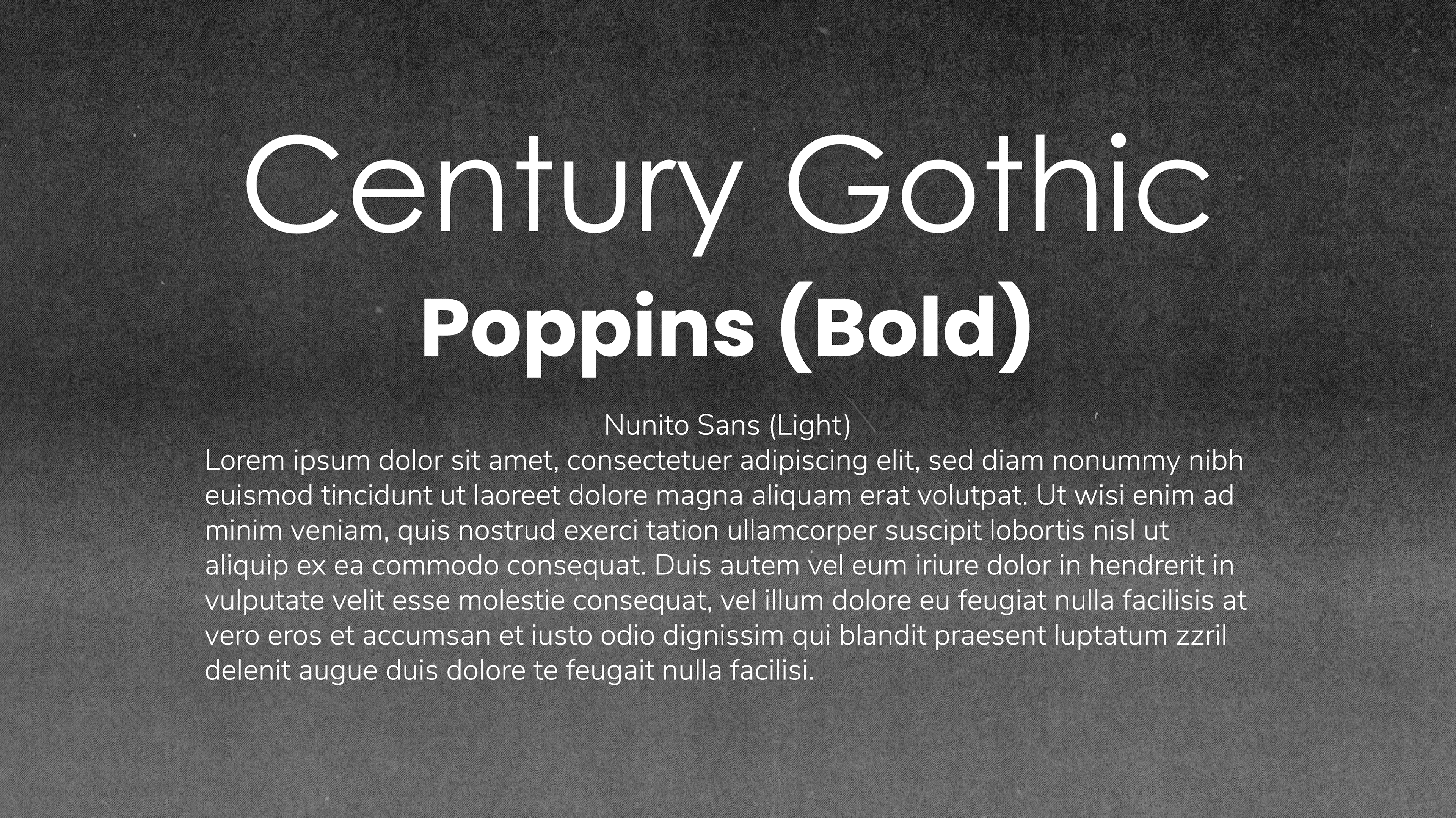
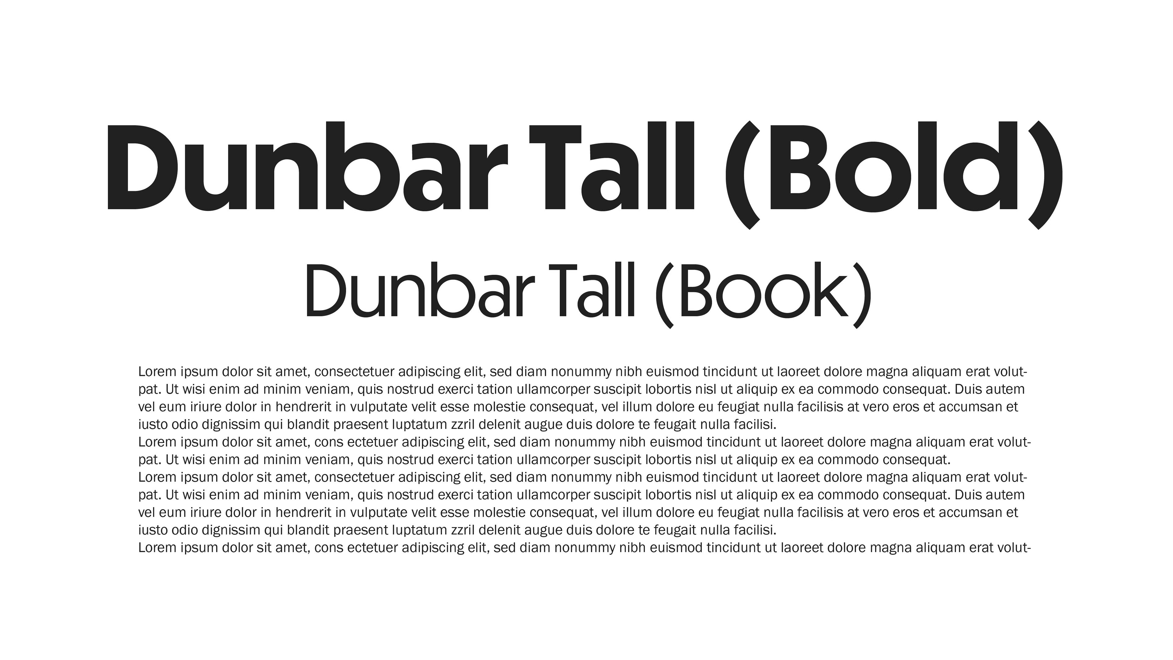
Type
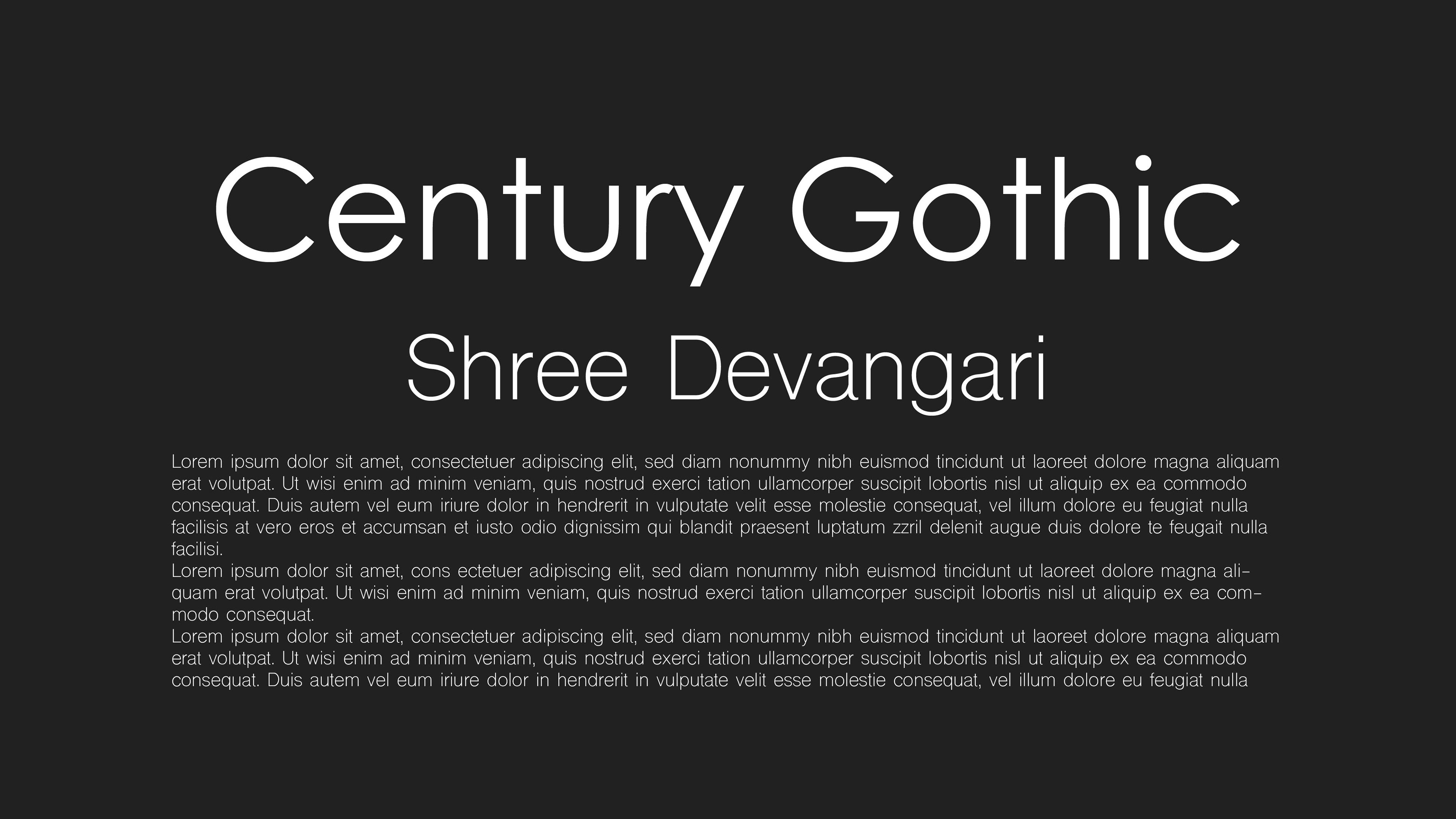
The typography system builds on the studio’s established identity while supporting a more modern visual approach. Century Gothic was retained to preserve brand familiarity, with Poppins and Nunito Sans added to complement the updated system. All selections were made with Wix compatibility in mind to support long-term internal use.
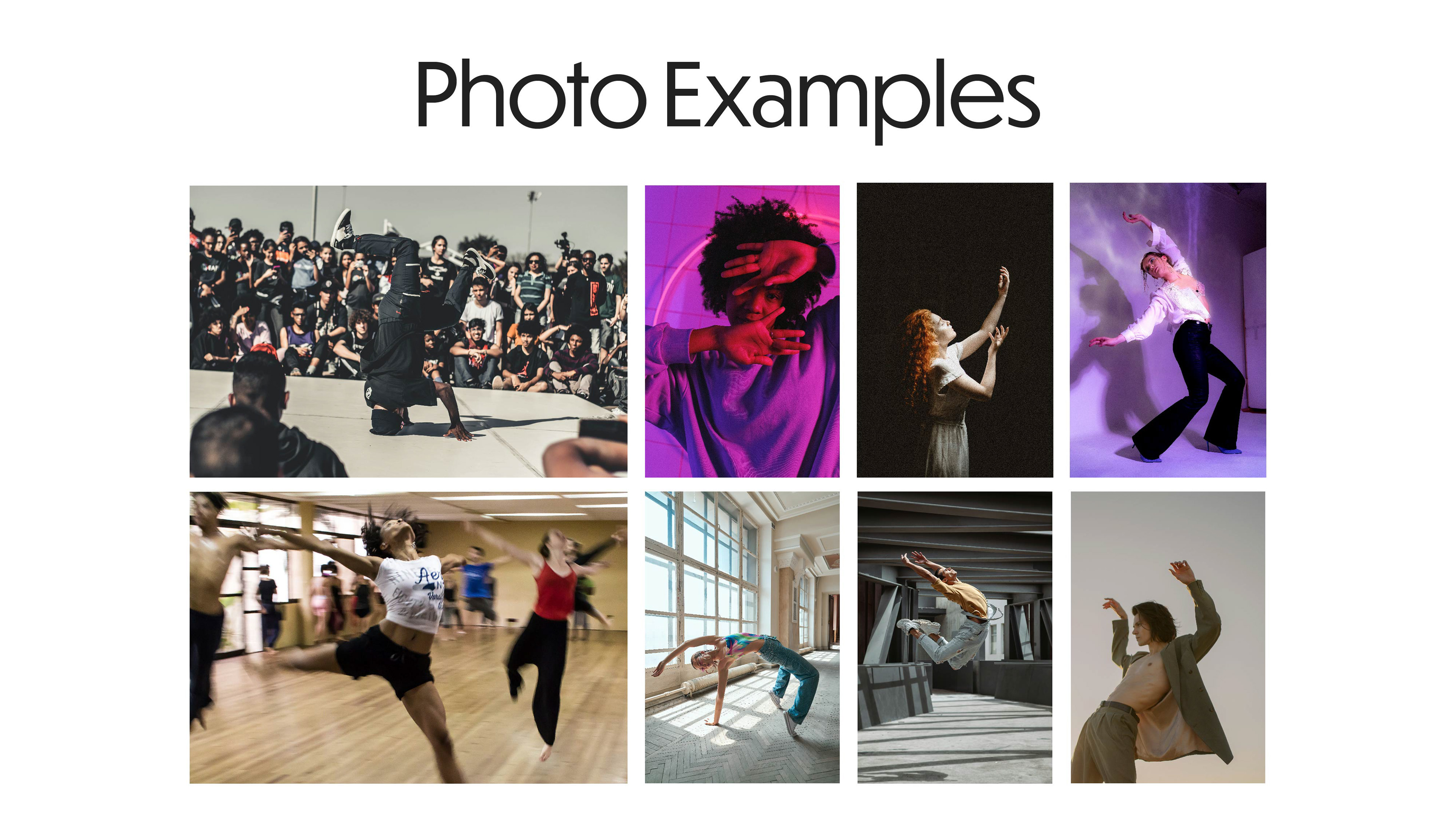
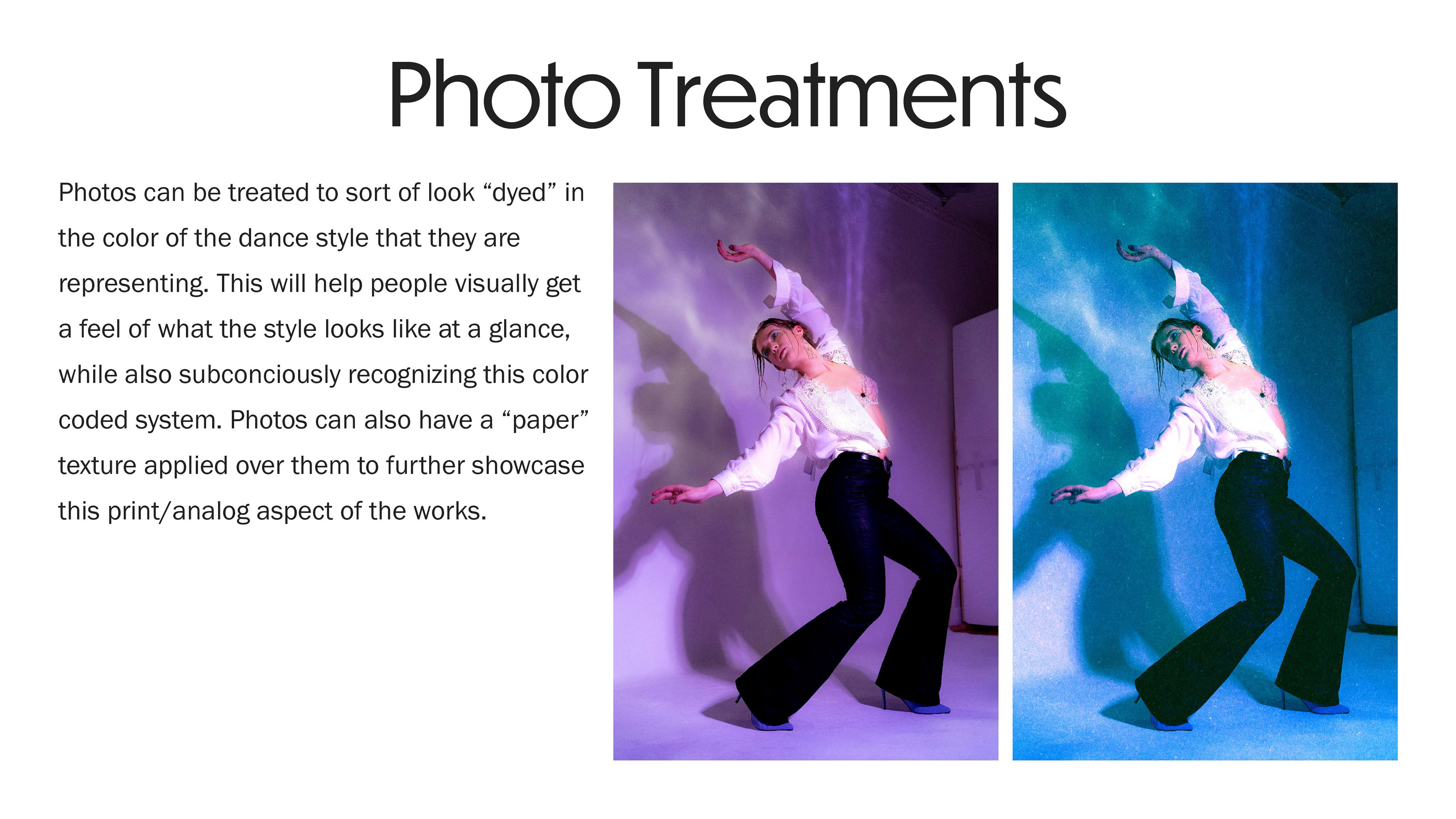
Photos
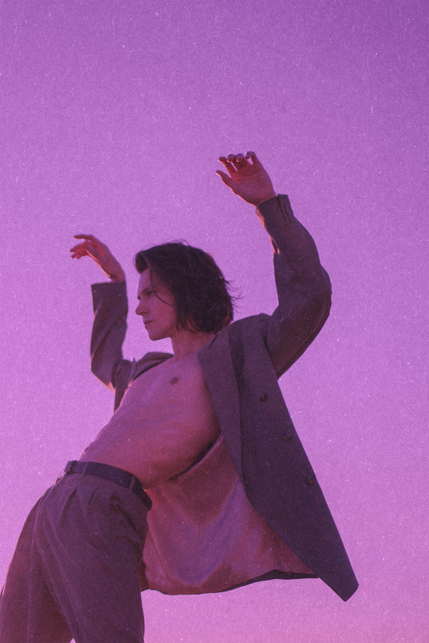
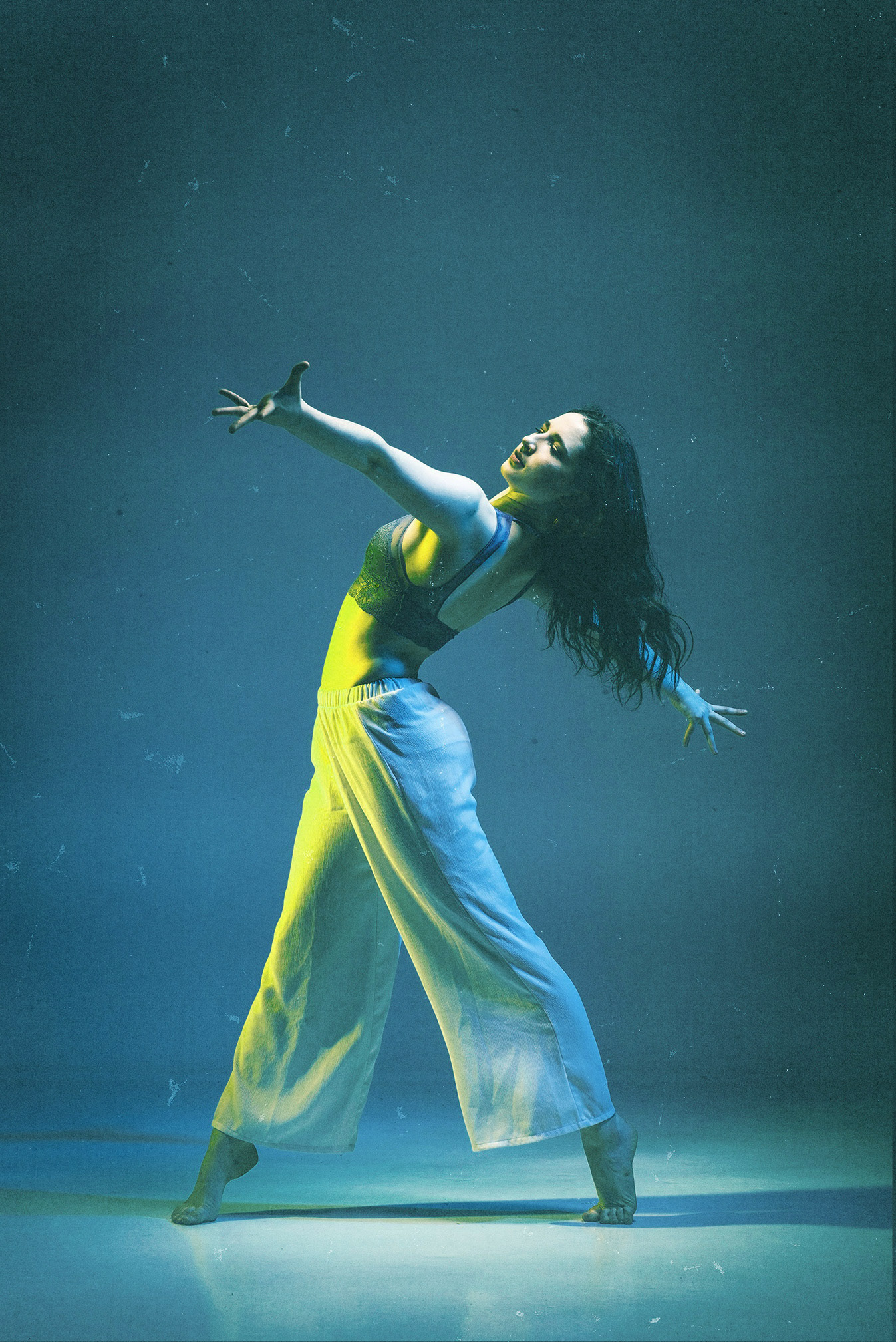
Imagery is color-coded by dance style to support quick recognition and visual consistency. Each style is assigned a specific color and applied consistently across photography and brand touchpoints. For example, jazz is represented using purple. Textured overlays reinforce alignment with the paper-inspired background treatments used throughout the brand.
Rebrand concepts
Below are the original concepts I pitched to Jordan and her team after we had discussed her vision.


Previous Branding